
A number of our customers still rely on the Classic UI for making authoring updates. This means the sites implementation doesn't make use of many of the latest features of the AEM product. Other customers may be operating in the Touch-Enabled UI, but they are still developing new content using static templates. Updating to Editable Templates requires review, planning, and a properly executed project. This lab is intended to help jump start that process, providing guidance and tools to reduce the effort to modernize your AEM Sites implementations.
In this lab we will learn about the process of migrating Experience Manager Sites pages. First we will review a site implemented using legacy static templates, and plan a migration to modern editable template-based pages. Using this information we will analyze the existing content for changes necessary to migrate to a new template. Then we will update the pages, to leverage the responsive grid, policies, and Touch-enabled UI capabilities in AEM. From there we will explore how to update code and configurations, making them compatible with modern AEM Sites development paradigms. Finally, we will adjust existing content to work with the updated code.
resources directory.This lesson sets up the AEM and software necessary for the remaining lessons. This should already be done on the Summit Lab machines, but is listed here for repeating off-line.
The following steps use Maven to install the provided software to your local AEM instance. You can instead upload these files to the Package Manager, if you would prefer to use the GUI.
Open the Terminal application
Change the working directory to the resources folder:
This command assumes that you have checked out the GitHub repository to a folder named Summit-2019 on your desktop. Replace this path with the correct one based on where you may have checked-out the Git repository.
$ cd ~/Desktop/Summit-2019/resources
$ mvn com.day.jcr.vault:content-package-maven-plugin:install -Dvault.file=./default-design.zip
$ mvn com.day.jcr.vault:content-package-maven-plugin:install -Dvault.file=./cq-geometrixx-pkg-5.11.11-SNAPSHOT.zip
$ mvn com.day.jcr.vault:content-package-maven-plugin:install -Dvault.file=./aem-modernize-tools-content-0.0.1-SNAPSHOT.zip
$ mvn com.day.jcr.vault:content-package-maven-plugin:install -Dvault.file=./summit-l761-geodemo.ui.apps-0.0.1-SNAPSHOT.zip
This lesson reviews an existing site which was implemented using Static Templates and identify identifies the appropriate steps to migrate them to Editable Templates. Afterwards, we'll use the Page Template/Structure Conversion Tool to convert a page.
The Geometrixx Shapes team has decided to upgrade their Static Templates to the new AEM Editable Templates. They want to start with converting the Home Page template over to a new structure.
They've already set up an initial code using the Adobe Maven AEM Archetype. The next steps are to:
Let's get started!
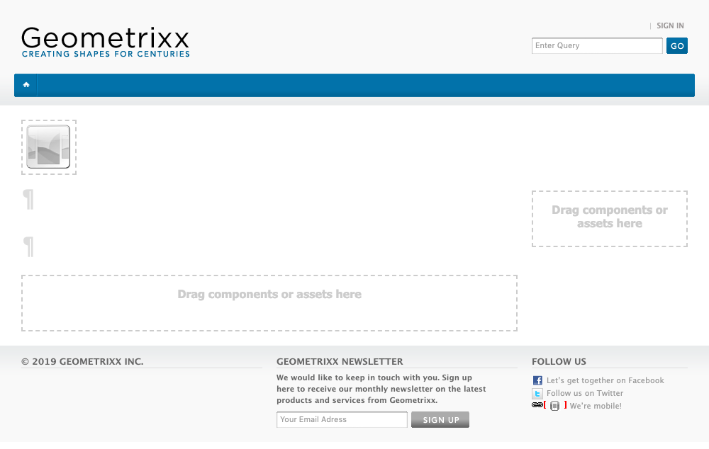
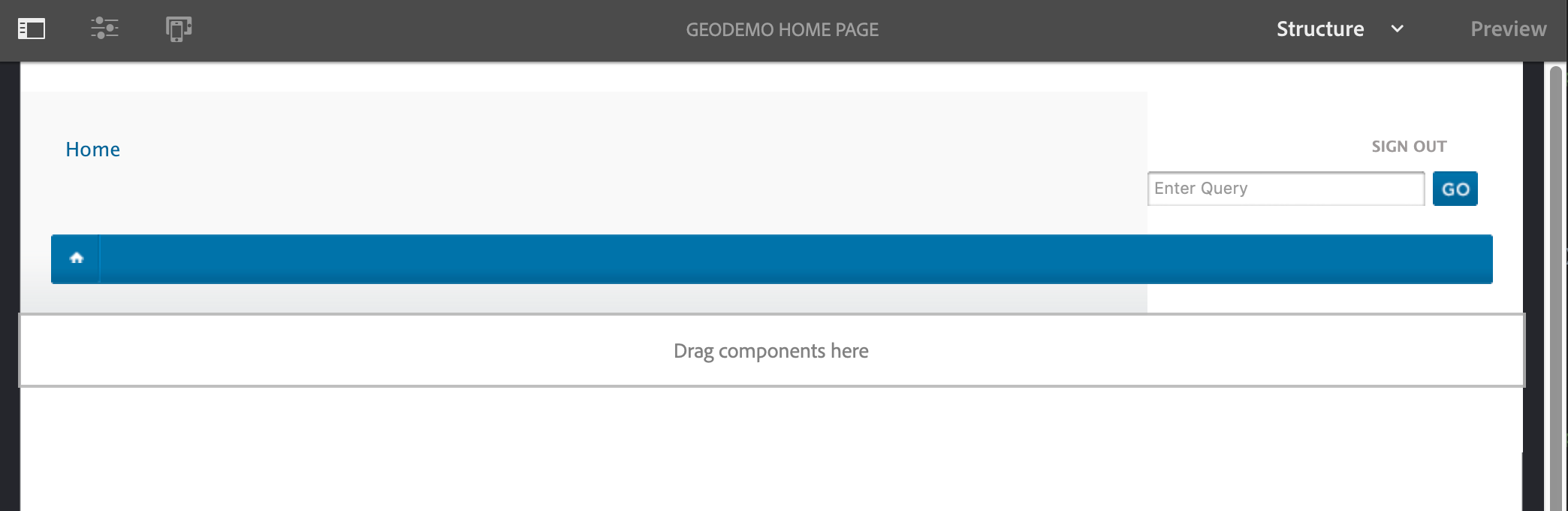
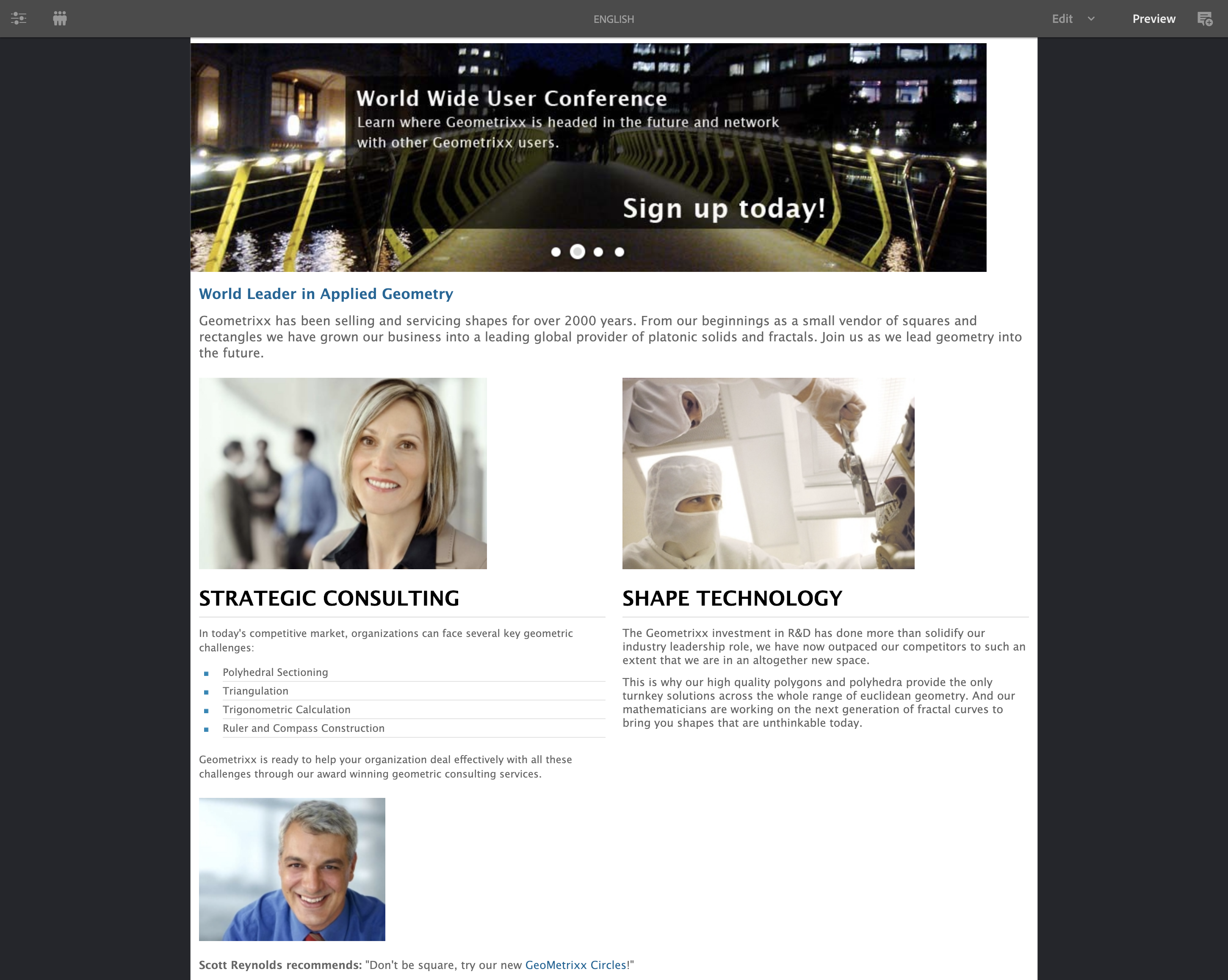
We've already reviewed the existing Geometrixx Home page and broken down the structure, identifying what is needed for the template. Let's look at a complete Home Page:
This is a home page filled out with all of the content. Sometimes it is easier to visualize the base components by looking at an empty page:
Empty Geometrixx Home Page
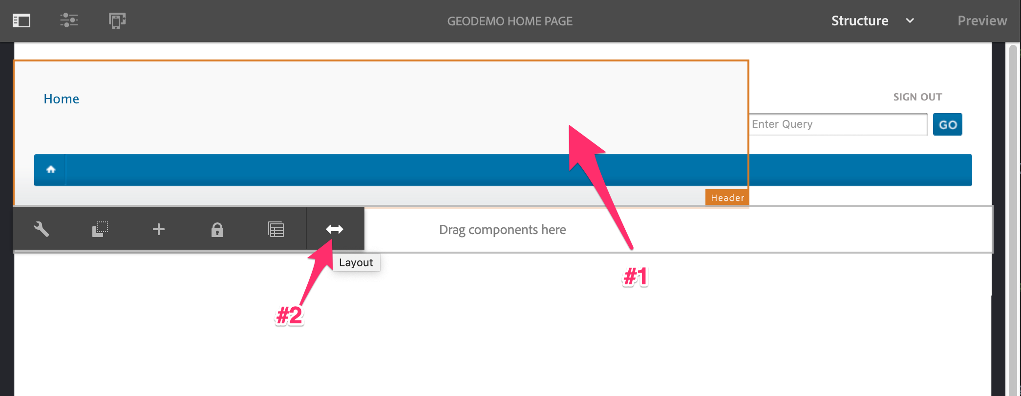
From here, you should now be able to see the break out of the components.

Annotated Template Structure
Here's an annotated view; the components listed here are identified using the new types - not the existing components currently employed by the template. Each of these components marked on this image are structure components. This means they are managed at the template and must be added to editable template, by the template author.

Annotated Template Structure
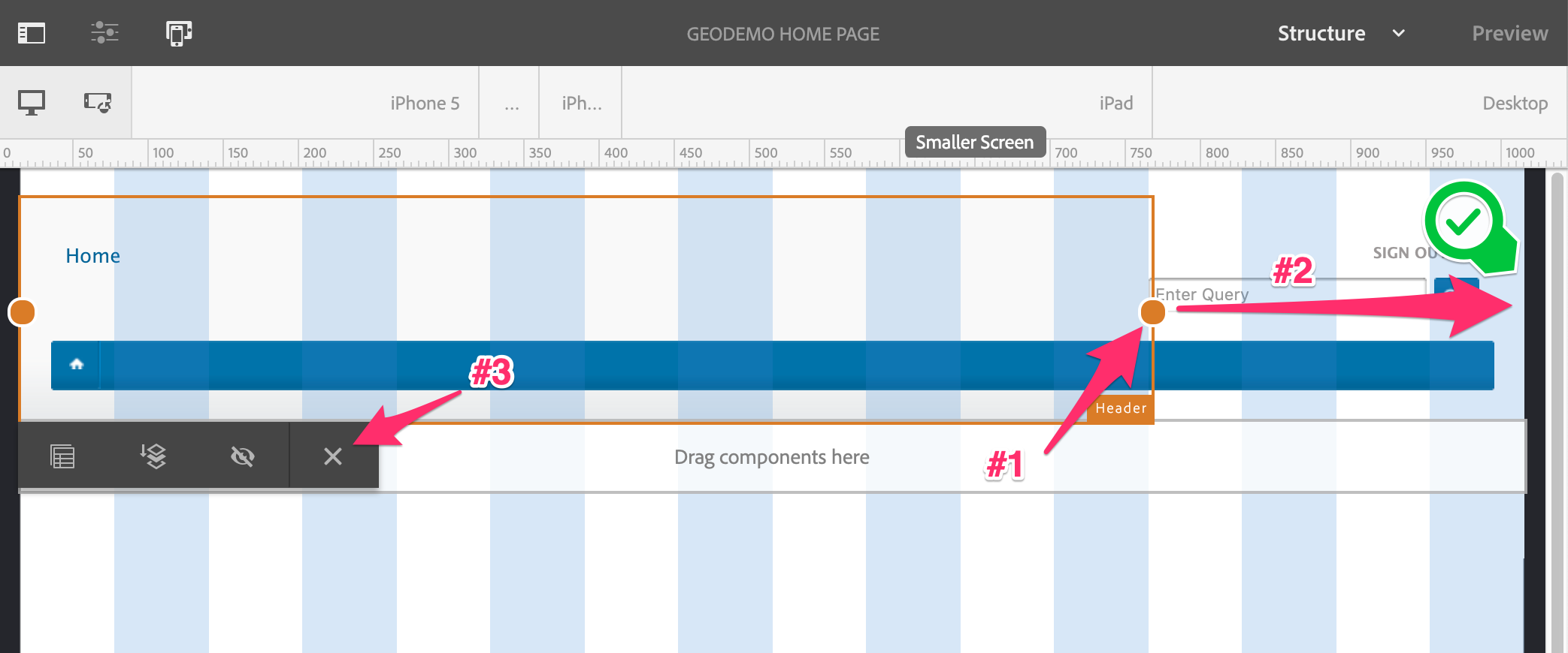
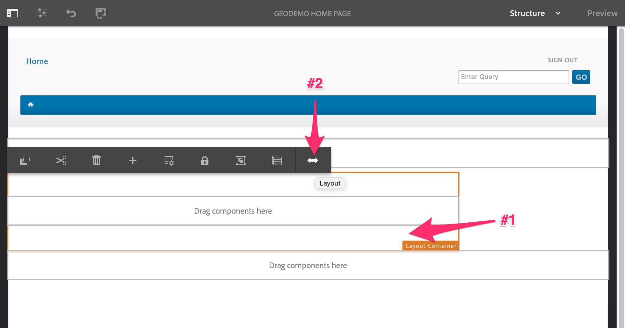
One additional point to clarify, within the layout container highlighted in blue, there are additional nested structure components:

Annotated Template Layout Container
In this exercise we will create an Editable Template which supports the same structure as the legacy Static Template.
Let's create what will be the new Home Page editable template. First log into AEM, use the default account:
Username: admin
Password: admin
Open the AEM Start Page Bookmark in Chrome.

AEM Login Page
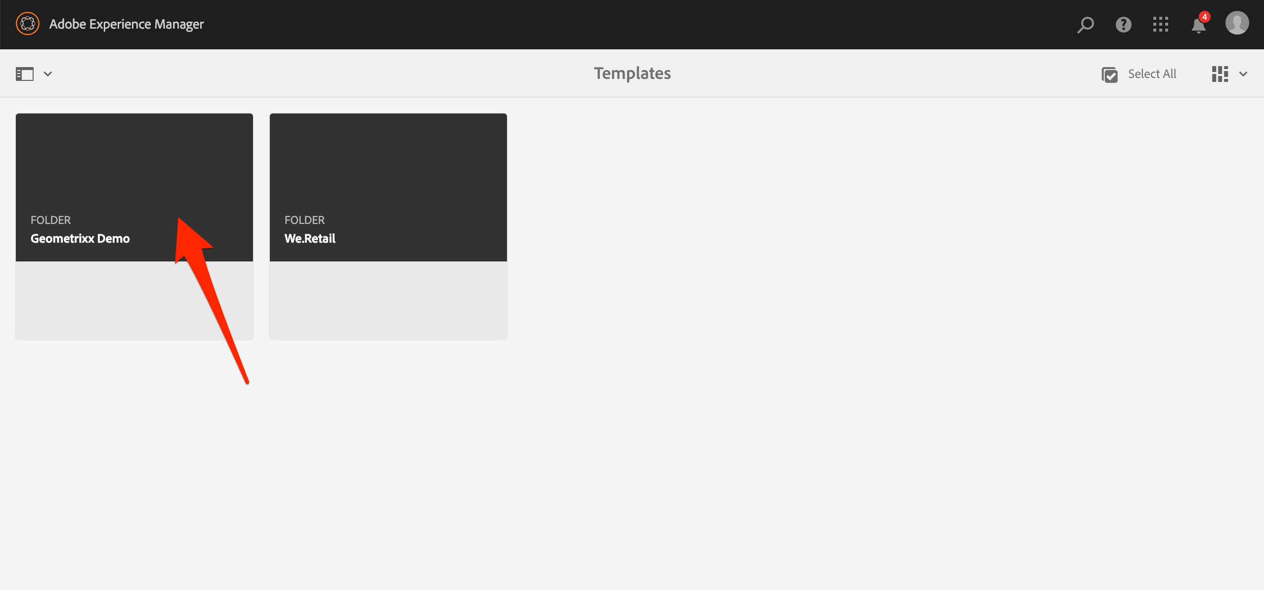
Navigate to the Templates folder.
Template Editor Wizard Selection
Open the Geometrixx Demo template folder.
Geometrixx Demo Template Folder
Start the Template Creation Wizard.
Create New Editable Template
Select the based template from which to derive the new Editable Template.
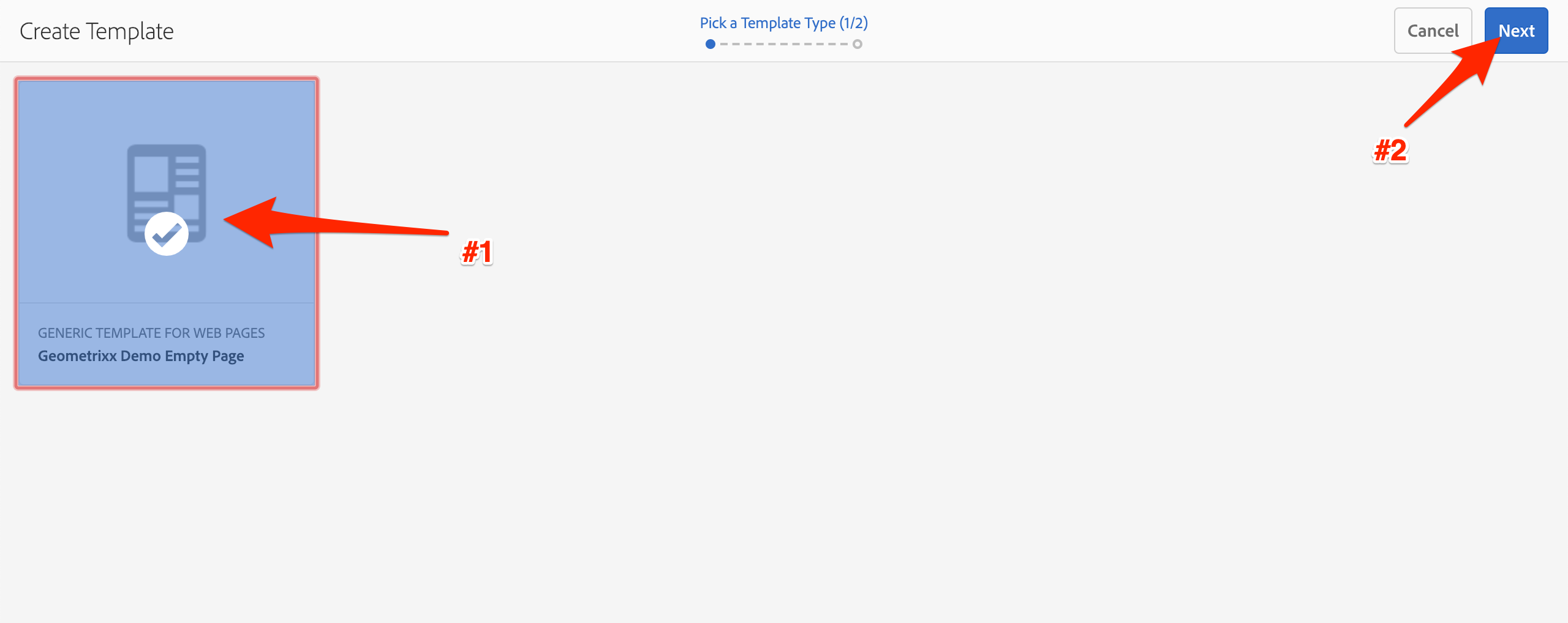
Starting Template Selection
Specify the new template's name. Note: Make sure to use the name GeoDemo Home Page; we use it in a configuration later.
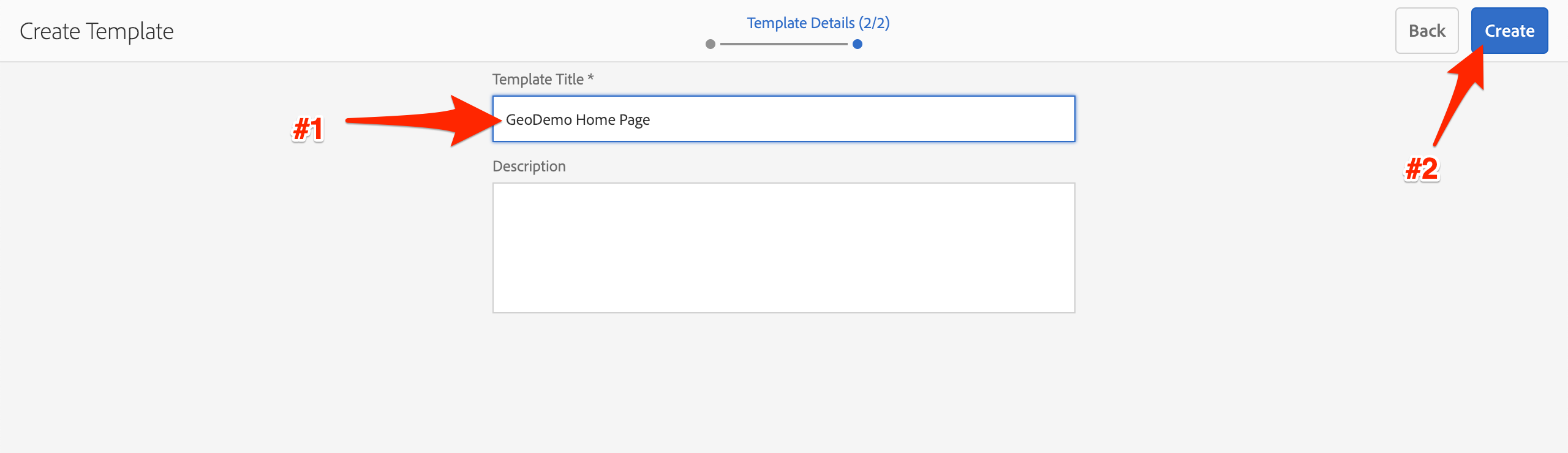
Editable Template Name
Open the newly created template.
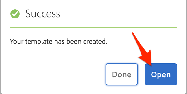
Successful Template Creation
We need to update the template's policy, so that the CSS rules are correctly applied. First step is to open the Page Policy dialog.
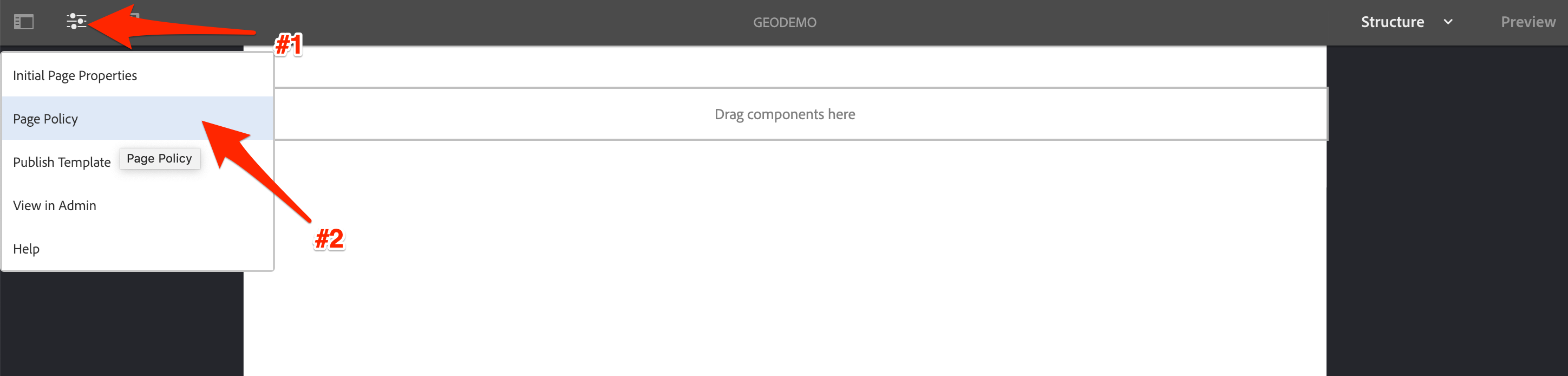
Template Policy Menu
Then we create a new policy, and add the homepage style definition.
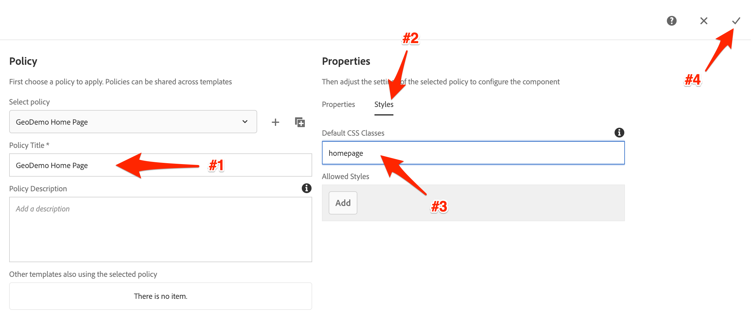
Edit Homepage Template Policy
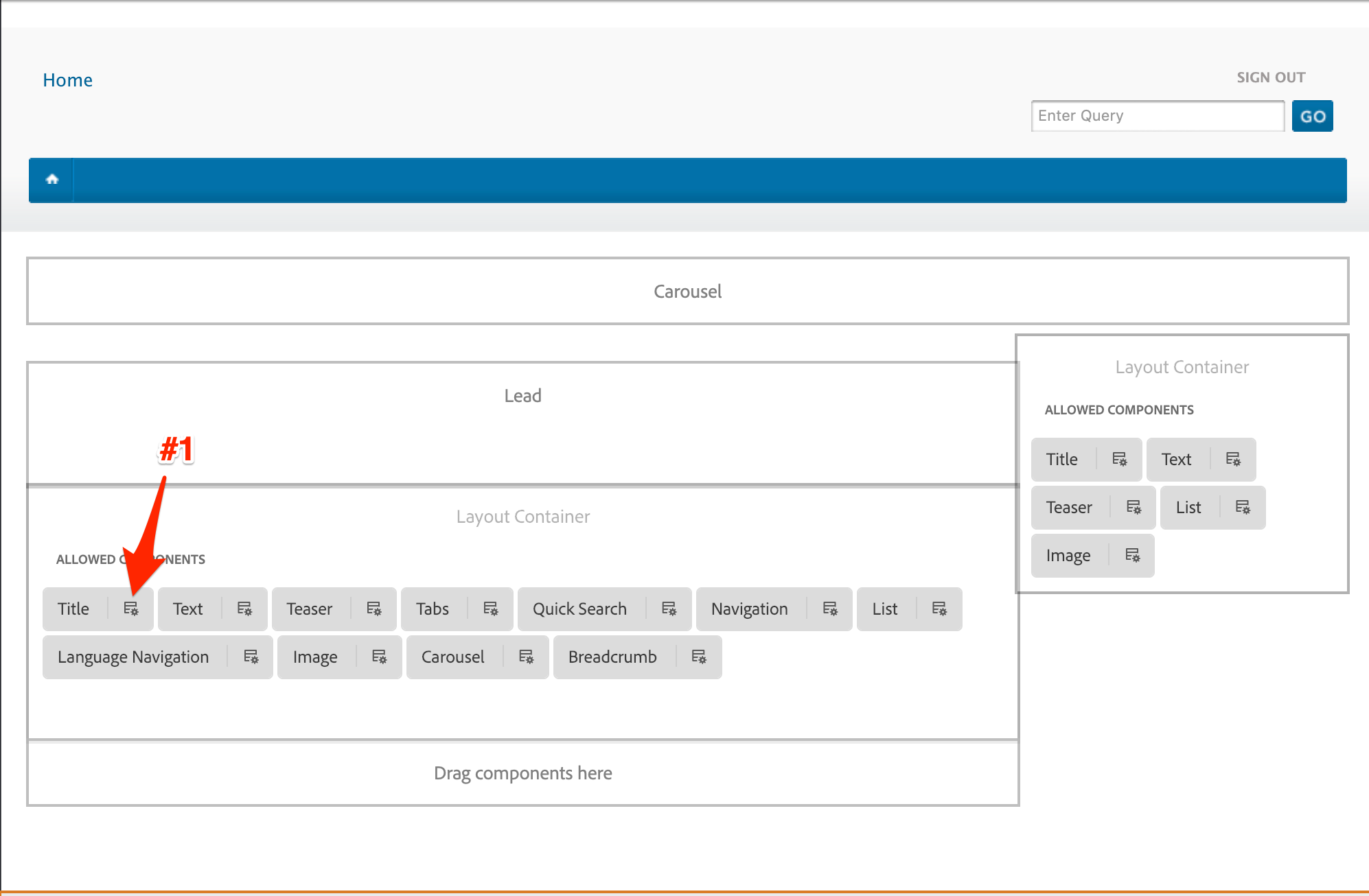
Now we need to configure the root layout container to set the default/locked components, and restrict components that can be used. For this exercise, make sure you only select the components you see here in the screenshots.
First, select the layout container and open it's policy dialog.
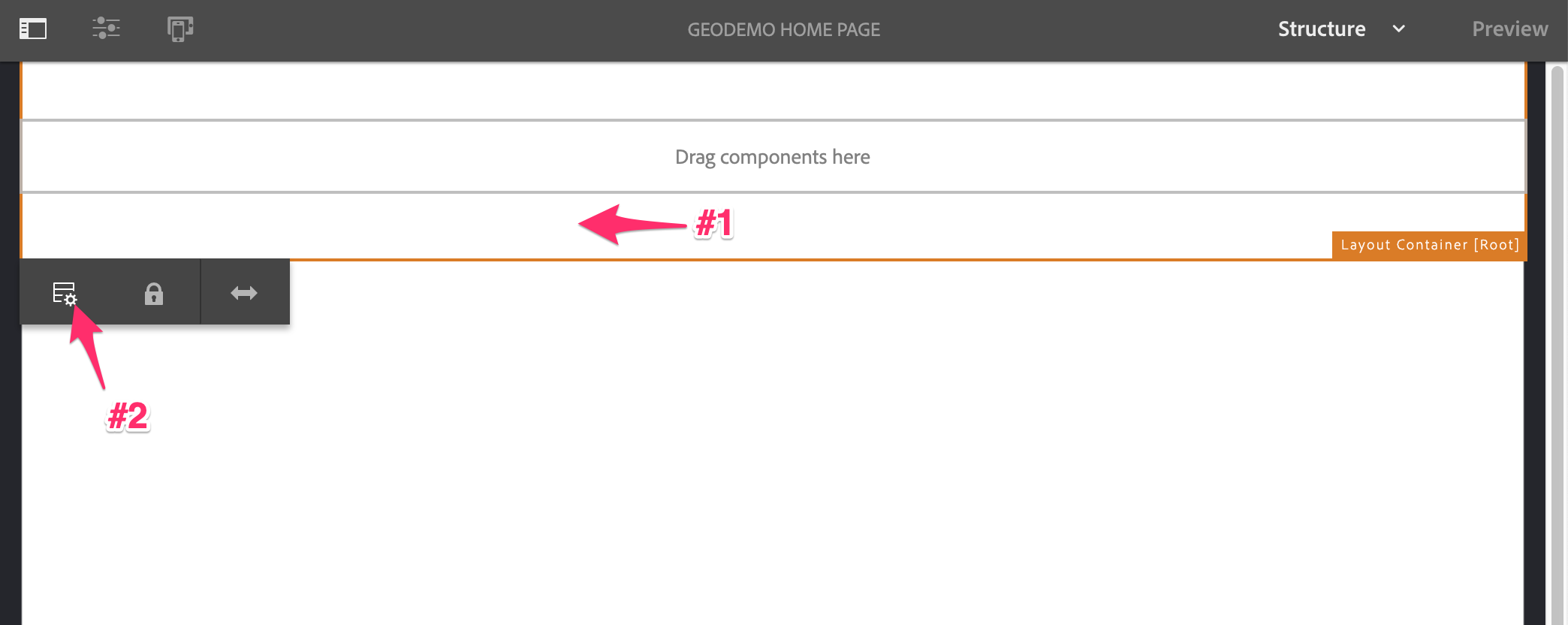
Select Layout Container Policy
Then create a new policy definition.
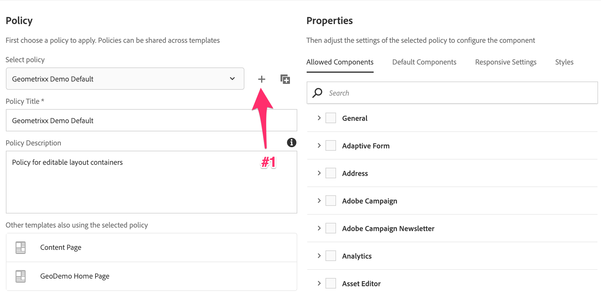
Create New Template Policy
Once we have a new definition, we'll give it a name and add a few components from the General group.
New Template Policy Properties
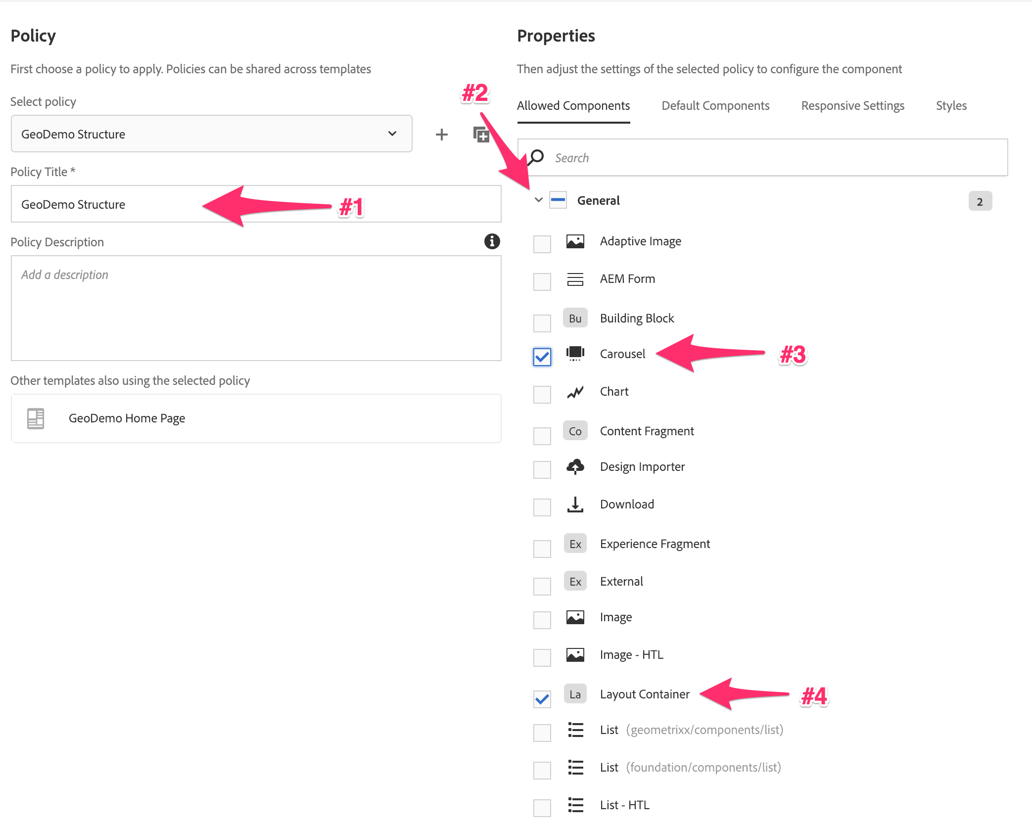
We also want to add a couple of the Geometrixx Demo components, as these will be structural components.
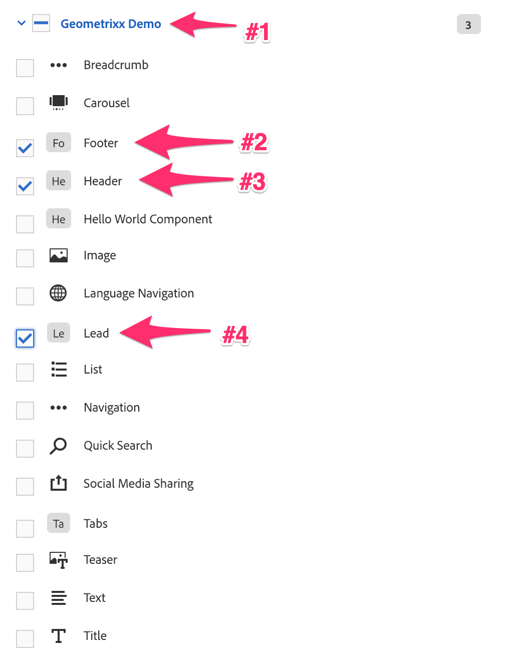
Template Policy Allowed Components
Finally, set the number of columns in the responsive grid, and save the policy.
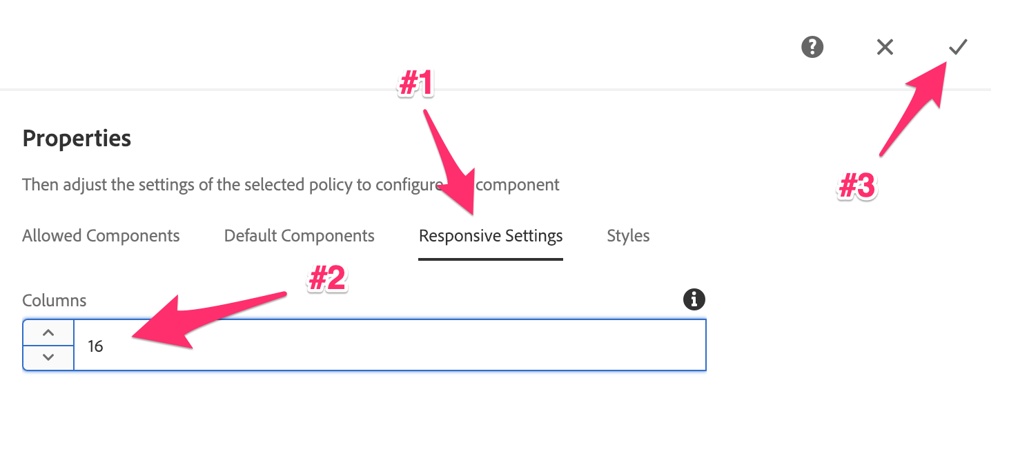
Template Policy Responsive Settings
Now that the policy is created, we can create the remaining structure for the template. This will lock specific components on the page, while enabling authors to use other components in the layout container. For this we need to be in the Structure mode. This is the default mode for the Template Editor. If you are not in structure mode, see the troubleshooting steps to switch modes.
In order to add components to the template, we need to open the side panel.
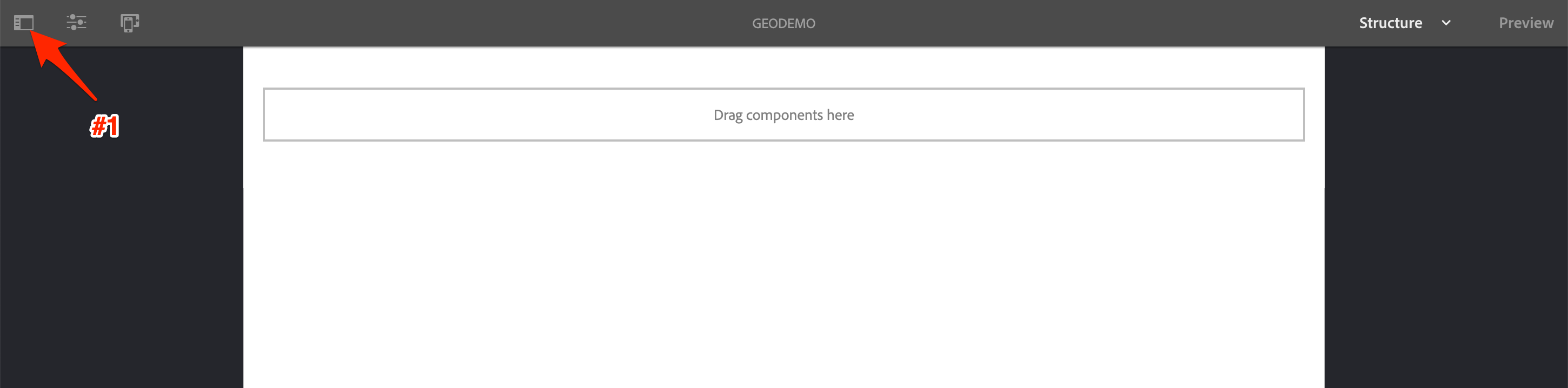
Open Side Panel
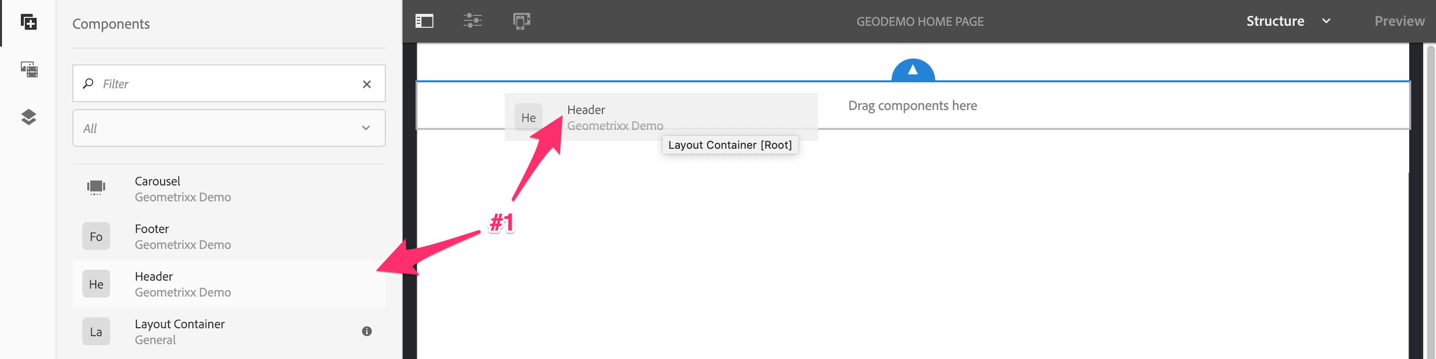
Now, drag the the Header component over, adding it to the root layout container. This component should only be editable by template authors.
Template Header Addtion
Once the header is placed it appears to take up the full 16 columns. However, this is not the case - something about the non-standard column count may create issues. Therefore, refresh the page and you should see it in the default 12 column layout. (Note: This is known bug and has been reported)
Template Header Refresh
Now that we can see the correct layout, we can fix it's width. Select the component and enter it's layout mode.
Template Header Layout Mode
While in layout mode, expand the header to take up the full 16 column width. Once done, exit the layout mode.
Template Header Resize
Next, we'll add the Carousel to the root layout container.
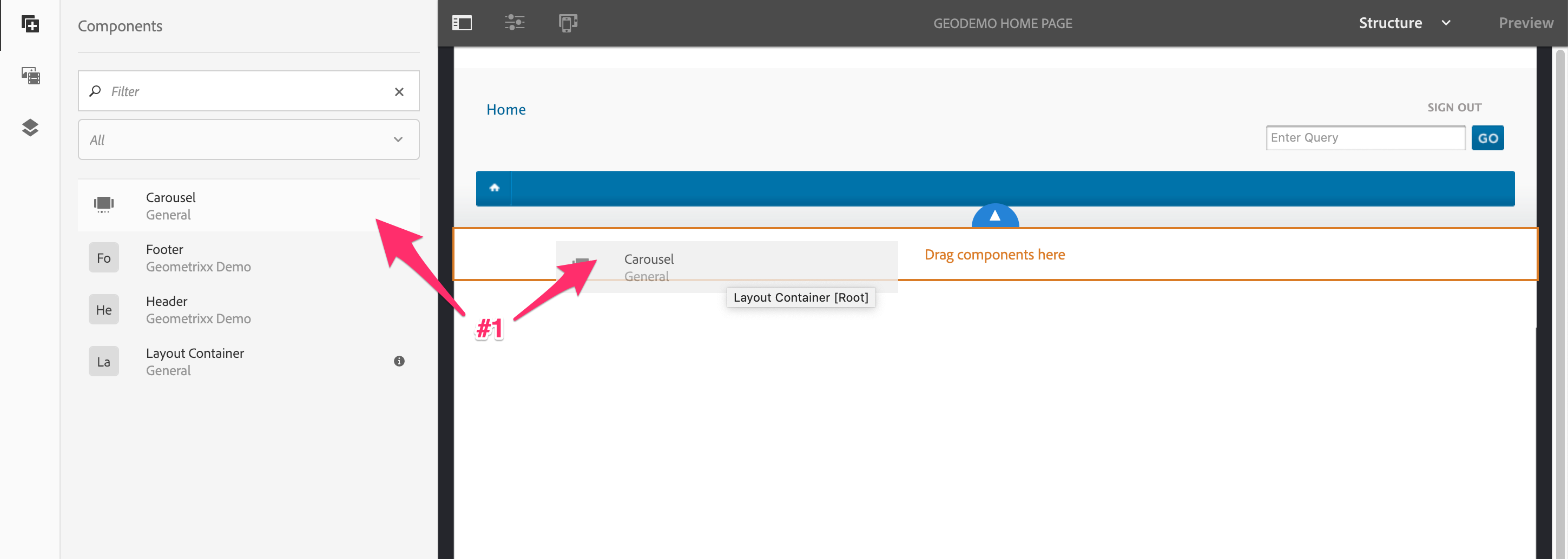
Template Carousel Addition
Like the header component, once the carousel is in the container it needs to be resized. So select the carousel and enter the layout mode again.
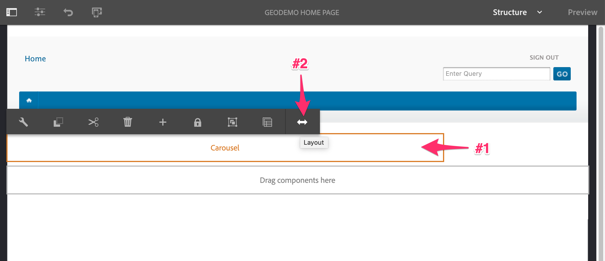
Template Carousel Layout Mode
Resize the carousel to take up the full 16 columns, exiting layout mode once complete.
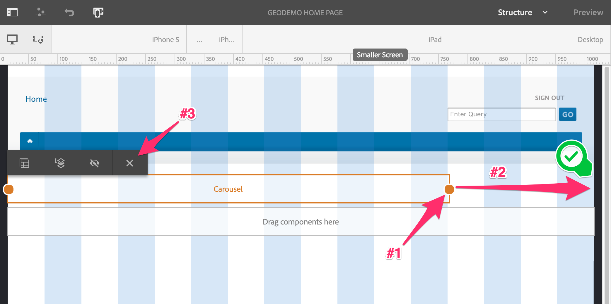
Template Carousel Resize
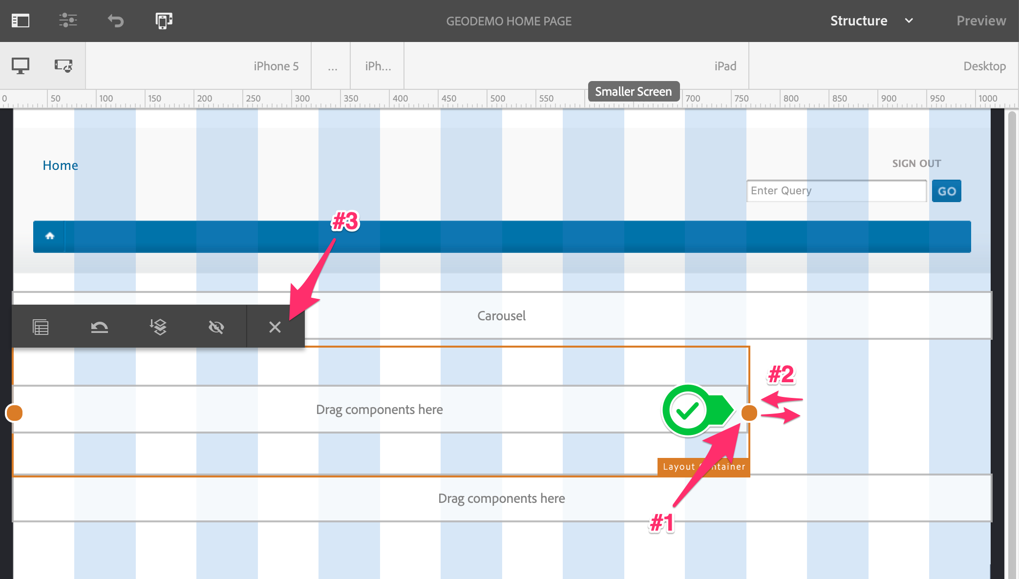
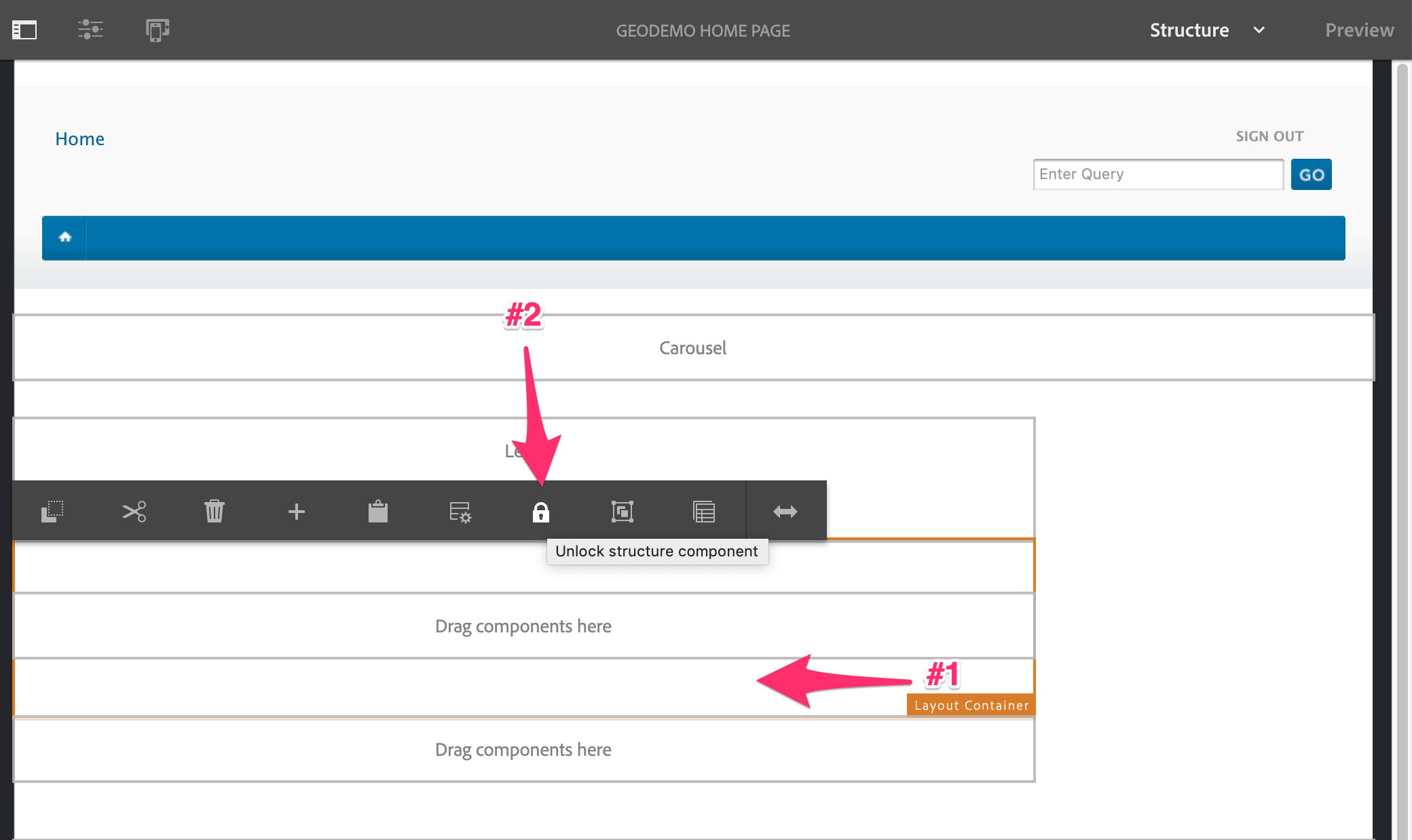
Finally, unlock the Carousel so each page created from this template can have custom content.
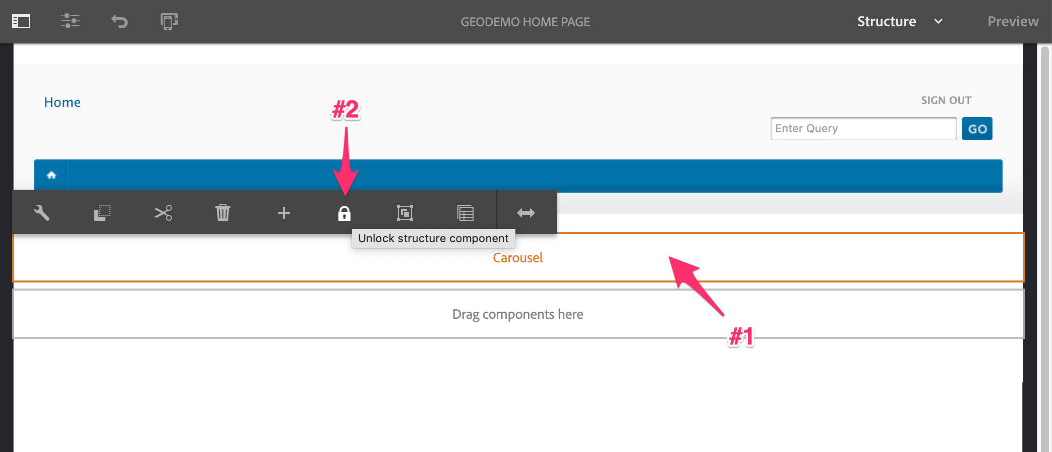
Template Carousel Unlocked
Next we'll add the Main Layout container, drag it over below the Carousel.
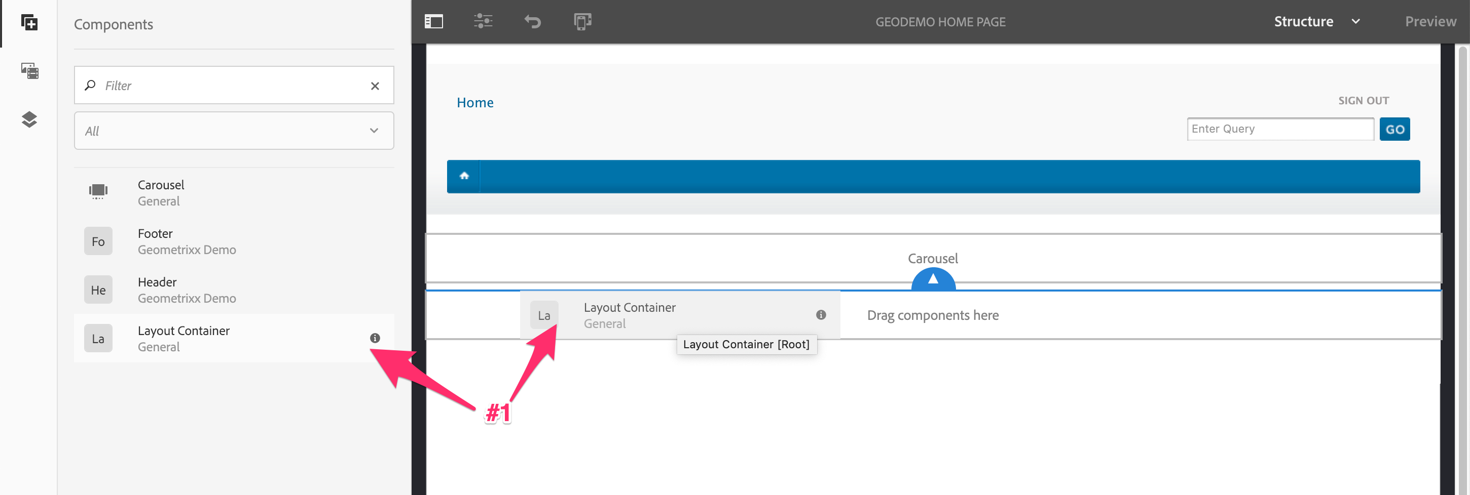
Template Main Layout Container Addition
This container will span 12 columns, which is the default column size in the responsive grid. It is still a good idea to force it to a specific size. So let's select the container and enter the layout mode.
Template Main Layout Container Layout Mode
To make the adjustment, we are just going to set the size to 12 columns, We don't want to adjust the width, but we do need to trigger the layout container set the width value. To do this, we move the right handle just enough to trigger the layout display, then release it locking it back into 12 columns. This will force the responsive size of the text container to be set.
Template Main Layout Container Resize
Next, we'll add the main layout container's content. This is will be a the fixed Lead component and a Layout Container, which will allow authors to add arbitrary content.
Drag the Lead Component over to the main layout container.
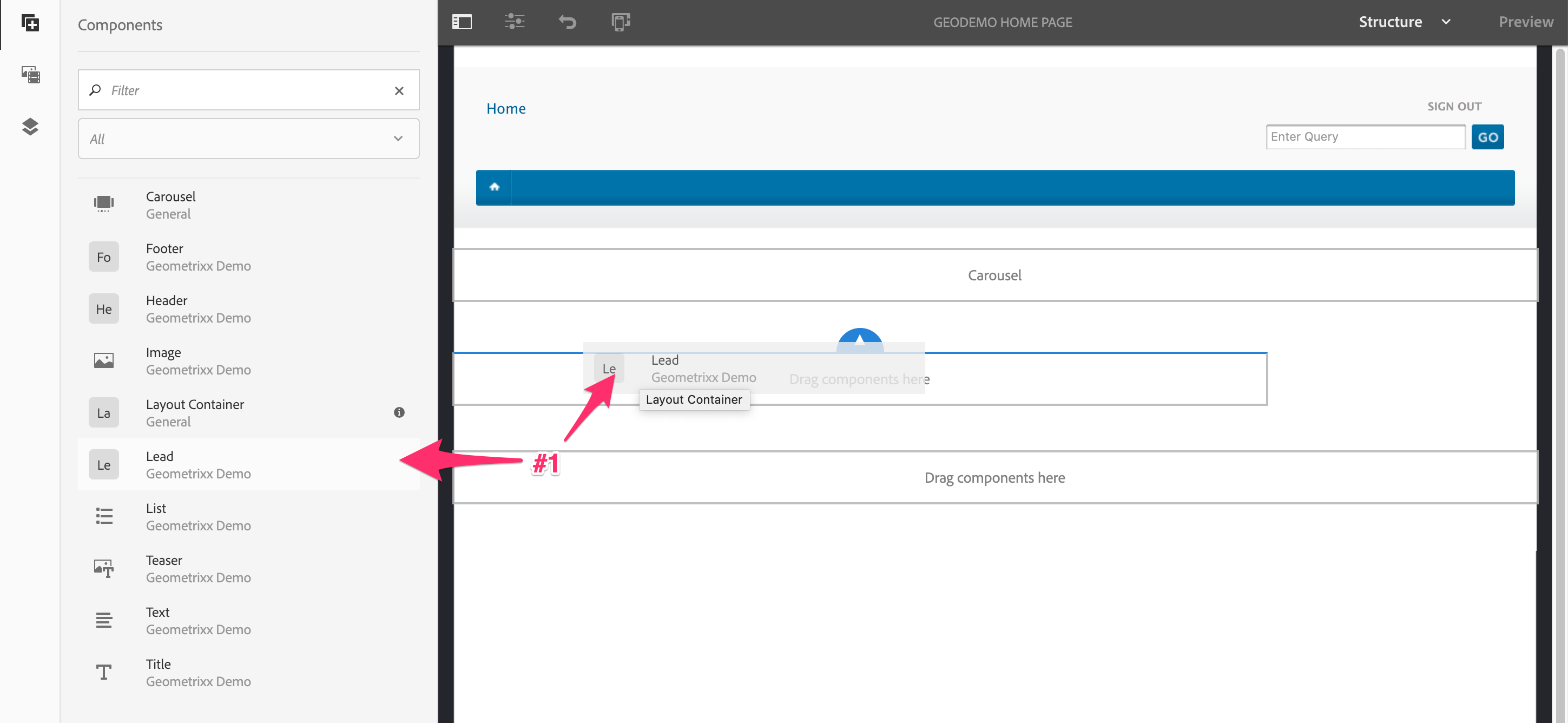
Template Main Layout Lead Addition
This will have custom content per page, so let's unlock it.
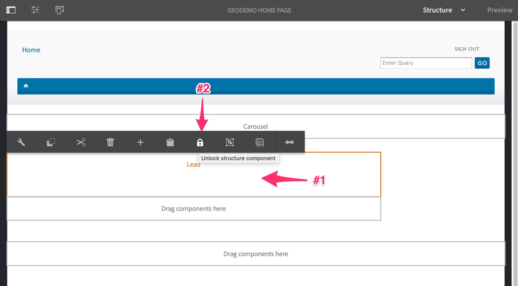
Template Main Layout Lead Unlocked
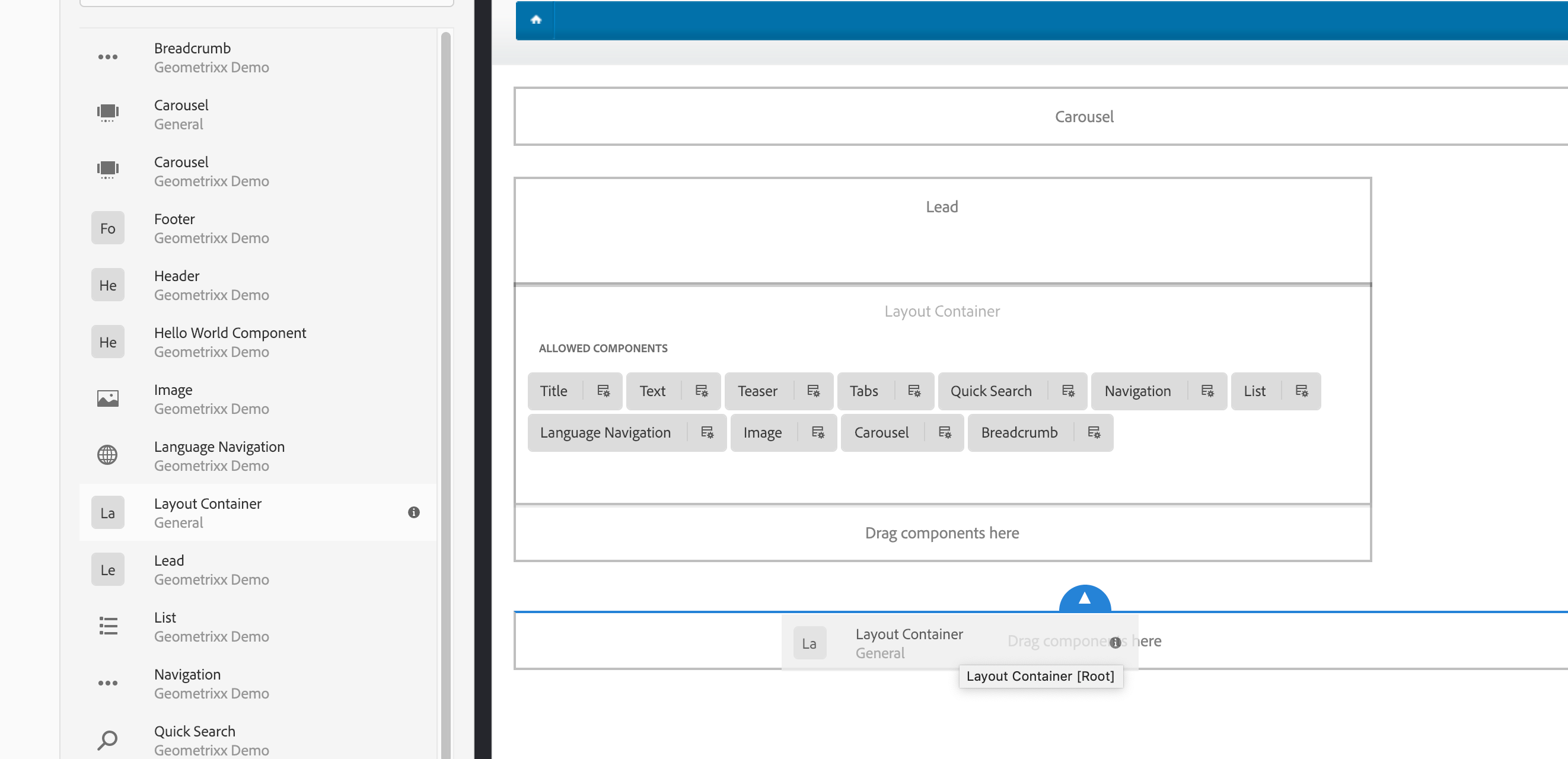
Now we can add the layout container that will allow authors add content and components.
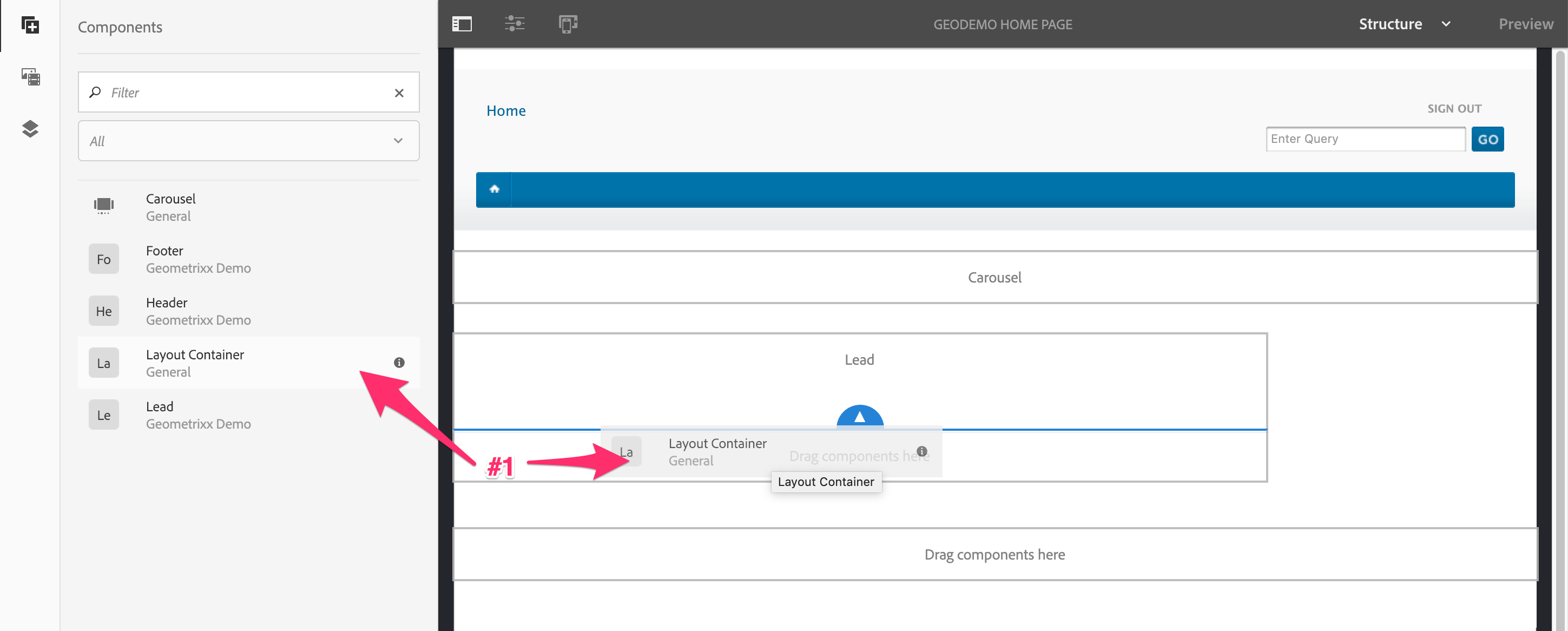
Template Main Layout Container Sub-Container Addition
We want to allow authors to add only specific components, and more than this template currently allows. So we'll add a custom policy to this container - open the container's policy.
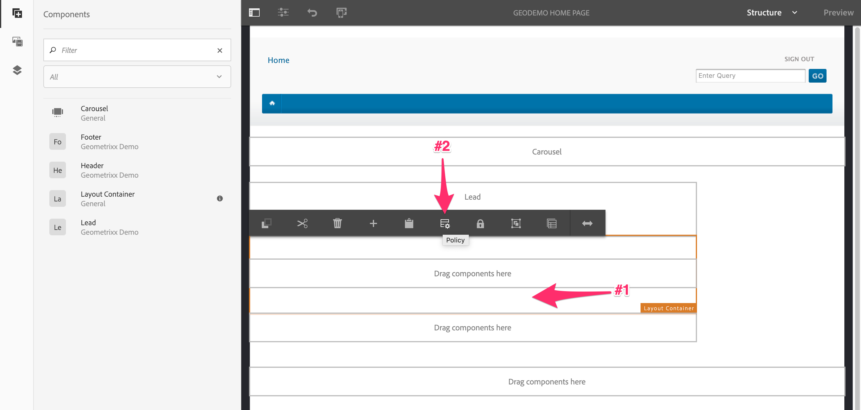
Template Main Layout Container Sub-Container Policy
Give the policy a descriptive name.
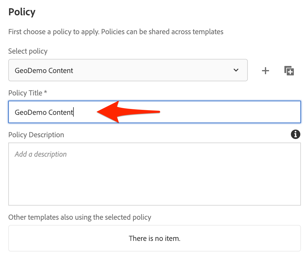
Template Main Layout Sub-Container New Policy
Add all the entire GeoDemo component group, and then save the policy.
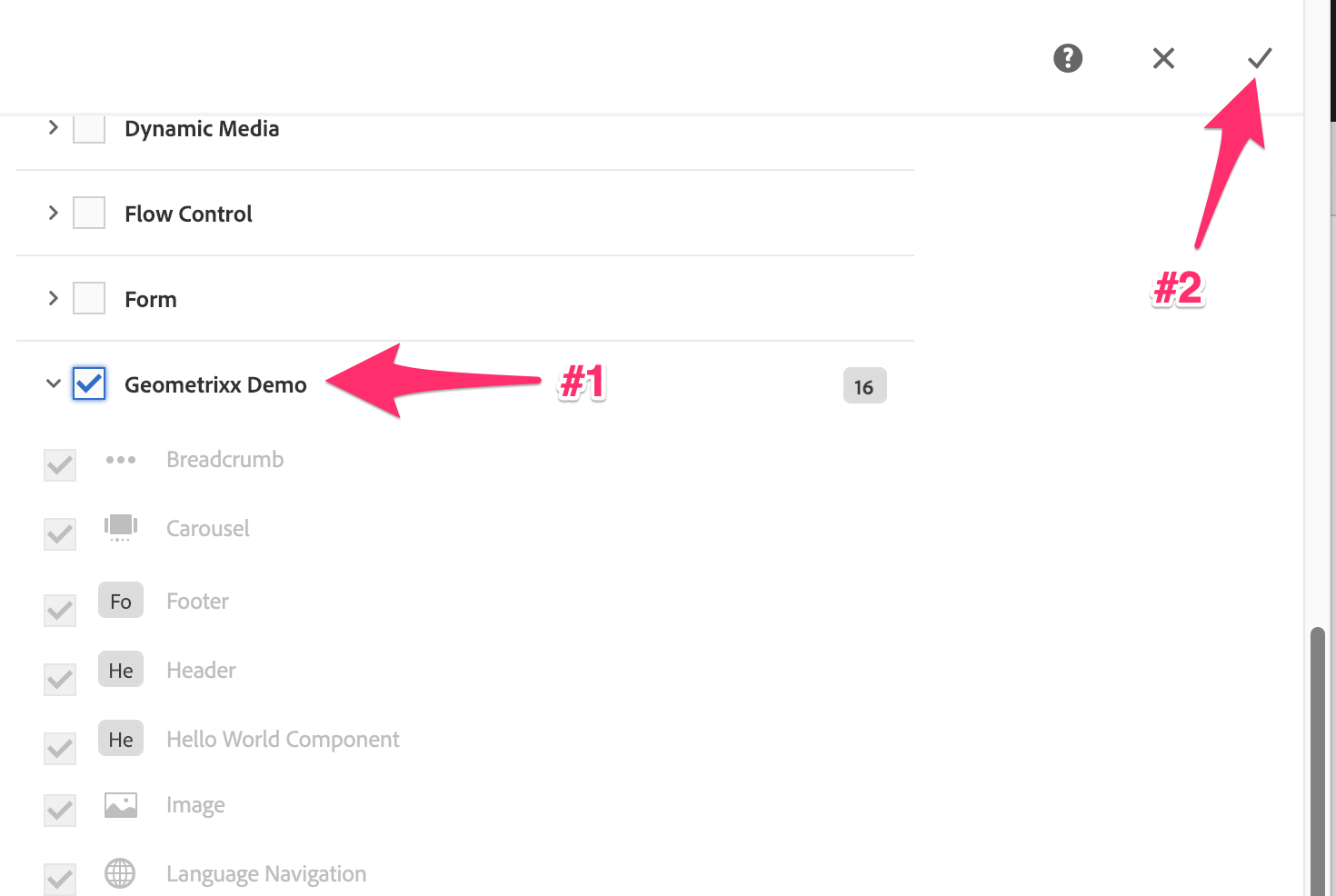
Template Main Layout Sub-Container Policy Components
Finally, we want authors to be able to add the allowed components and add content to them, so unlock the container.
Template Main Layout Sub-Container Unlocked
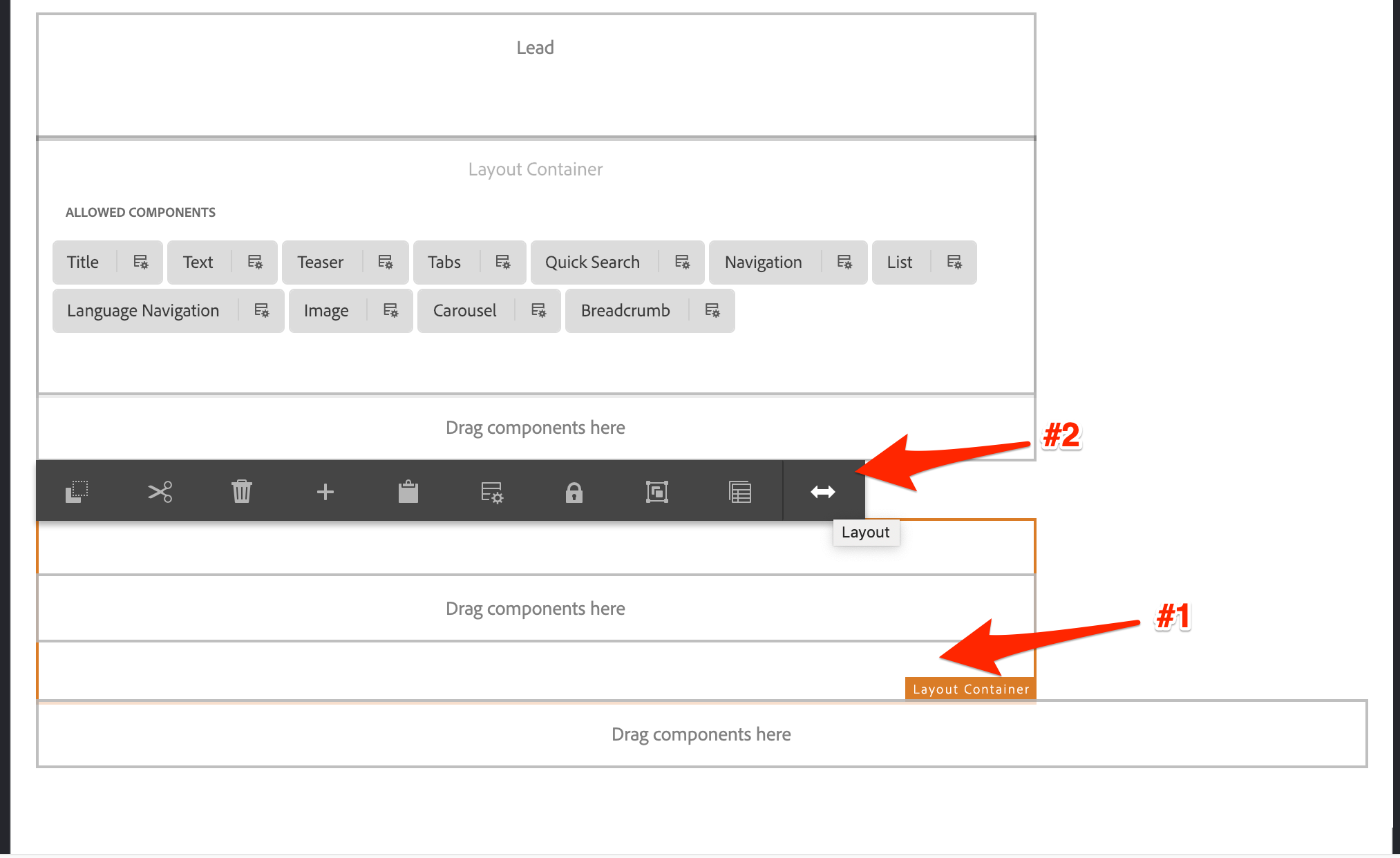
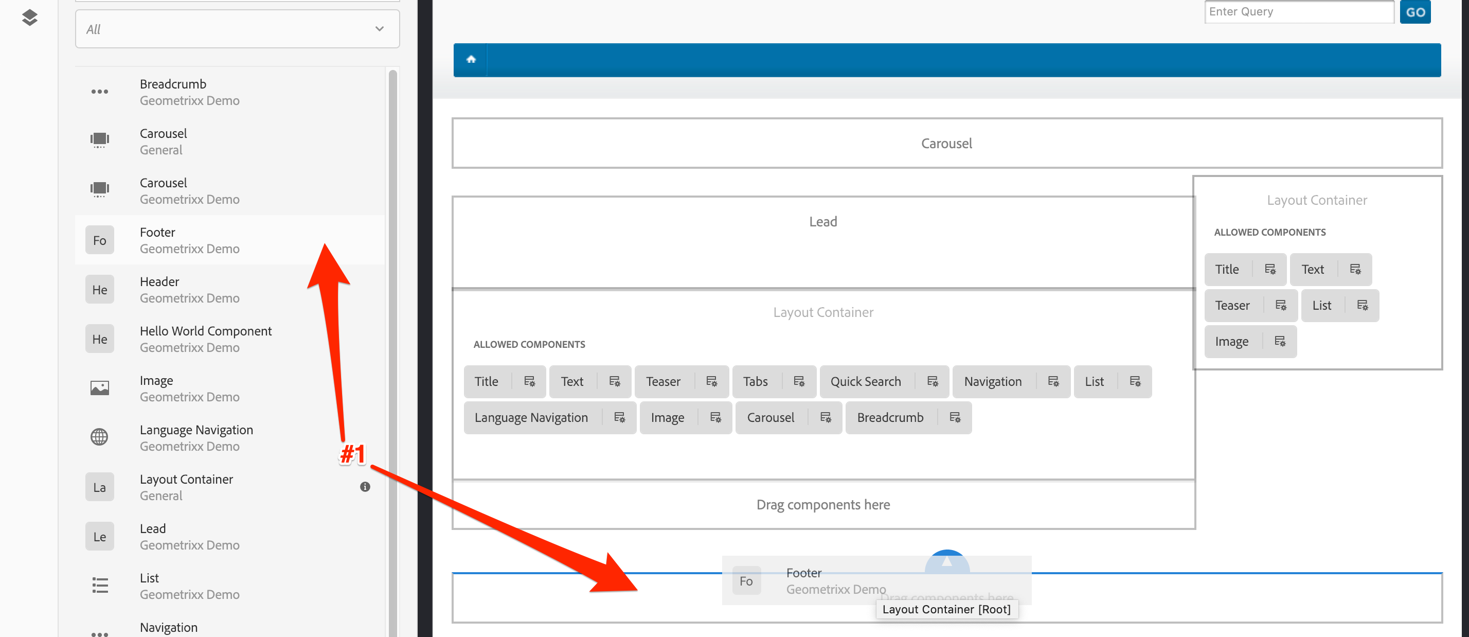
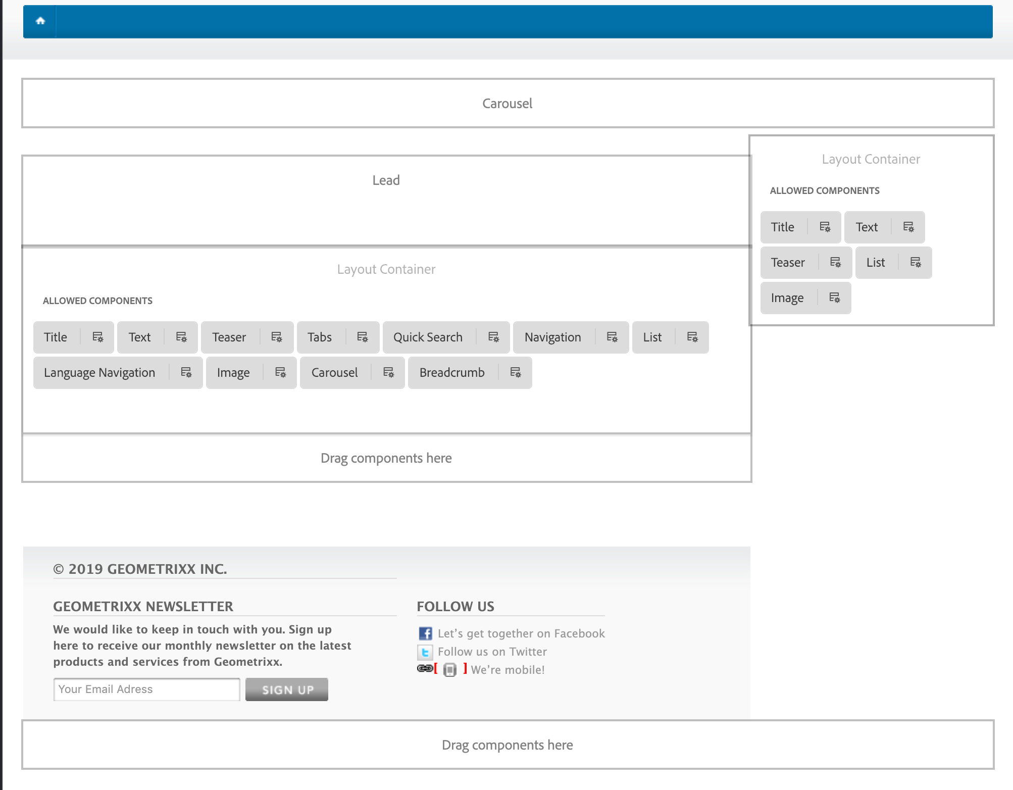
Next, we'll add the Right Rail Layout container, and configure its policy of allowed components.
First, drag over the layout container - make sure to place it in the root layout container, this is the 16 column wide instance.
Template Right Rail Layout Container Addition
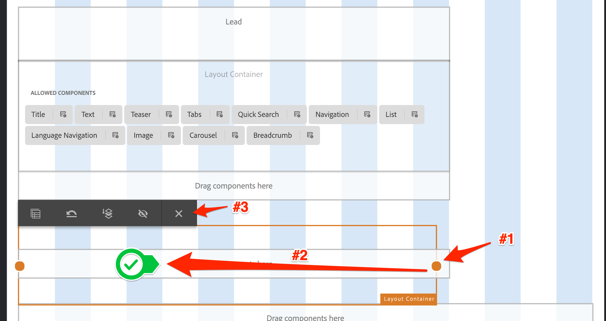
To resize it, we need to enter layout mode for it.
Template Right Rail Layout Container Layout Mode
Resize it to be four columns wide, this will make it automatically float to sit next to the other container.
Template Right Rail Layout Container Resize
Like the main container, we want to allow authors to add a restricted set of components to this container. So open its policy editor.
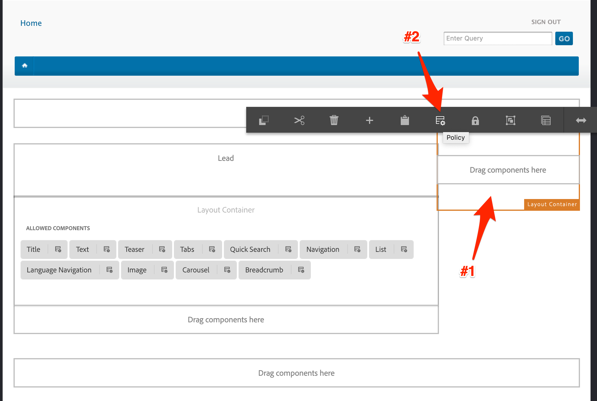
Template Right Rail Layout Container Policy Edit
Give the new policy a name.
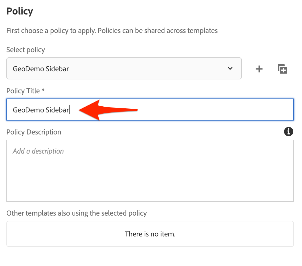
Template Right Rail Layout Container New Policy
Add the allowed components for this container and save the policy.
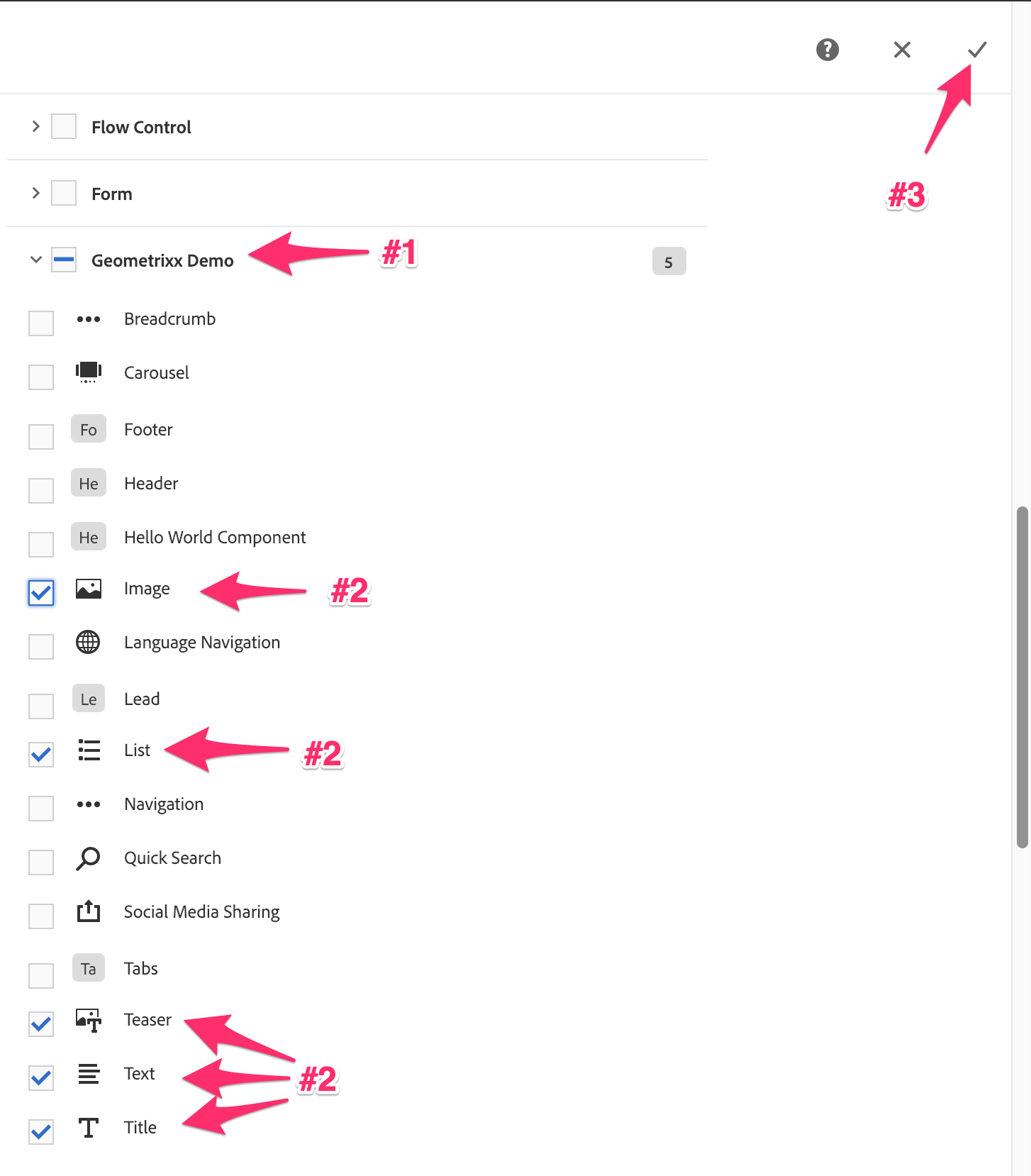
Template Right Rail Layout Container Policy Components
And finally, unlock the container to allow authors to add content.
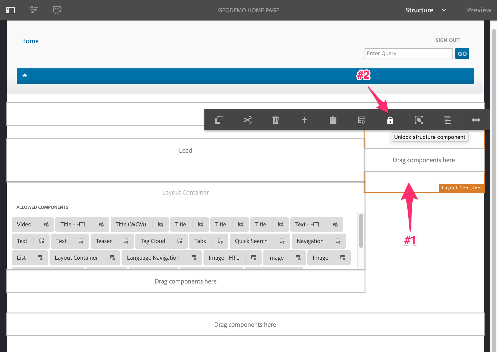
Template Right Rail Layout Container Unlocked
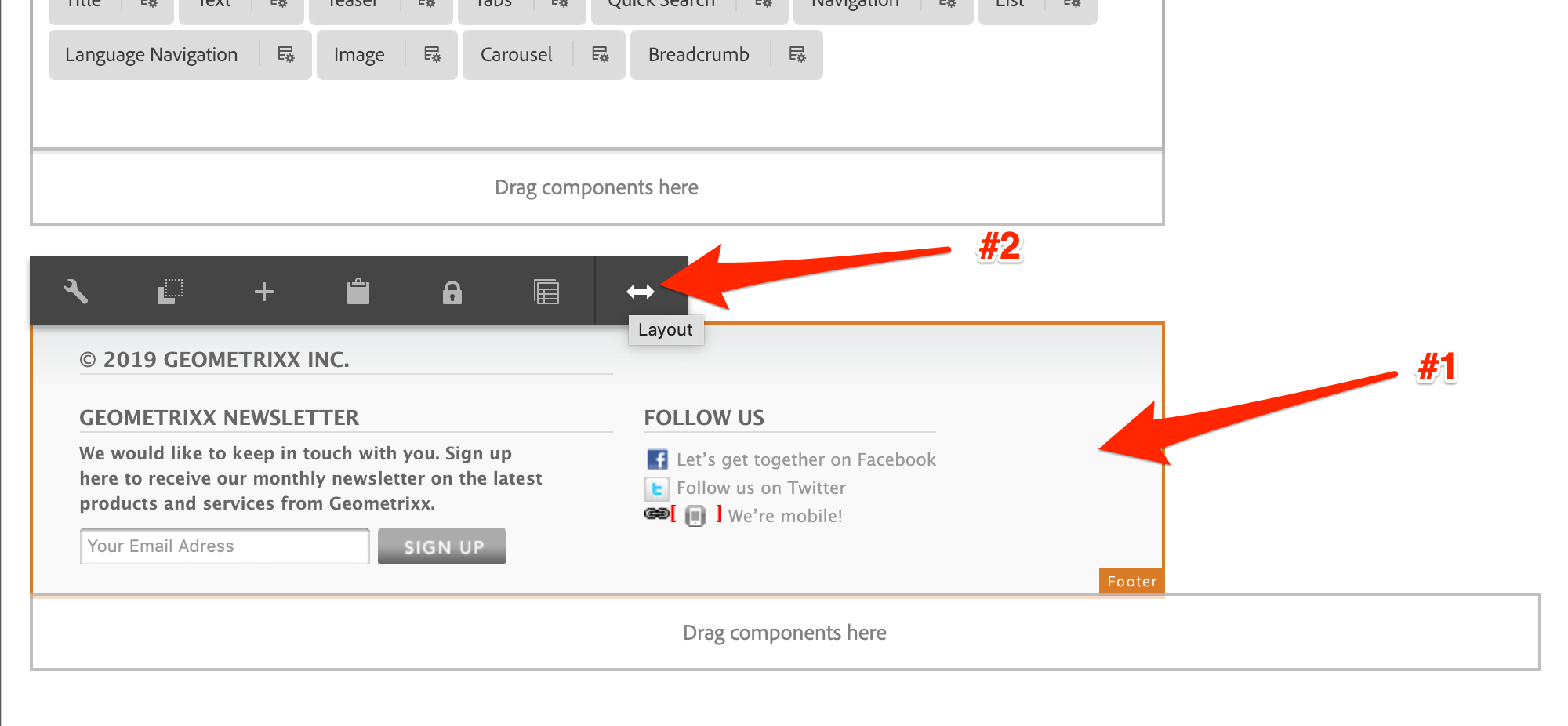
The final step is to add the Footer to the root layout container. This component should only be editable by template authors.
Drag the Footer component to the root layout container.
Template Footer Addtion
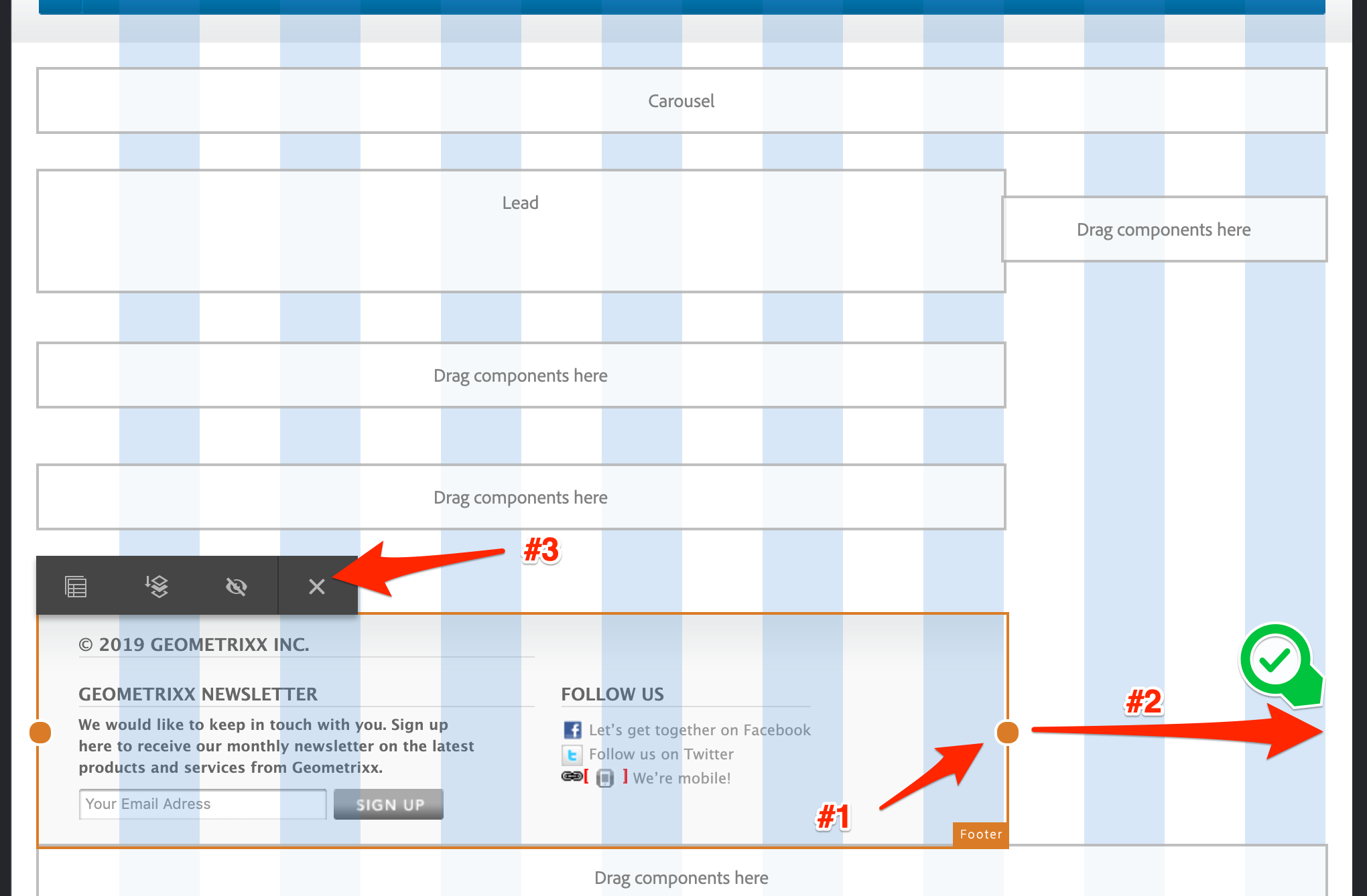
Like the Header, once the footer is placed it appears to take up the full 16 columns. However, this is not the case - something about the non-standard column count may create issues. Therefore, refresh the page and you should see it in the default 12 column layout.
Template Footer Refresh
Now that we can see the correct layout, we can fix it's width. Select the component and enter it's layout mode.
Template Footer Layout Mode
While in layout mode, expand the header to take up the full 16 column width. Once done, exit the layout mode.
Template Footer Resize
Now that we have a working template, we can convert the Geometrixx home page. To do this, we'll use the Page Template/Structure Conversion Tool. This is a tool created specifically to convert from a legacy static template to an editable template, and works in three steps:
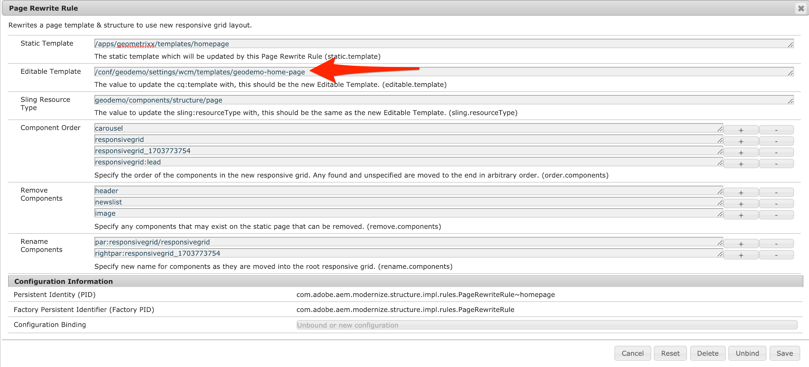
The Page & Column control rewrite rules are configurable. For this lab we have provided the default ones necessary to convert Geometrixx column control. However, we do need to customize the configuration for the Page Rewrite Rule. Let's do that now:
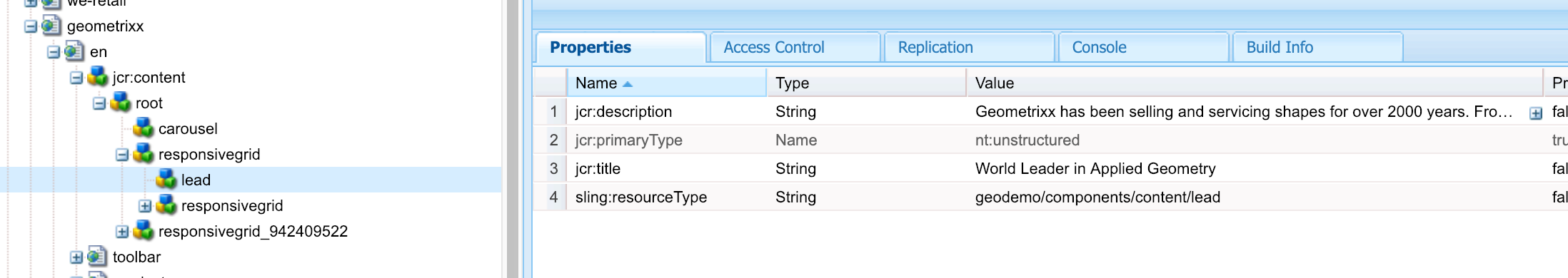
Open CRX/DE and list the component names on the new Editable template.
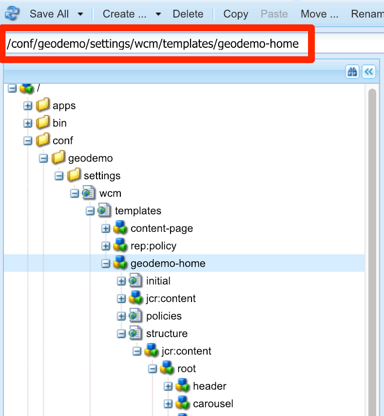
Navigate from the tree root to:
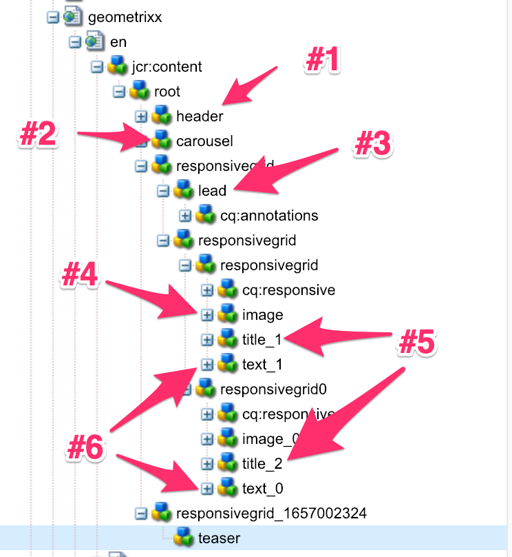
Click on the root node to expand it and display the node names on the Editable Template. In this example the responsivegrid node represents the main parsys. The responsivegrid_942409522 node represents the rightrail parsys. *Note: the node responsivegrid_942409522 is unique to this example, you will have a different value in your AEM instance
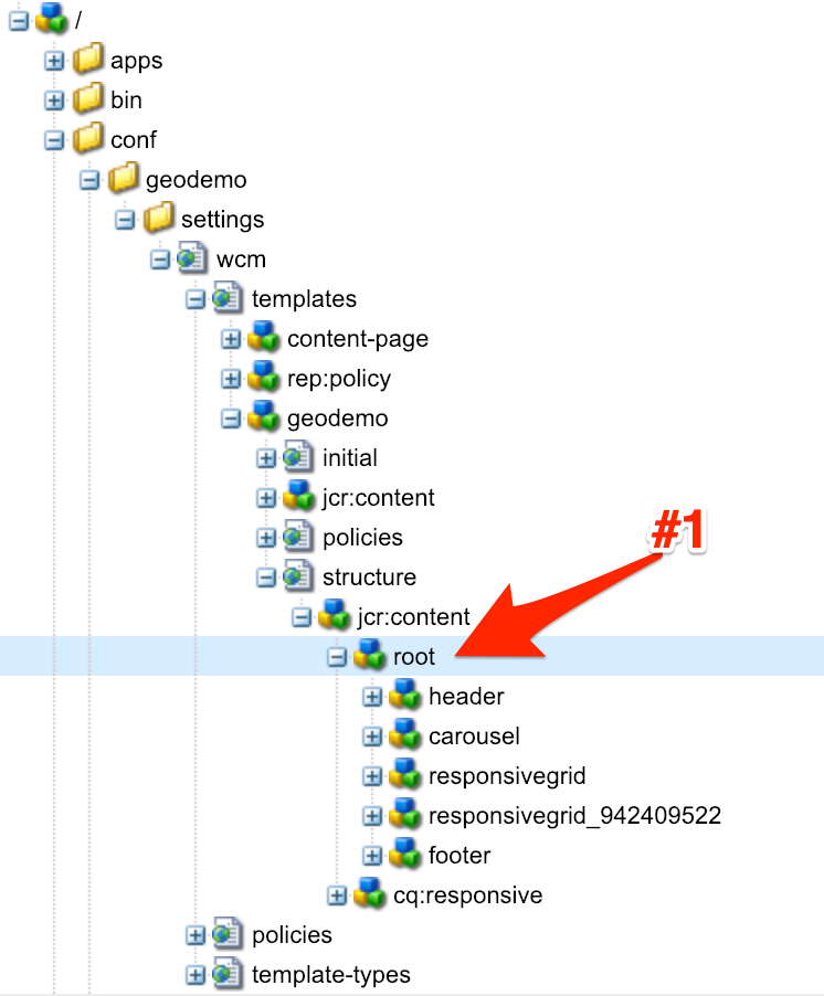
Template Node Structure
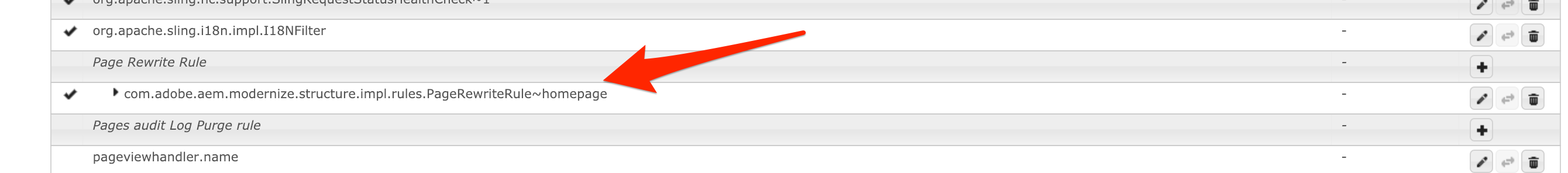
To configure the Rewrite Rule we need to update the OSGi Configuration, to do this, open the Web Console:
Search for the Page Rewrite Rule Configuration. Click on the configuration entry labeled com.adobe.aem.modernize.structure.impl.rules.PageRewriteRule~homepage, and open the form.
AEM Web Console Configurations
This is the pre-edited configuration form, we are going to update the <<responsive_grid_name>> references highlighted here:
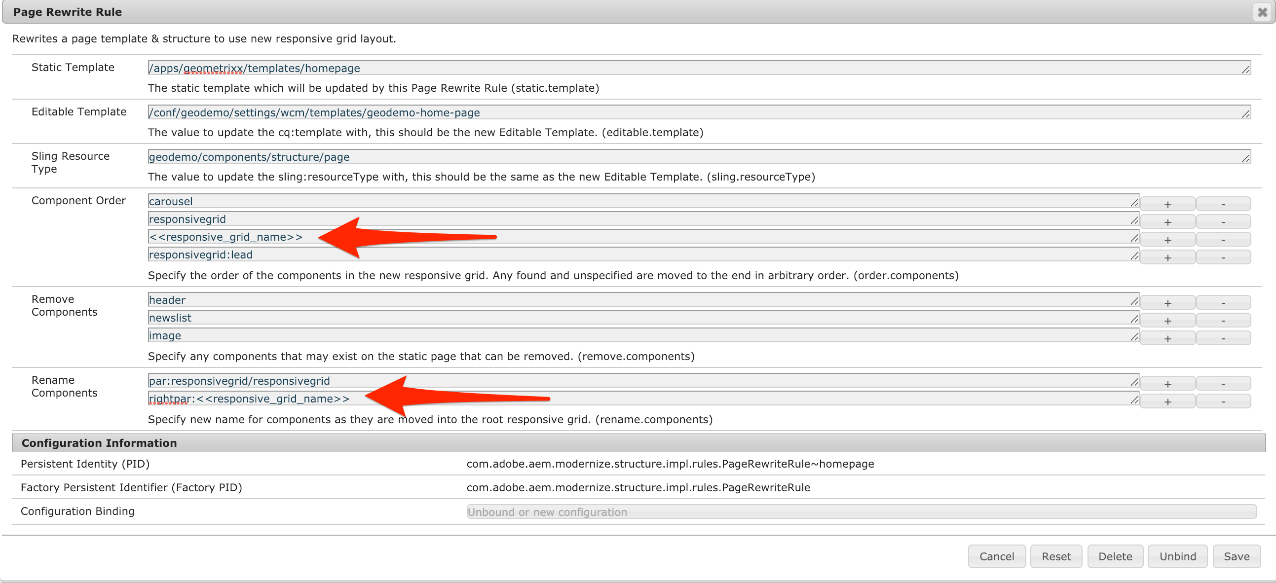
Page Rewrite Configuration - Pre Edit
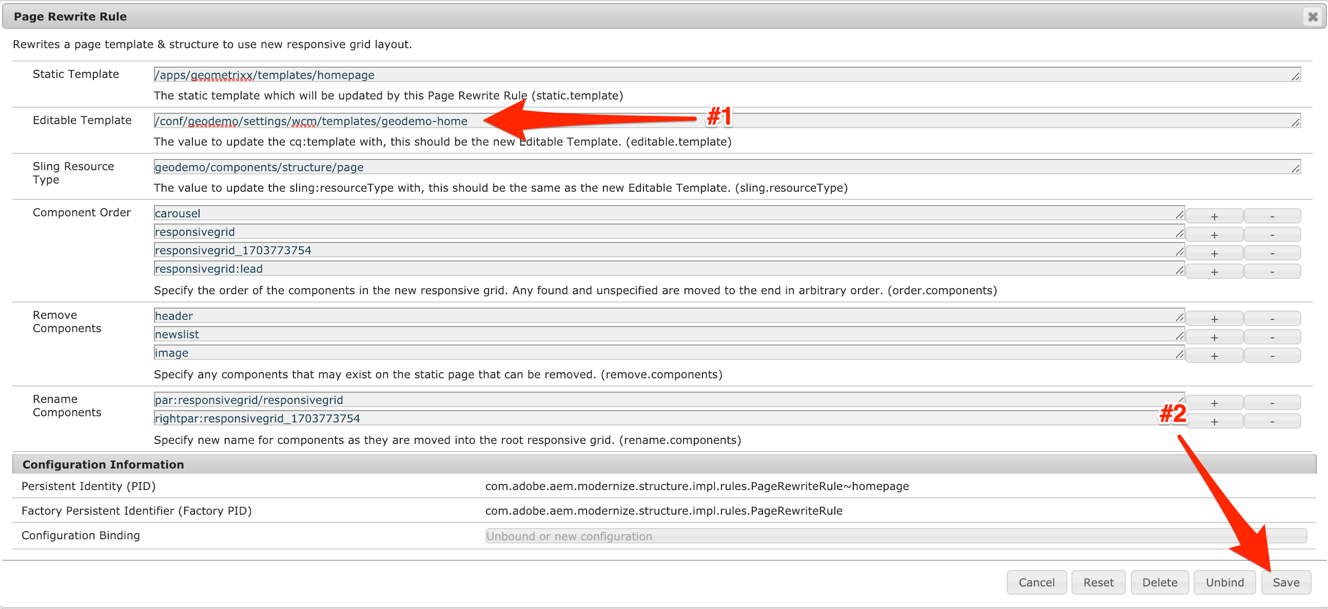
Replace <<responsive_grid_name>>, with the name of the rightrail parsys shown in your AEM instance. This is an example complete form, the numbers will be different for your updates. Once the updates are done, save the form.
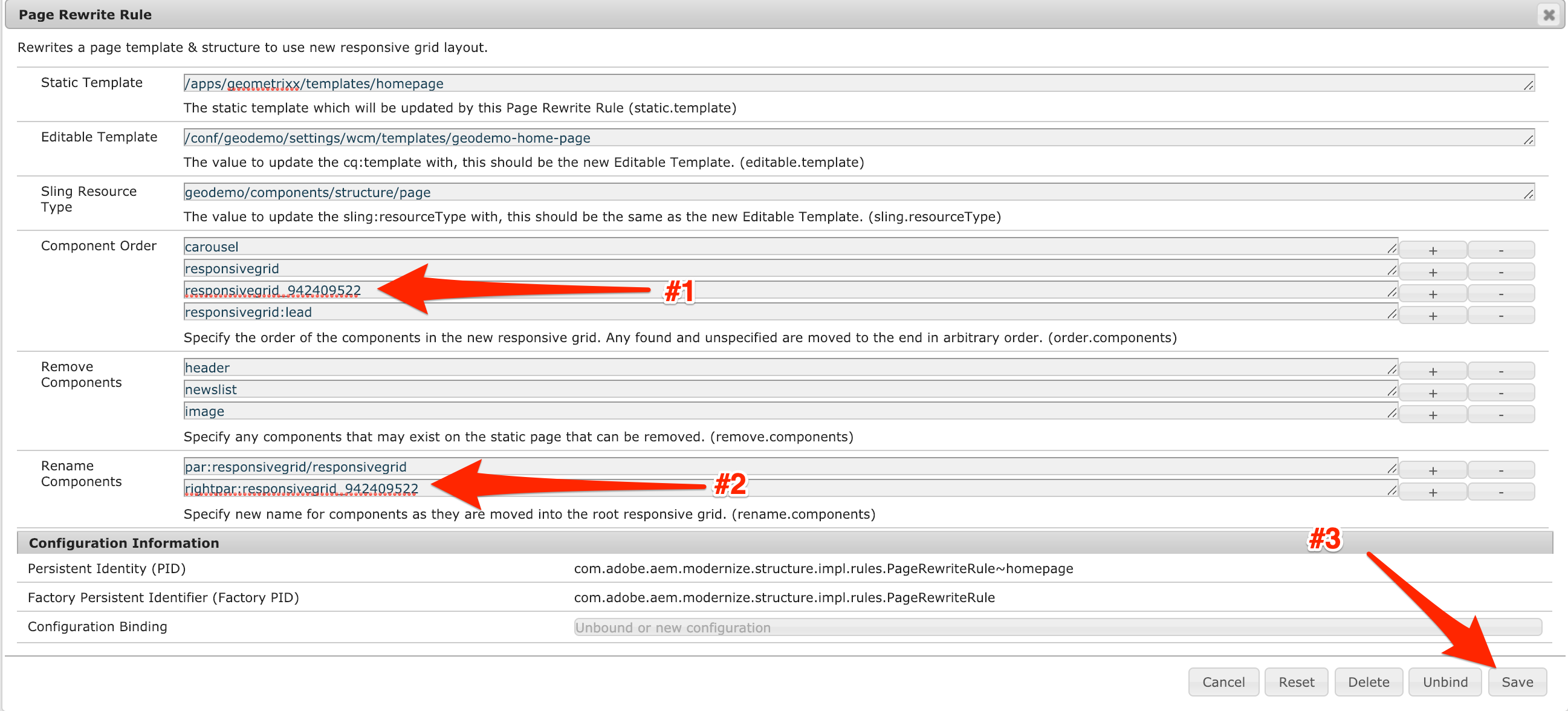
Page Rewrite Configuration - Post Edit
This will actually convert the page to use the new Editable Template. The only pages that are listed, are those which match configured PageRewriteRule Service definitions. At this time, this is just the Geometrixx Home Page template.
Navigate to the Page Conversion Tool
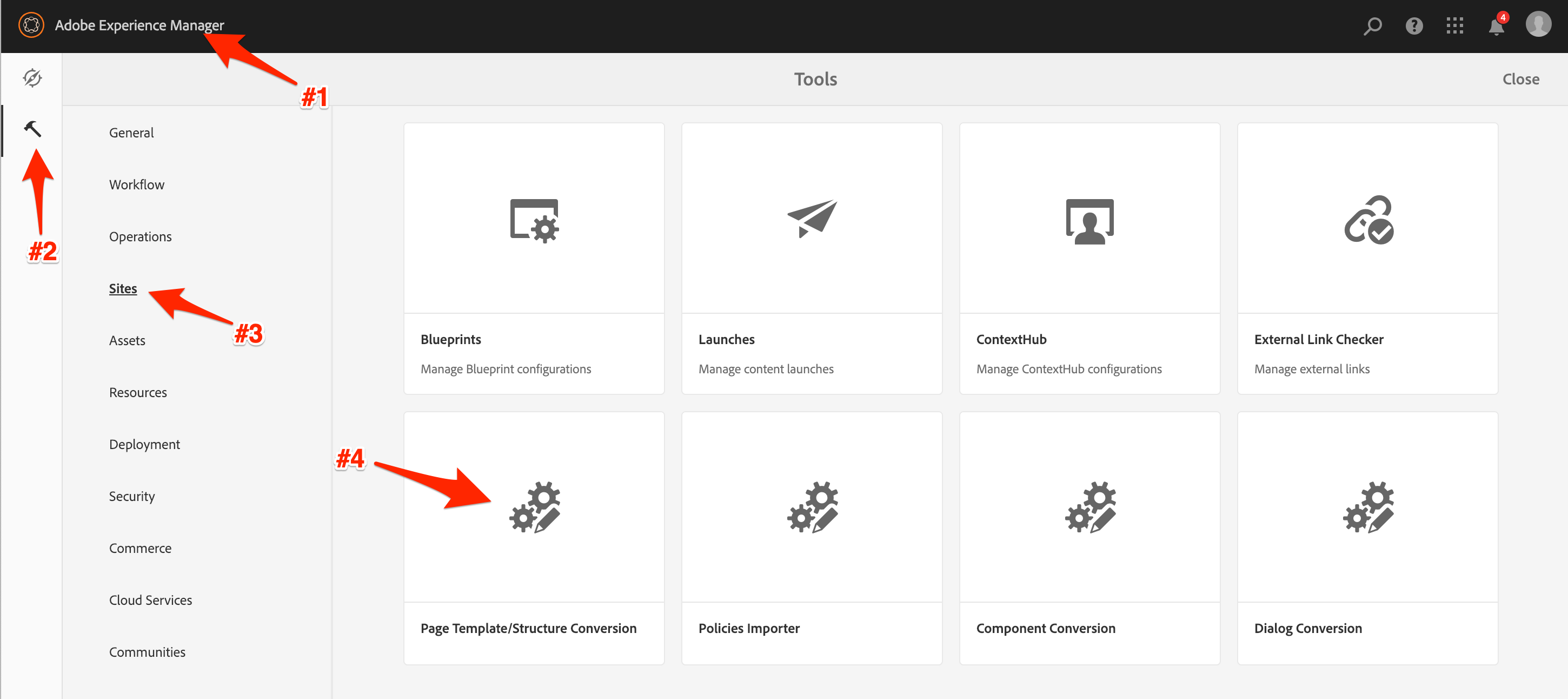
Structure Conversion Navigation
Enter the Geometrixx Homepage path and run the search.
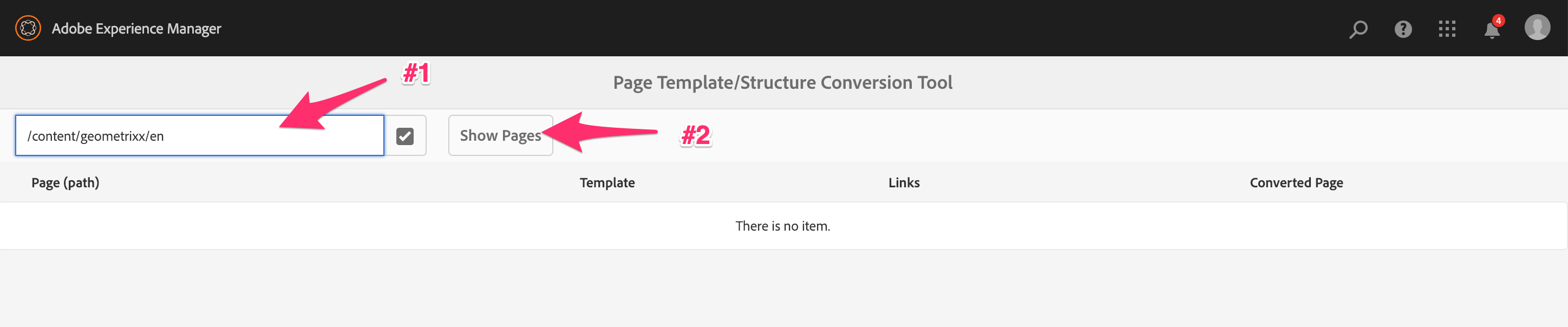
Structure Conversion Page Search
Select the Gemoetrixx English home page and run the conversion process!.
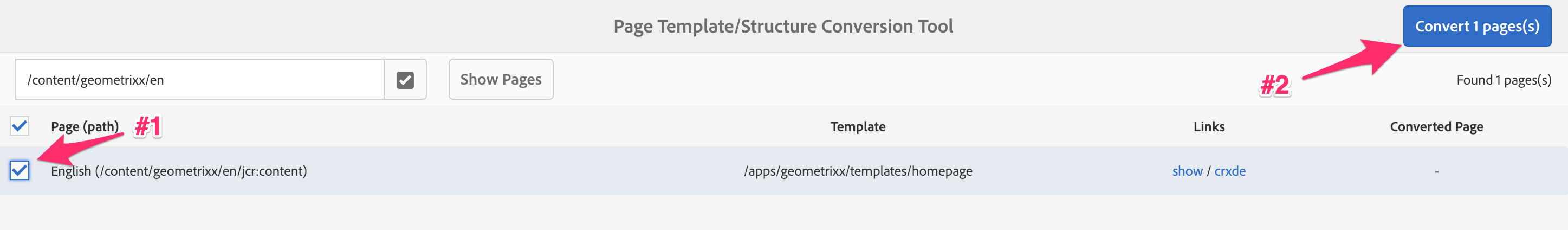
Structure Conversion Page Selection
Once the process is complete, you'll see the success message.
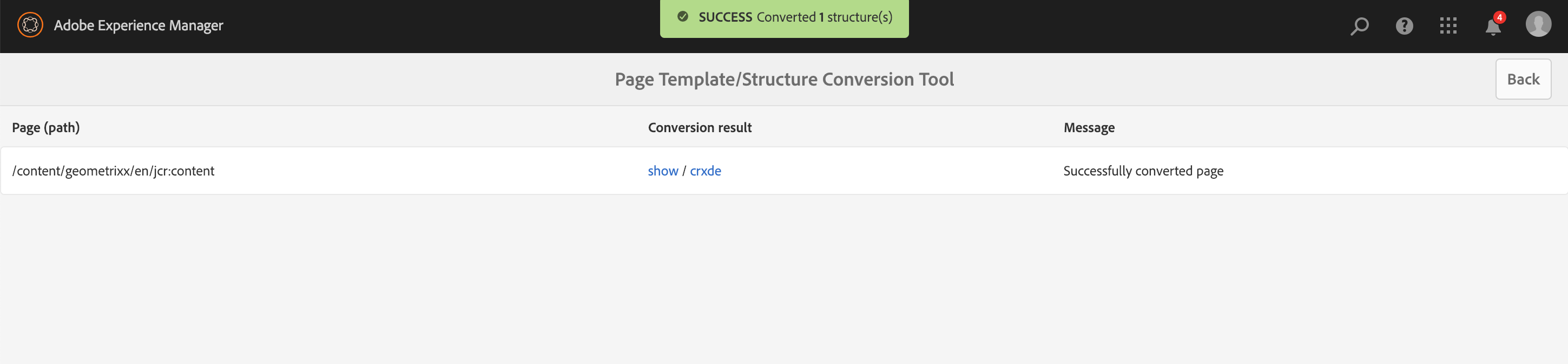
Structure Conversion Page Success
After this step, the Home page has been converted. Let's take a look at it:
For the most part, the page looks the same, which is precisely the outcome we wanted.

Updated Geometrixx Home Page
Note:There are still some stylistic differences in the page. This is attributed to a difference in the components no longer aligning with the new page structure. Let's address this in the next lesson.
In this lesson we'll look at legacy components and update them to either proxy AEM Core Components, or updated (HTL) custom/customer components. To accomplish this, we'll use the new Component Conversion Tool for migrating component definitions.
The Geometrixx Shapes team realized they have a good amount of custom components on their projects, which they need to review every time AEM gets updated.
They conducted an evaluation of their components and the Core Components, and figured out they could use the latter as replacement for custom code in many situations, and guarantee reduced upgrade work in the future.
In this exercise, we will review the list of custom Geometrixx components, and identify those who could be replaced with Core Components equivalent.
Navigate from the tree root to:
Most of Geometrixx's components are from the legacy foundation component suite. Here are a few:
Geometrixx Home Page Component Tree
geometrixx/components/headerfoundation/components/carouselgeometrixx/components/leadfoundation/components/imagegeometrixx/components/titlefoundation/components/textLooking over this list, we want to update the following components to the specified references. Each of these are either new custom components or Core Component proxies. We provided the target source code in this lab, so there's no code to create/update.
geometrixx/components/header
geodemo/components/content/headerfoundation/components/image
geodemo/components/content/imagegeometrixx/components/lead
geodemo/components/content/leadgeometrixx/components/title
geodemo/components/content/titlefoundation/components/text
geodemo/components/content/textSince many organizations can have a large number of components, the Component Conversion Tool only displays components as long as they match a rule. This will help the conversion process by limiting options and allowing you to convert components in batches, as desired.
This cuts down on the size of the list, so as not to display components which will never be modified.
We have already provided the rules that will make the changes for updating these components. Let's review them:
You can view them in CRX/DE:
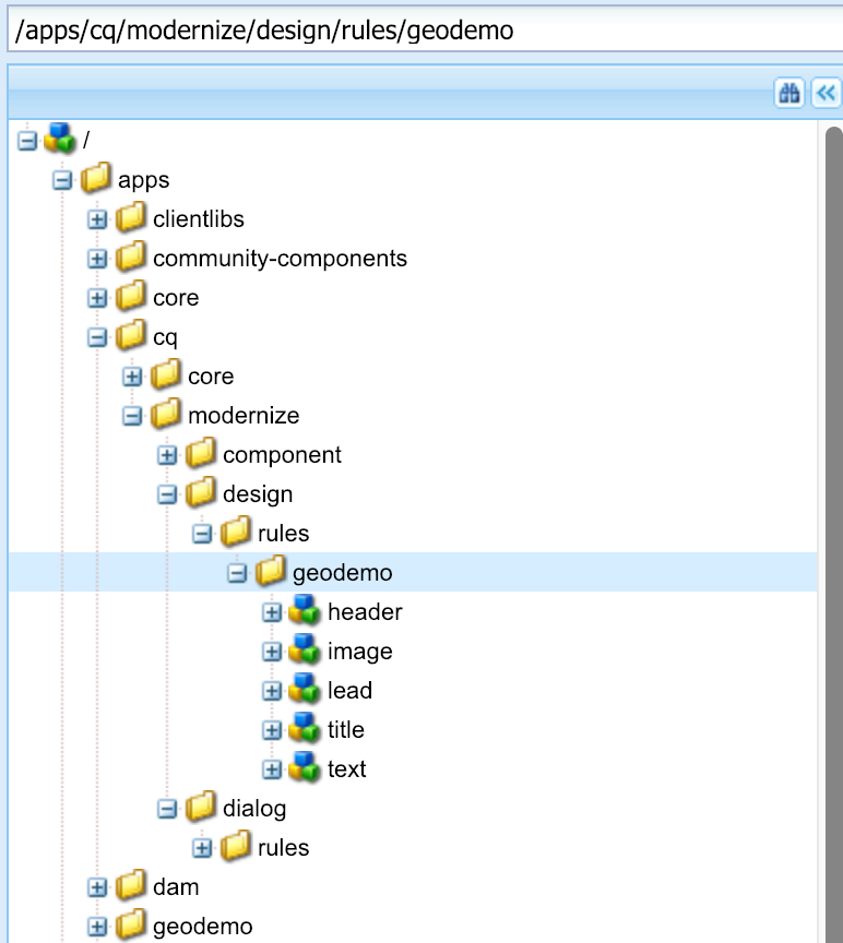
Navigate from the tree root to:
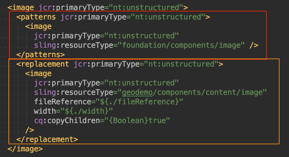
Lets take a close look at one of the rules. Each of the rules consists of two parts, a list of patterns and a replacement.
Component Rewrite Rule Structure
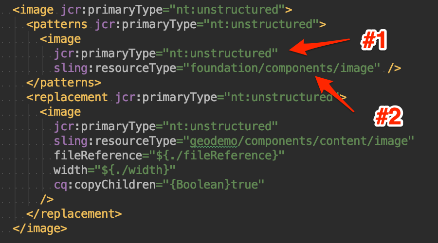
Each node under patterns is essentially a structure that must match for this rule to be applied. A rule may have multiple patterns, if any of the patterns match, then the rule will be applied.
Component Rewrite Rule Pattern Properites
In order to match, each of the properties, child nodes, and properties must match. In this case, the following must be true:
sling:resourceType set to foundation/components/imageNo matter how many patterns exist, there is only one replacement. This is used as the basis for writing the replacement node. There are a number of replacement rules, we won't need all of them for this lab, for more information see the HelpX page for the Conversion Tool.
Let's go through the configuration of this replacement:
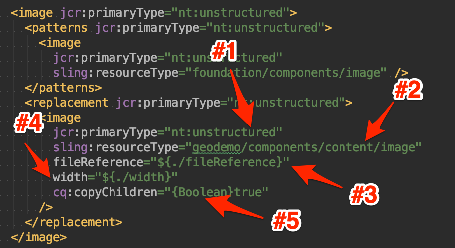
Component Rewrite Rule Replacement Properites
sling:resourceType property to the static value geodemo/components/content/image.fileReference property to the original node's fileReference property.width property to the original node's width property.Now that we've reviewed the conversion rules, we are confident that we can use the Component Conversion tool. Let's open it up:
Navigate to the Component Converter Tool.
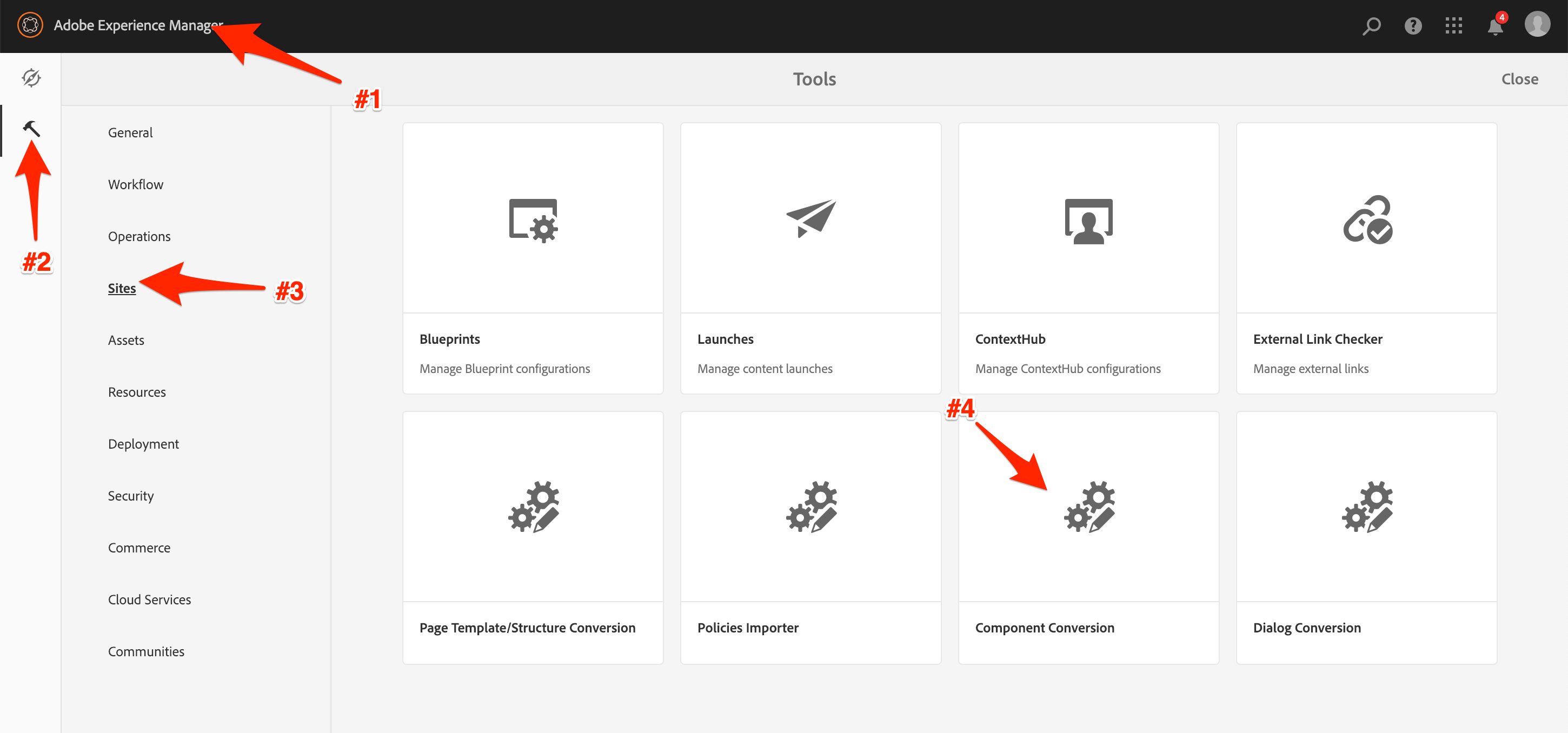
Component Converter Navigation
We need to search for the components to convert. We only want to convert the components on the Geometrixx Home page, so specify its jcr:content node - otherwise it will list all of the children pages' components as well.
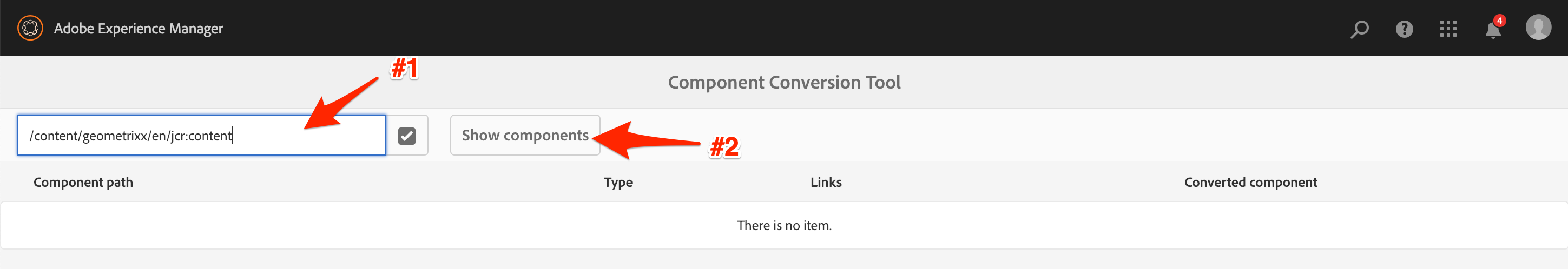
Component Converter Search
This list looks correct for our rules and the components we want to update. Let's run it!
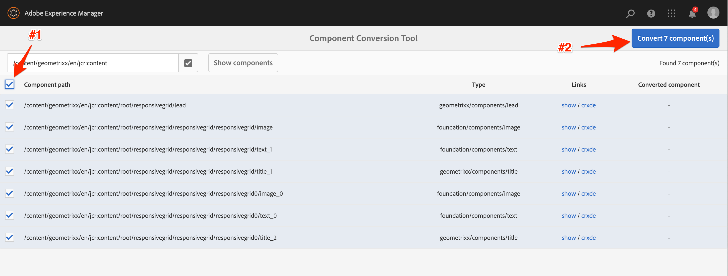
Component Converter Selection
Once the conversion is done, you'll get the success message.
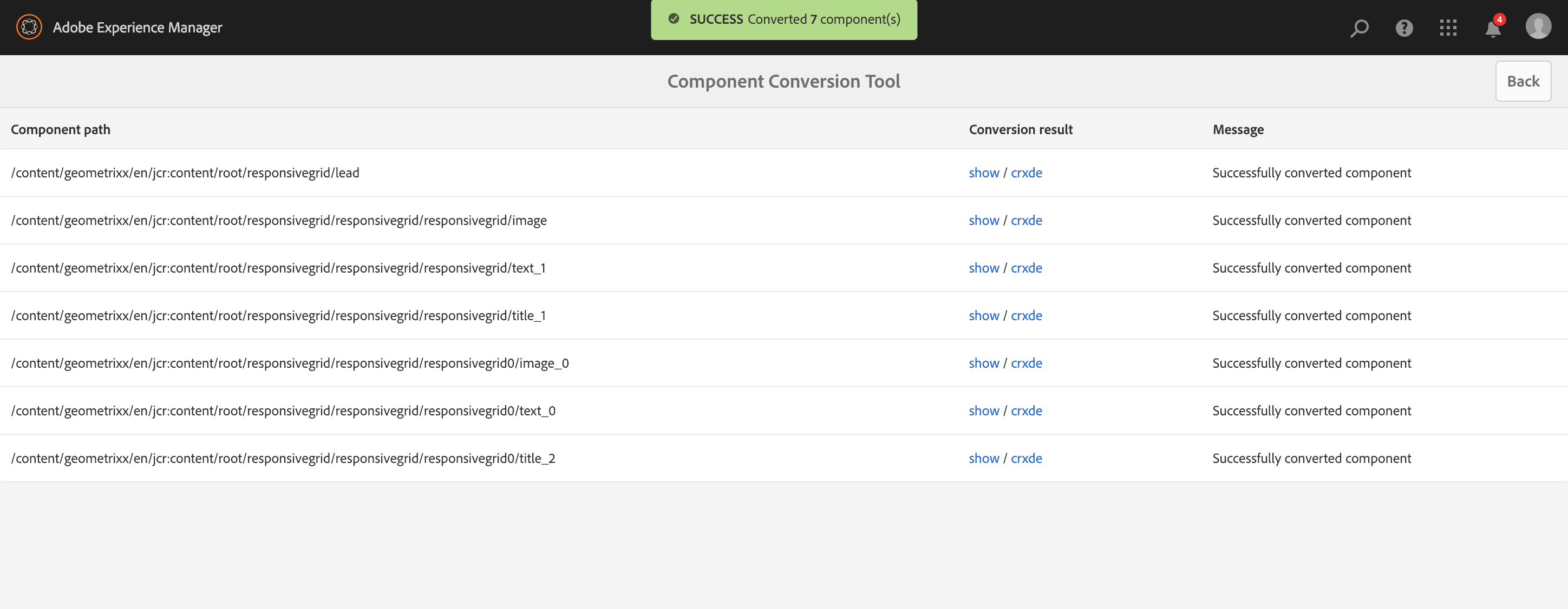
Component Converter Success
Let's take a look at the full page final output now:
Completed Component Conversion Home Page
There's no obvious visual distinction using the new components, which is exactly the outcome we were looking for. If we take a closer look at the nodes in the repository, we can see they are now using the updated references:
Navigate from the tree root to:
Example:
Updated Lead Component Node
This lesson reviews existing Design Mode configurations of a site which is implemented using Static Templates and how to migrate them to Editable Templates as Content Policies.
While upgrading their Static Templates to the new AEM Editable Templates, the Geometrixx Shapes team figured out they will spend time recreating configurations. However, that work could be automated.
To assist them, we are going to:
While converting the former Geometrixx Home page's template, we noticed we had to re-create configurations that were previously stored in the Design Mode. This design is applied to the root page of the site via the cq:designPath property. However, since the property serves no purpose on the new template configurations, it is removed during the page conversion process. We can still review the content of the old configurations.
When looking at the Geometrixx Design, you can observe it contains:
General styling for the website (CSS files, icon, images)
Client libraries definition
Design configurations
Open the CRX/DE Lite bookmark in Chrome.
Navigate from the tree root to:
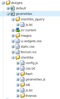
Geometrixx Design Configuration Contents
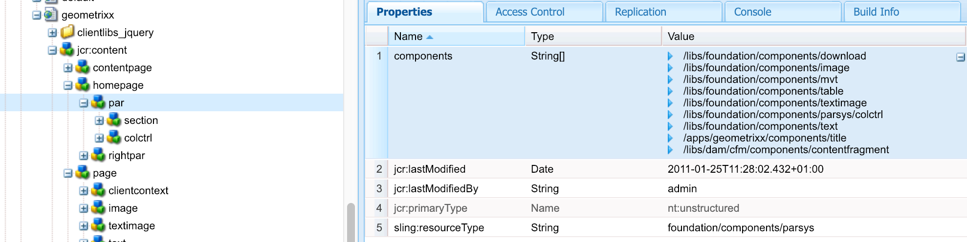
Under the geometrixx design’s jcr:content node, we can see a separate node for each type of page in the Geometrixx site implementation. Drilling down into each of these page type’s will show us the hierarchy of components that is allowed on these pages as well as the configurations that have been set in each component’s design dialog.
Navigate from the tree root to:
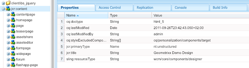
Geometrixx Design Configuration Details
We already converted a number of components on the pages from the legacy foundation types, to new GeoDemo components. Now, we need to migrate the policies - this process applies the same rewrite capabilities as the previous Components Converter. This is necessary as Policies are referenced by sling resource type, not by page/container path.
In this exercise, let's first look at the existing design configuration that we'll be updating. We'll start with the Title Component Style.
Navigate from the tree root to:
Most of Geometrixx's components are from the legacy foundation component suite. Here is an example:
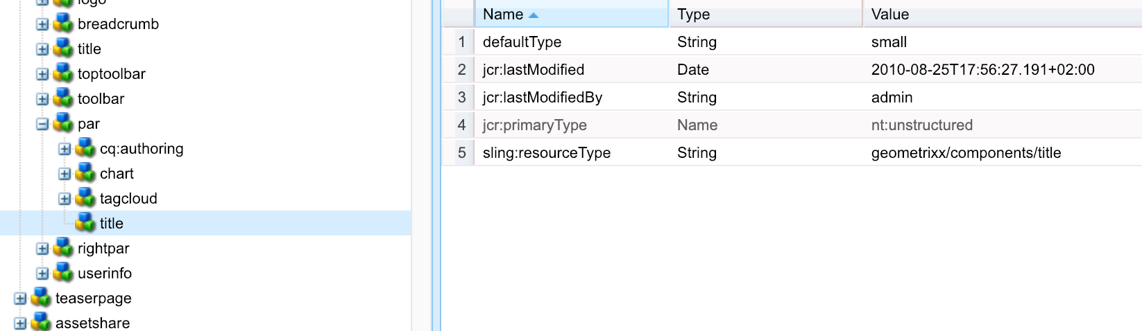
Geometrixx Home Page Parsys Title Design
Just like in the Component Conversion, we'll be updating this component with the following rule:
geometrixx/components/title
geodemo/components/content/titleAgain, similar to the Component Conversion Tool the Policy Importer/Conversion Tool only displays components as long as they match a rule. This will help the conversion process by limiting options and allowing you to convert components in batches, as desired.
We have already provided the rules that will make the changes for updating these components. Let's review them.
Navigate from the tree root to:
Geometrixx Home Page Parsys Title Design
The component rewrite rules are written in the same way as the component rewrite rules that we reviewed in the previous lesson, so we won’t discuss them again.
In this exercise we will extract existing configurations from former design, and turn them info Content Policies that could be reused on editable templates.
Let's run the tool and select the page design components we want to import.
Navigate to the Policy Importer tool.
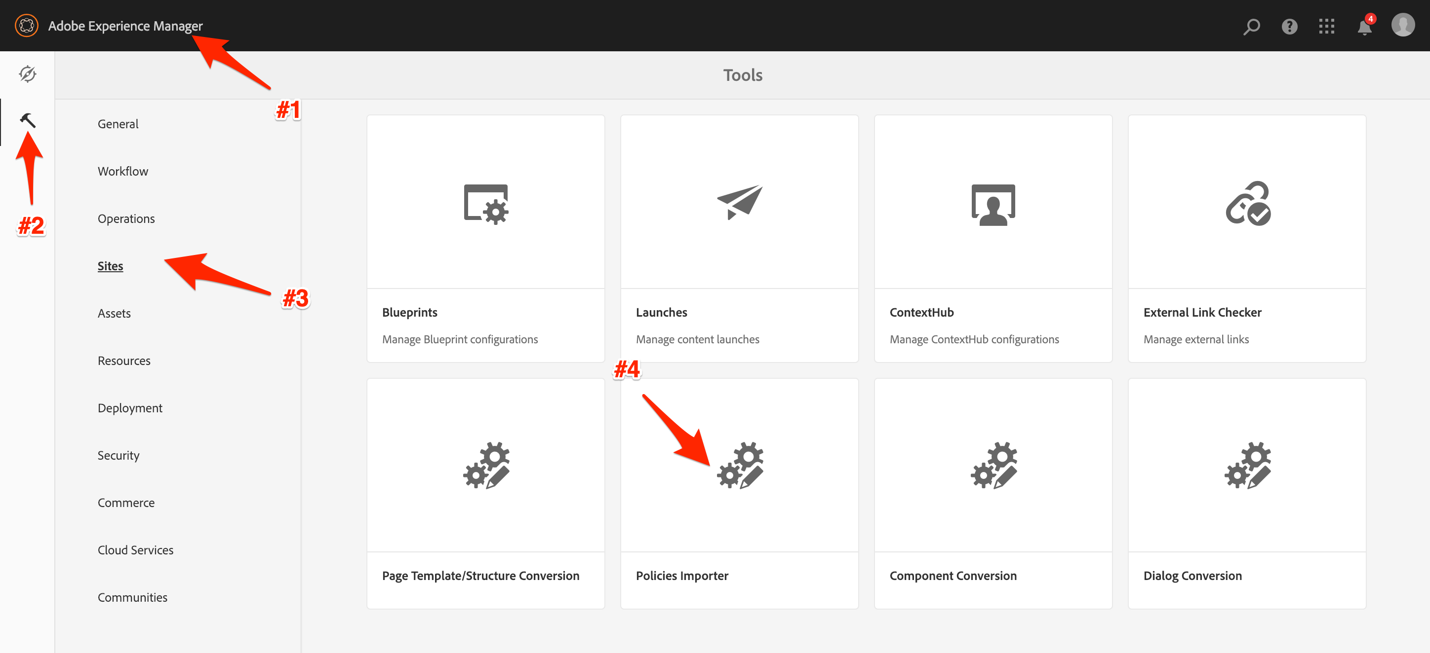
Policy Importer Navigation
We only want to convert the components from Geometrixx Design, the only components displayed will be those with a rule defined. Search for the available styles within the specified design.
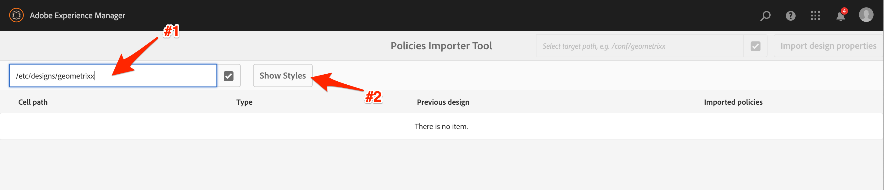
Policy Importer Style Search
To reduce the list of styles after the conversion, only select the styles for the page's parsys and title components, as shown here. Make sure to select the target Policy location for the import, otherwise you will get a failure.
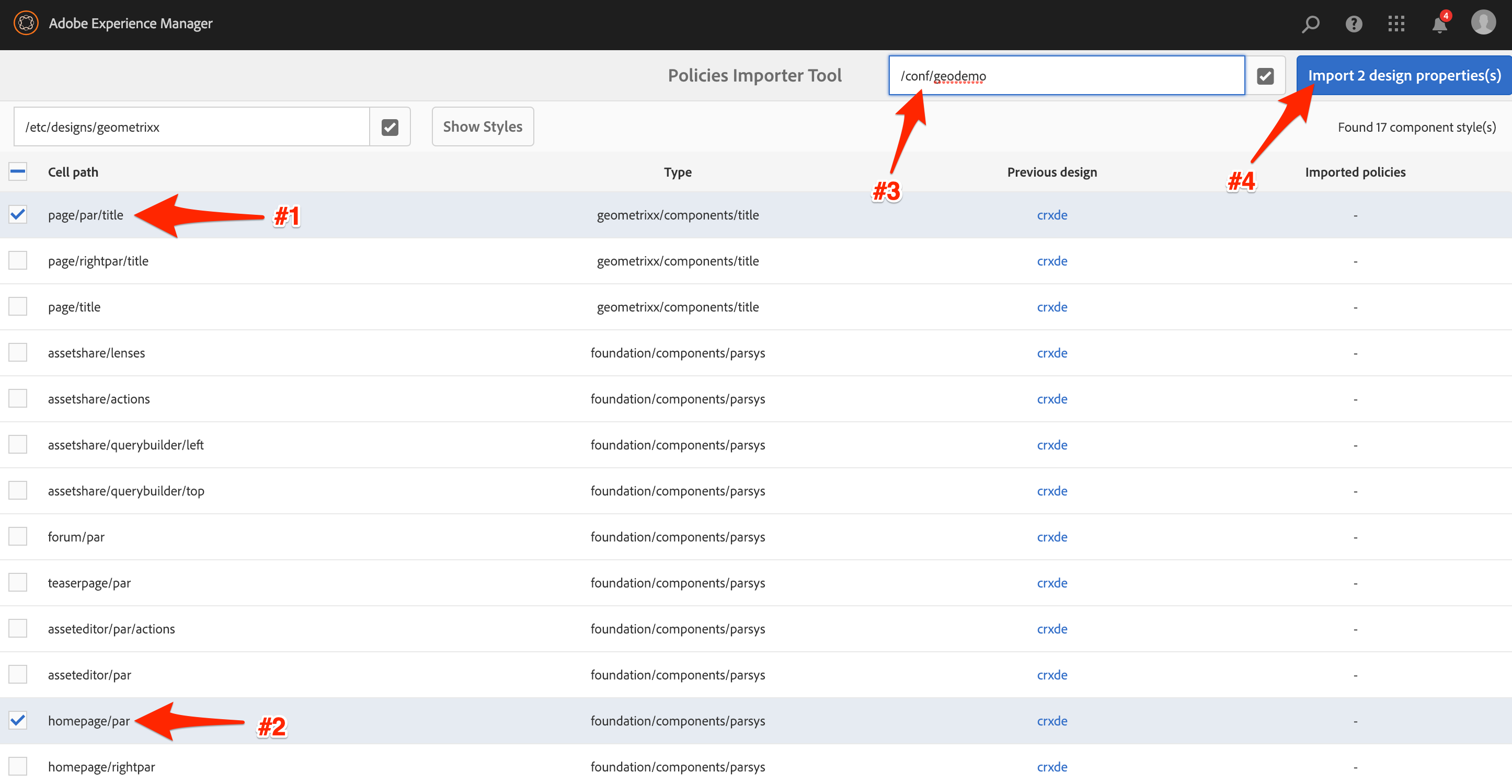
Policy Importer Style Selection
Once we're done, the success message will be displayed.
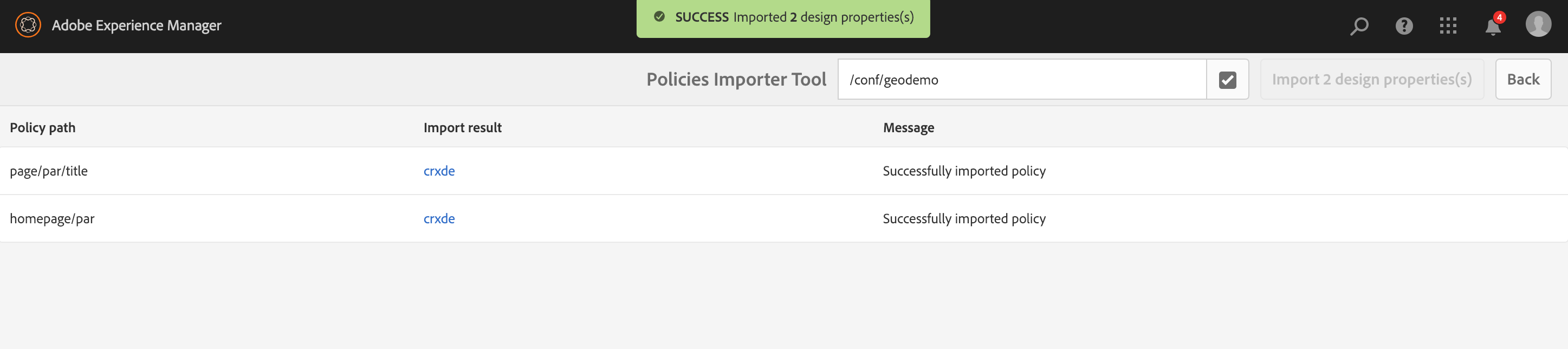
Policy Importer Process Complete
Once the tool runs successfully, we can review how those policies have been imported.
Policies have been stored in the location defined while running the conversion tool.
Navigate from the tree root to:
GeoDemo Policy
Some components have been configured with specific conversion rules.
Paragraph system is one of those. Former configurations get converted into Layout Container configurations.
Observe once more the definition of the Geometrixx Design for content pages:
Navigate from the tree root to:
Geometrixx Homepage Parsys Design Configuration
Now look at how that policy got converted into a Layout Container configuration.
Navigate from the tree root to:
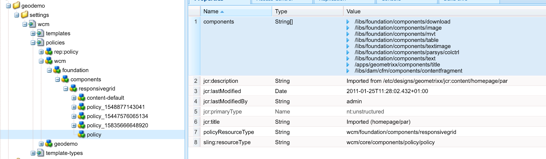
GeoDemo Converted Reponsive Grid Policy
In this exercise we will apply an imported policy on our template. The intent of this is to fix those pesky titles being incorrectly formatted.
Edit the Title's policy configuration on the original template.
Homepage Title Policy Edit
Select the newly created policy and save form.
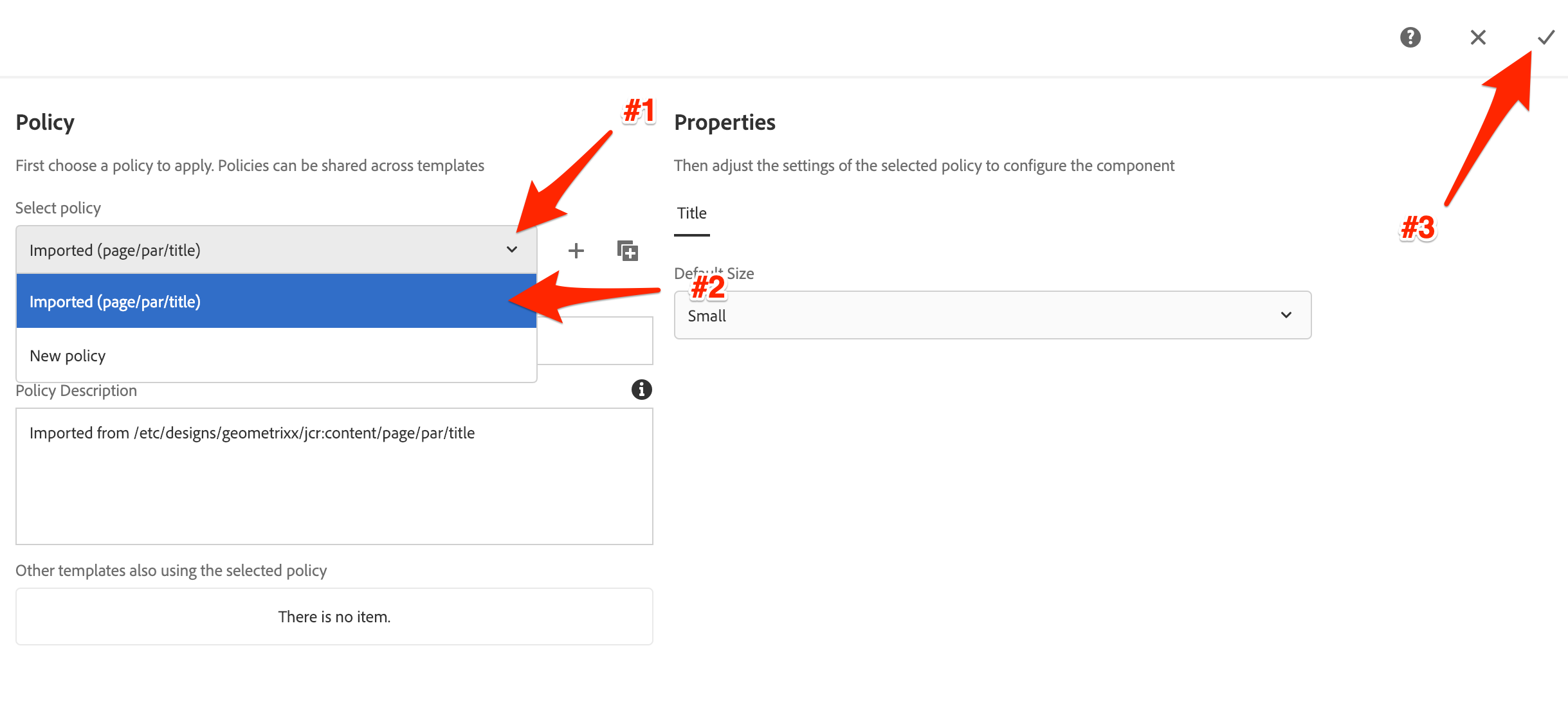
Homepage Title Policy Selection & Save
And now that we've applied the policy, we can refresh the Geometrixx Home page and see the titles have the correct default styles applied.

Completed Geometrixx Home Page
This lesson covers how to use the Dialog Conversion Tool for updating Classic Dialogs for a component. There is thorough documentation available (see References) on how to use this tool. However, we'll go through the process in a controlled environment.
Now that the templates and components have been updated, we need to optimize the dialog for the Lead component for the Touch-enabled UI.
Before we begin, lets take a look at the current dialog and how a Classic dialog appears on the Touch-enabled UI.
Make sure we're in edit mode.
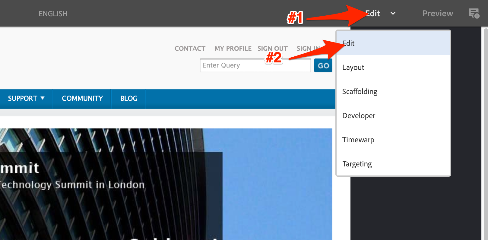
Edit Mode
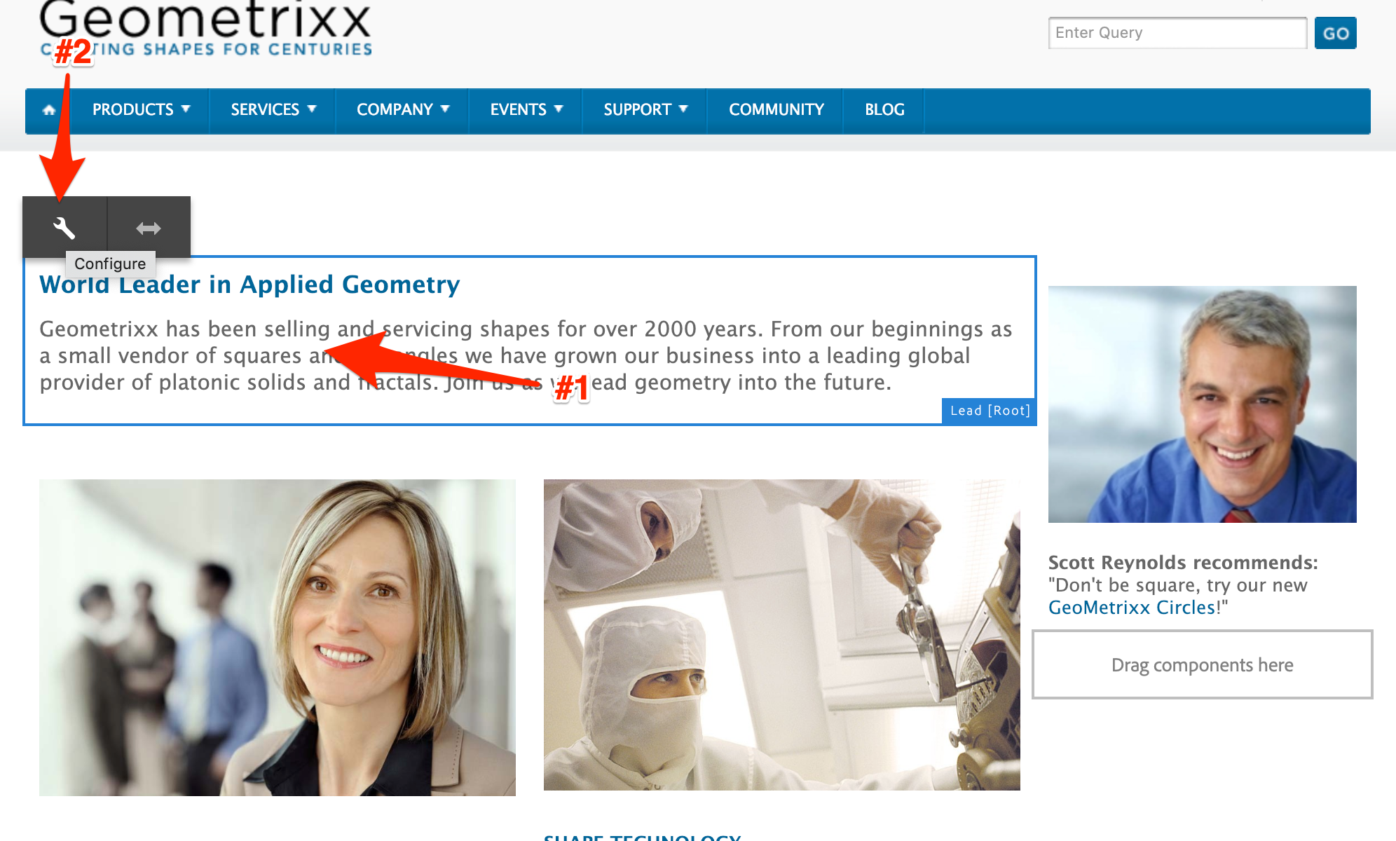
Open the lead component's dialog on the Geometrixx home page.
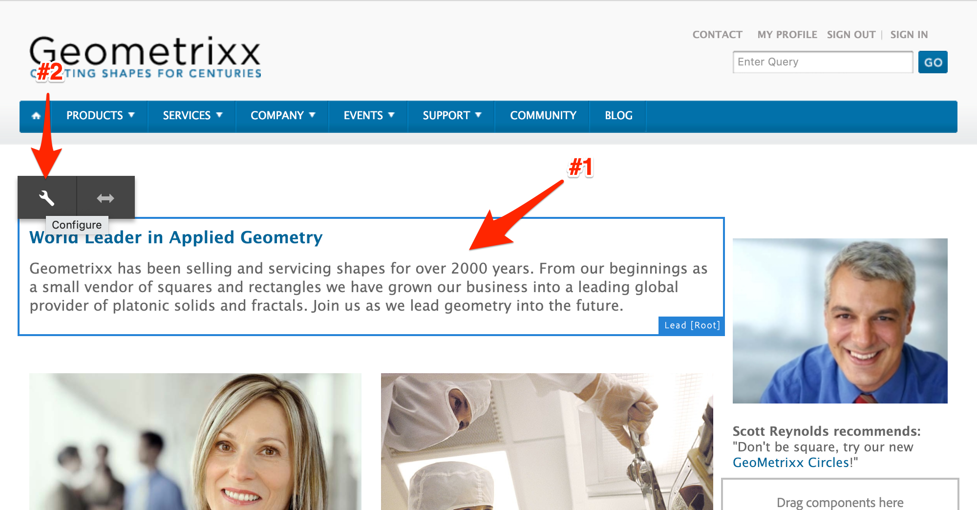
Lead Component Selection
Review the rendering. You can see that it is an embedding of the classic dialog in a Touch UI wrapper.
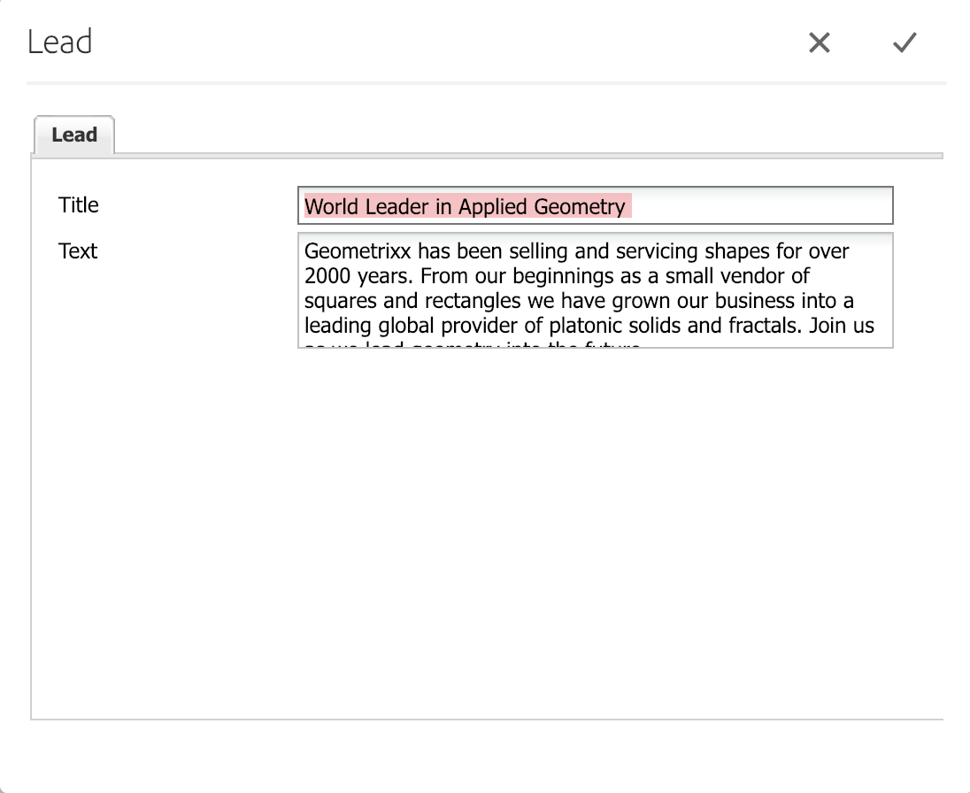
Lead Component Classic Dialog
We're going to identify the first dialog we want to migrate. In this case, it's the Geometrixx Lead component. We copied the original over to the new code base as an example.
Navigate to the Dialog Conversion tool.
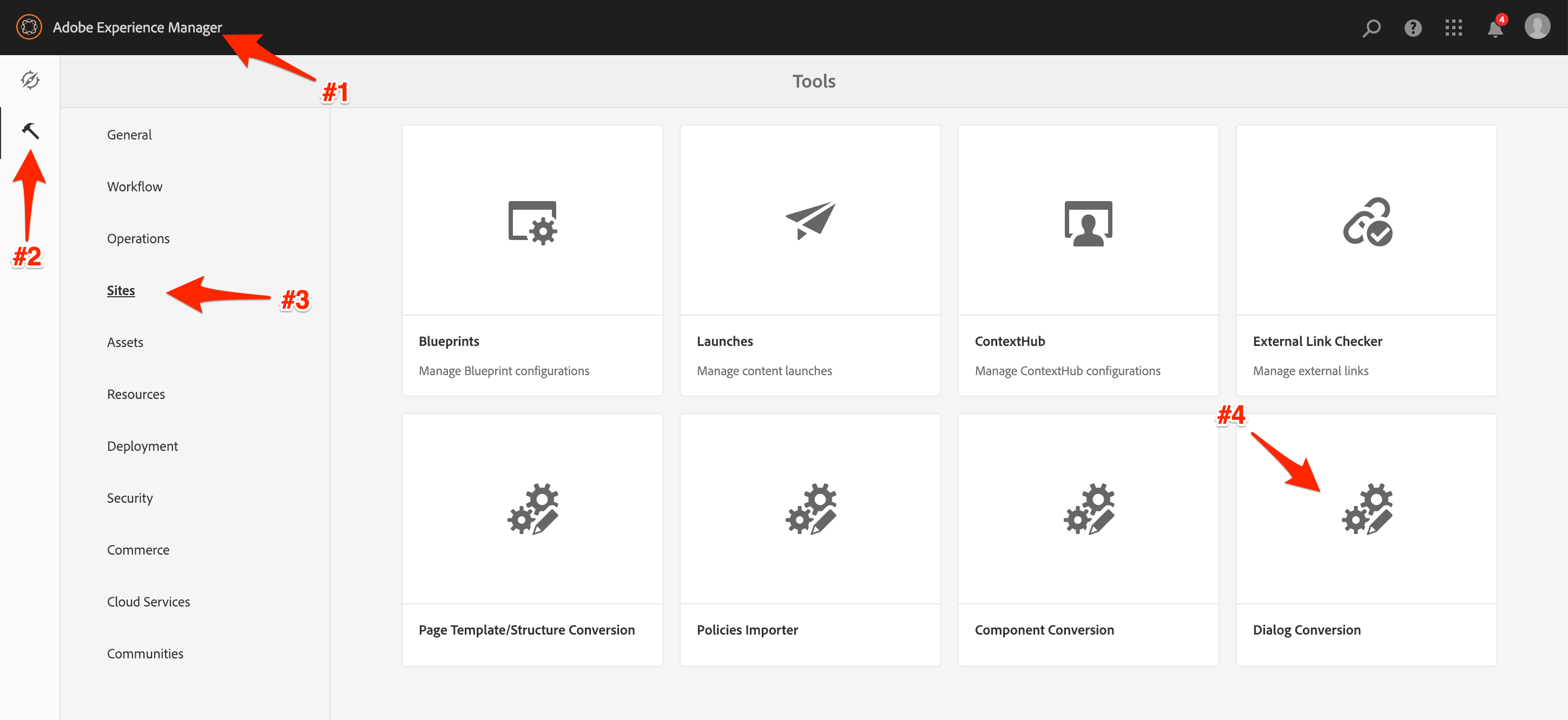
Dialog Conversion Navigation
Search for the components with legacy dialogs. In this project's case, there is only one: our Lead component.
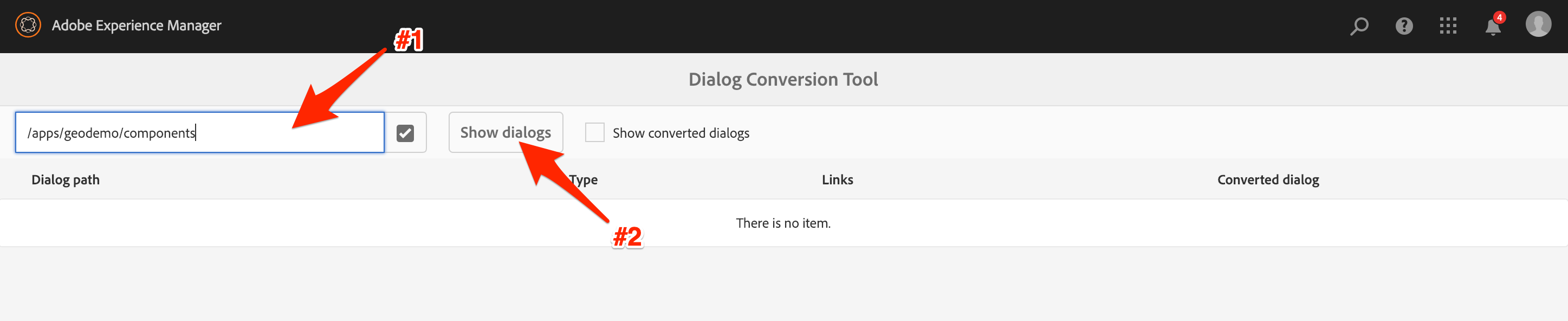
Dialog Conversion Search
Select the lead component for conversion, and kick the process off.
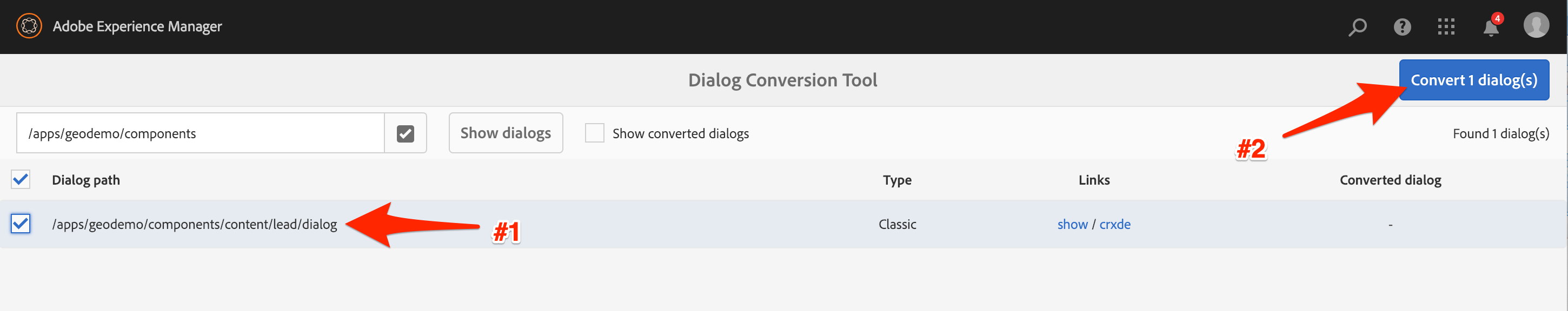
Dialog Conversion Selection
After it's done, you'll get the standard success message.
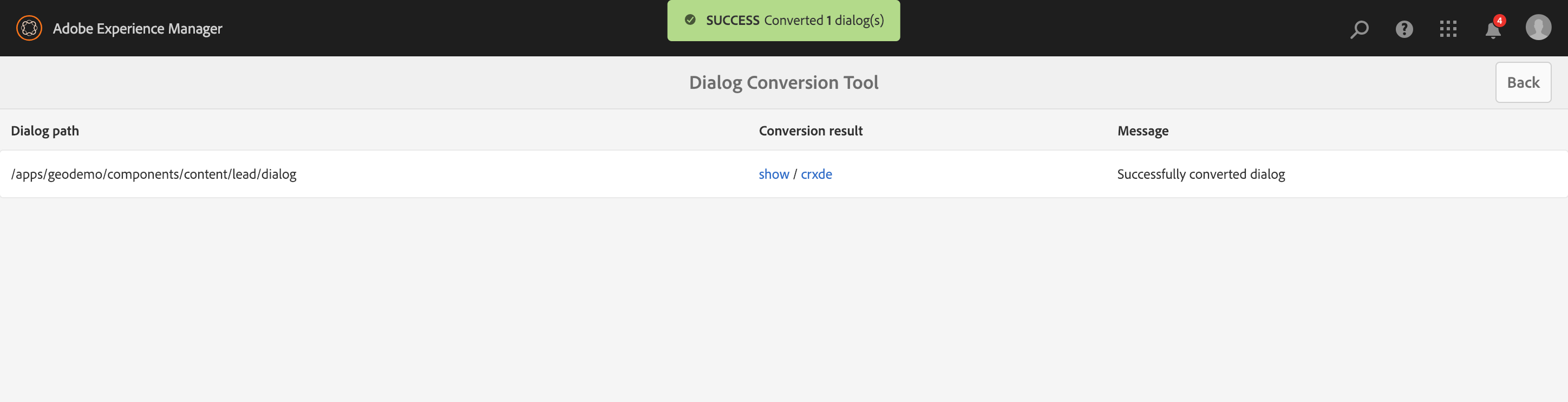
Dialog Conversion Success
With the dialog conversion complete, we can take a look at the new dialog.
Select the Lead component and open it's dialog again.
Lead Component Selection
As you can see, it now renders using the much cleaner Coral 3 widgets.
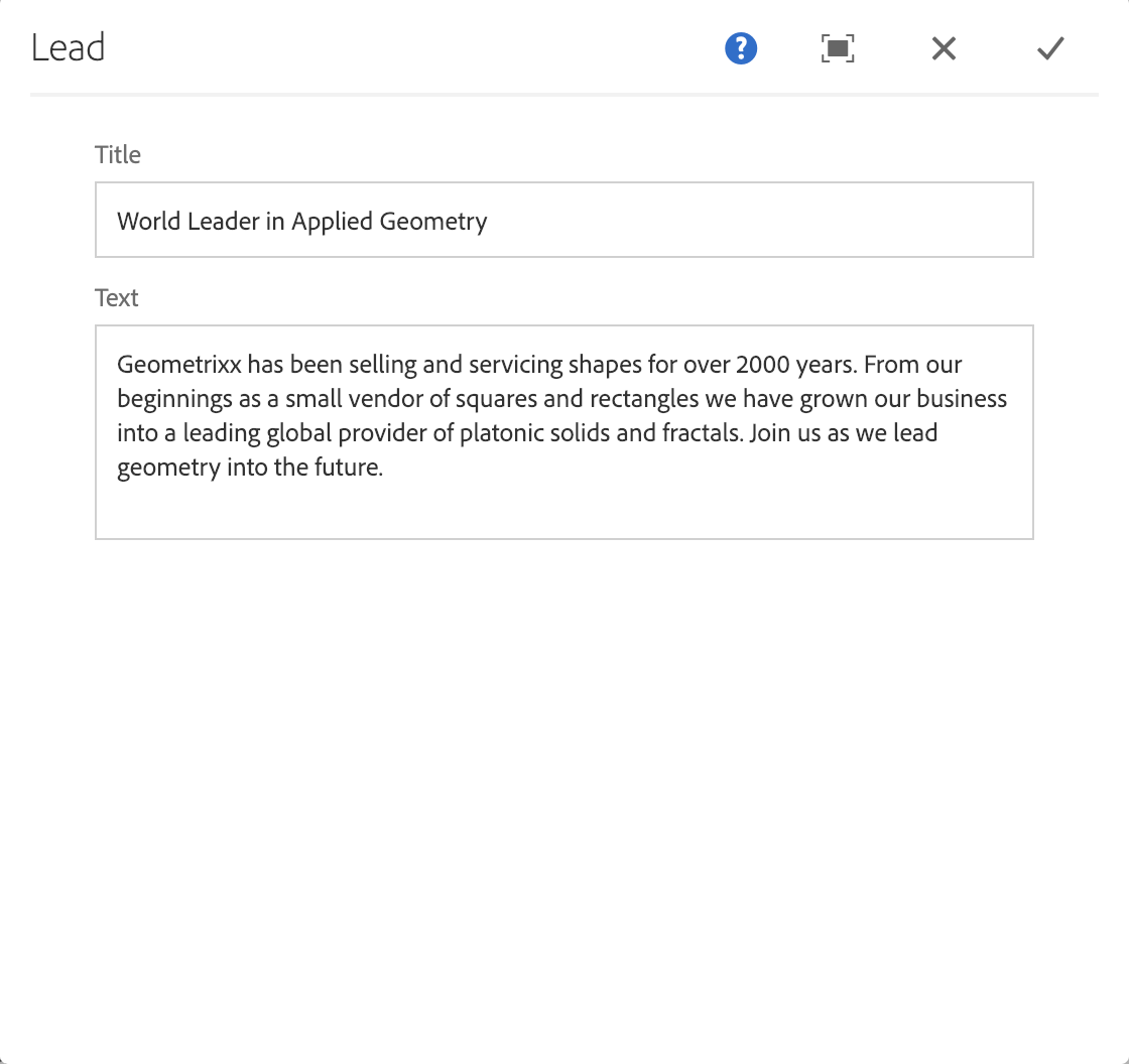
Lead Component Coral3 Dialog
There are a few places where something may go wrong during the lab, and you may need to backtrack to fix it. This information should help with the most likely issues that may be encountered.
The first possible, albeit highly unlikely, issue that may be experienced is the inability to add components to the newly created Editable Template. This can occur if you are not in the Structure mode.
Instead, you may find yourself in Layout Mode:
Template Layout Mode
Or possibly Initial Content mode:
Template Initial Content Mode
Or finally, Preview mode:
Template Preview Mode
To resolve this, simply change modes back to Structure by selecting it from the mode menu.
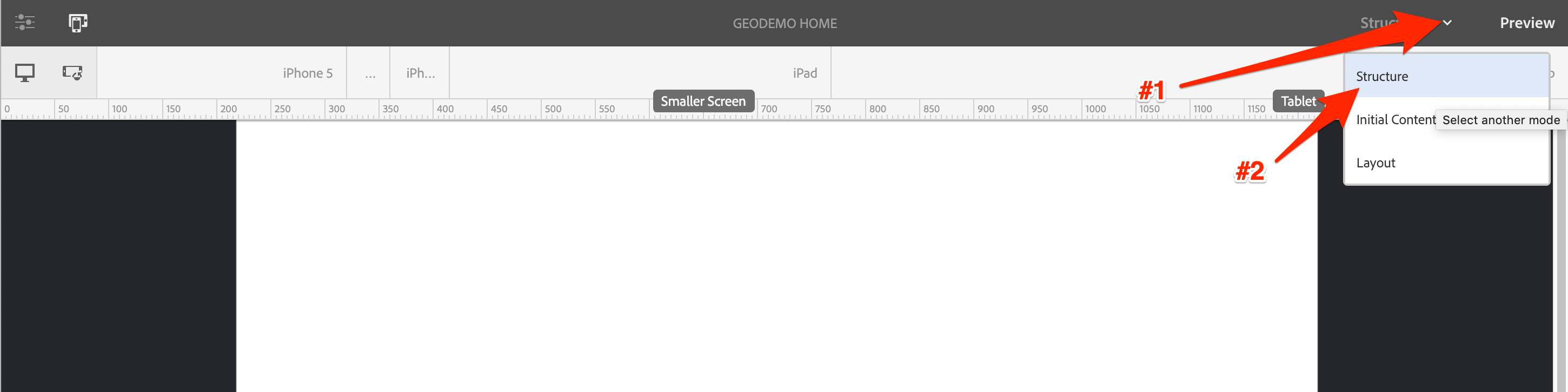
Change Template Mode Menu
After the conversion, the right rail is not displayed:

Right Rail Missing
This occurs when the name of the right rail parsys was not set correctly in the OSGi configuration. It is not essential for the lab that it be correct, so we are not providing a resolution.
Another issue which you may encounter is an error during the Page Conversion process. This produces an error which appears as:
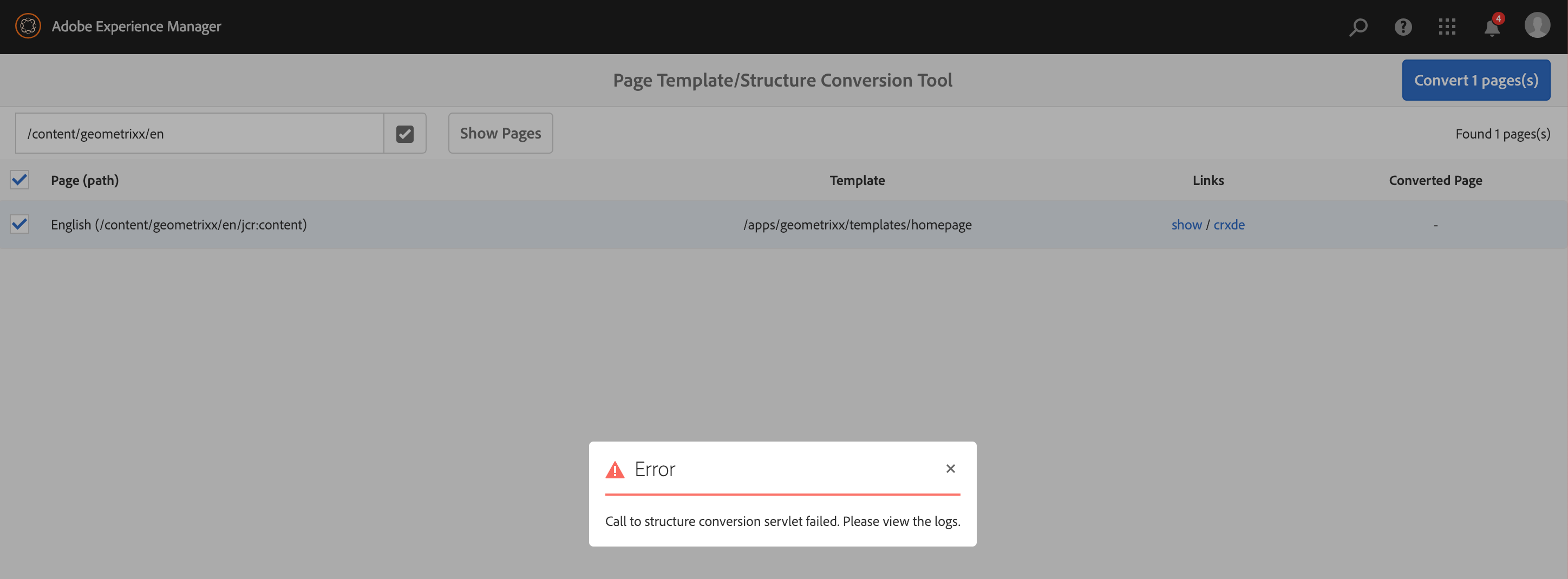
Page Coversion Error
This occurs when the one of the updates to the Page Rewrite Rule configuration was missed, ensure both values are updated here:
TextEdit PageRewriteRule File
After the conversion, if your page does not appear as you expect, it probably looks something like this:
Page with Missing Template
You can see that the header and footer are missing. The columns are not in the correct locations, and none of the updated styles are applied. This occurs when the template name does not match up to the steps in this workbook.
If you encounter this issue at Summit, ask for assistance from a TA and take the following steps:
Open the Terminal App
Reinstall the provided Geometrixx Demo content.
$ cd ~/Desktop/Summit-2019/resources

$ mvn com.day.jcr.vault:content-package-maven-plugin:install -Dvault.file=./cq-geometrixx-pkg-5.11.11-SNAPSHOT.zip
Navigate to the Template location under /conf and get the full path to the created template. This is likely different than what is shown in this screenshot, as this is only an example.
Editable Home Page Template Path
Search for the Page Rewrite Rule Configuration. Click on the configuration entry labeled com.adobe.aem.modernize.structure.impl.rules.PageRewriteRule~homepage, and open the form.
AEM Web Console Configurations
The path to the template is a property of the OSGi Configuration.
Page Rewrite Configuration - Pre Edit
Change the value to the correct path - take the value identified in the previous step, and update the configuration.
Page Rewrite Configuration - Post Edit
Return to the Page Converter Tool and follow Lesson 1, Exercise 1.3, Step 3. The converson should complete and the page should display correctly.
If you encounter an error during your policy import, it may appear like this:
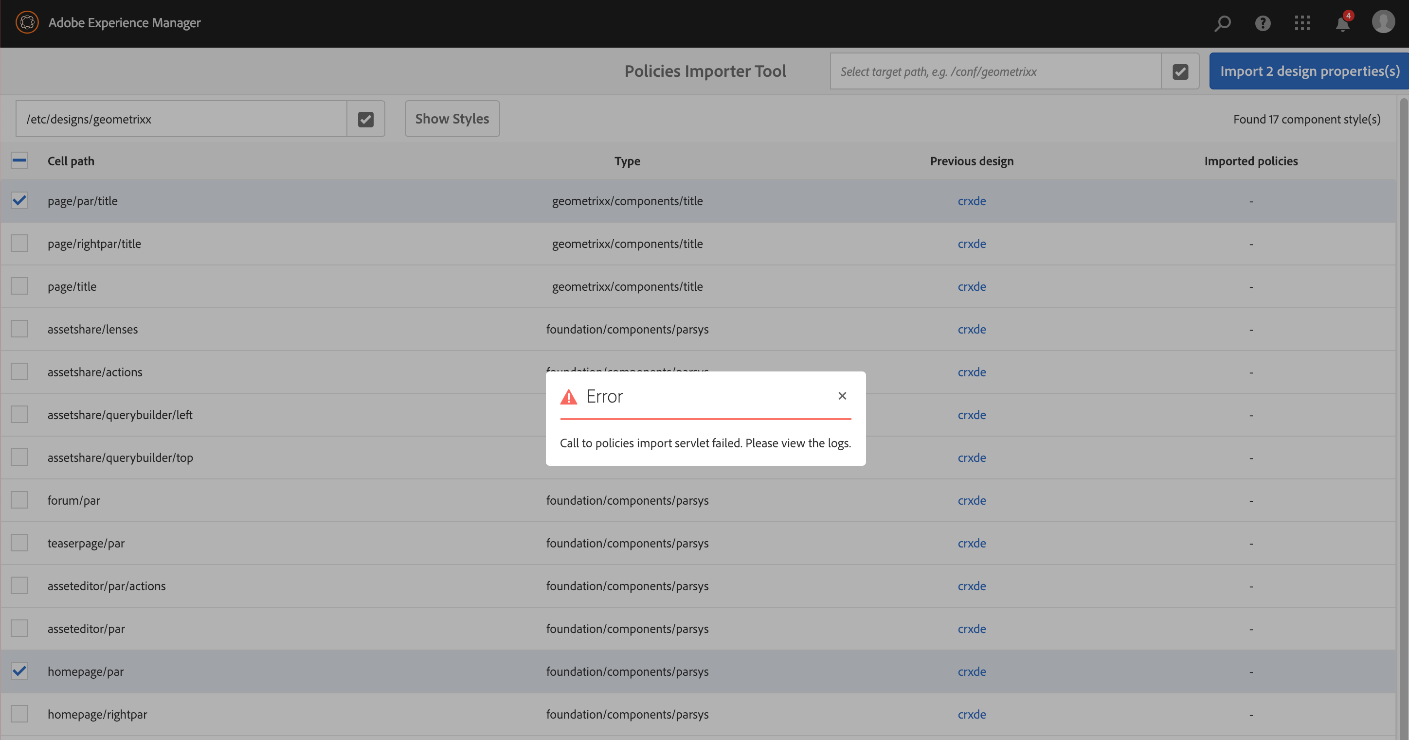
Policy Import Error
You will see this error if you forgot to specify the target location for the new policies.
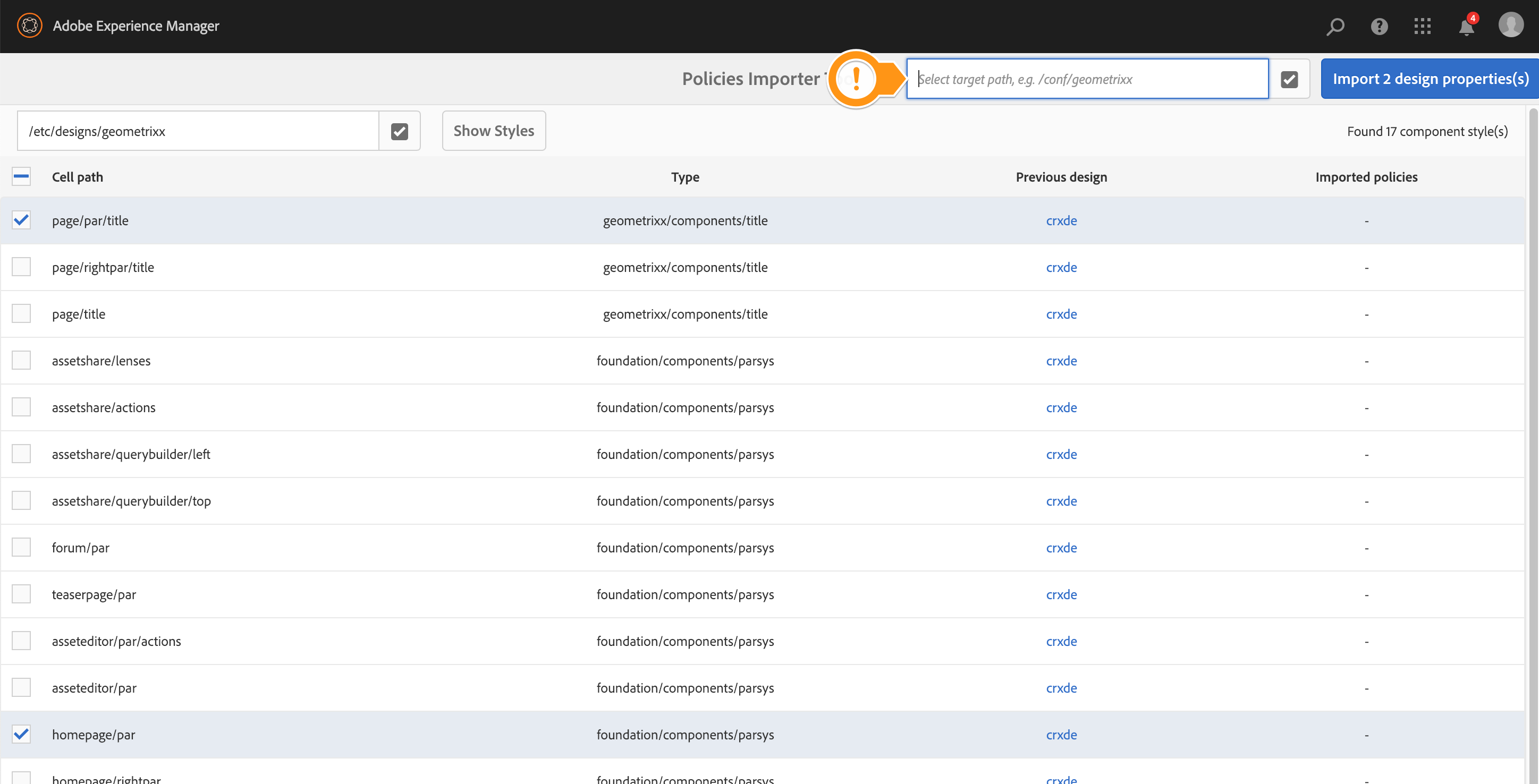
Policy Import Target Missing
Make sure you provide a value in the import target field:
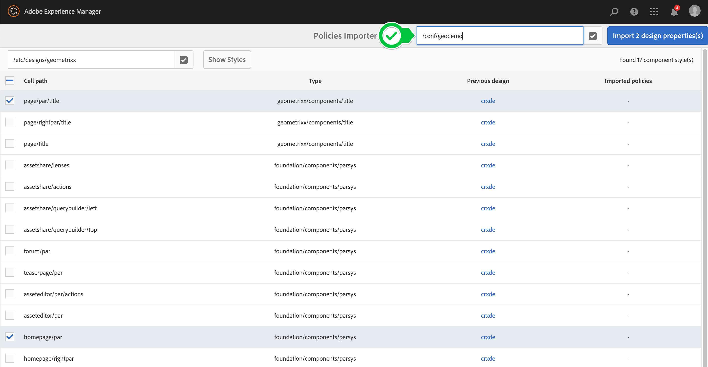
Policy Import Target Provided
In this lab, we provided an overview of the tools created to assist in migrating AEM pages, templates, and components to modern capabilities. From here, customers can begin planning projects to apply these tools to their current implementations. You can:
With this information in hand, you can create custom conversion rules. Use them on a proof-of-concept application to begin your AEM Modernization effort!