
This labs walks you through the entire process of creating an Experience Manager site from scratch using the latest features, concepts, and best practices.
After this session, you can set up your own, design editable templates, create components using HTML Template Language (HTL) with a style system, leverage core components , implement Sling Model Exporter and a lot more.
In this lesson, we will learn to create and deploy a project to an AEM Server.
An AEM Project contains multiple modules and requires a set of dependencies to correctly build and deploy in Enterprise.
This could be complex if we have do it on our own. To simplify the task, Adobe provides the AEM Project Archetype based on Maven.
This AEM Project Archetype or Maven template can be used to create a new AEM project as starting point for developing your own functionality.
Create a folder called training in the Documents folder on your machine.
Open the Terminal in this folder and run following command:
mvn org.apache.maven.plugins:maven-archetype-plugin:2.4:generate \
 -DarchetypeGroupId=com.adobe.granite.archetypes \
 -DarchetypeArtifactId=aem-project-archetype \
 -DarchetypeVersion=16 \
 -DarchetypeCatalog=https://repo.adobe.com/nexus/content/groups/public/
Enter the following values in interactive mode and press enter or return to accept the default values.
| Input | Values |
|---|---|
groupId |
com.adobe.training |
artifactId |
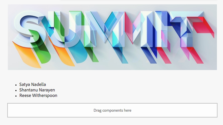
summit |
package |
com.adobe.training.summit |
siteName |
Summit |
Figure: Maven Interactive Mode
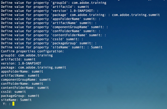
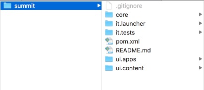
Figure: Generated AEM Project
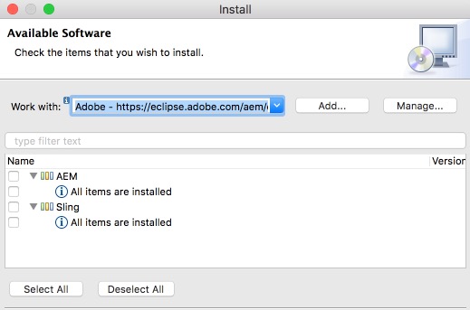
AEM development in Eclipse is supported using the following two plugins:
- AEM Plugin
- Sling Plugin
These plugins should already be installed on your Lab Machines.
Figure: AEM & Sling Plugin
Note: We have removed a few modules and some sample content from the generated archetype project to reduce deployment time for this lab.
We will be using the provided project summit for the lab - this project is available in resources/project folder.
We can deploy project code changes directly from Eclipse to AEM. For this task, we need a connection to AEM server. This connection also helps in syncing changes made in CRXDE to the Eclipse project.
Figure: Add and Remove Modules Console
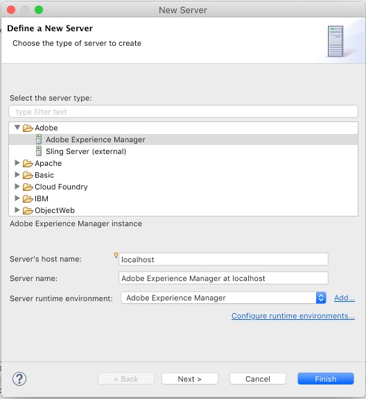
Figure: Add and Remove Modules Console
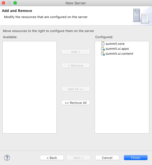
Figure: Server Configuration
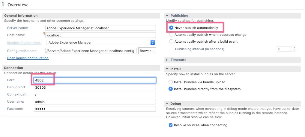
4502.We will use the AEM Server connection to pull code changes made in CRXDE.
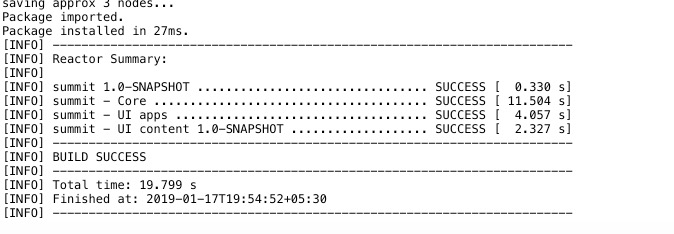
Another way of deploying code is using Maven, the benefit of this process is it provides details of the build process in the console.
Figure: Run Configuration
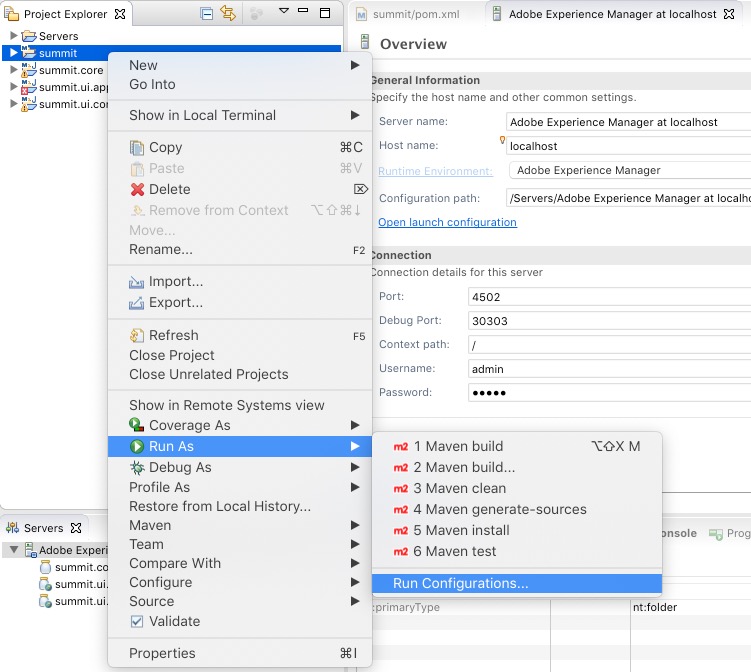
Figure: Run Configuration Settings
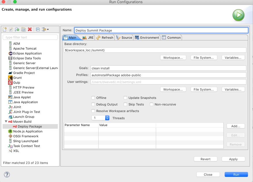
Figure: Maven Success Message
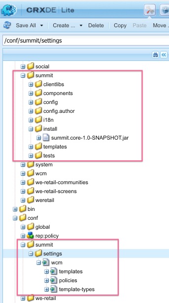
Go to CRXDE Lite at http://localhost:4502/crx/de.
You can verify successful deployment by checking the following path.
| CRX Structure | Project Modules |
|---|---|
/apps/summit |
ui.app module |
/apps/summit/install/summit-core.*.jar |
core module |
/conf/summit |
ui.content module |
/content/summit |
ui.content module |
|
Figure: Summit Project in CRXDE Lite
In this lesson we created and deployed an AEM project and got familar with the tools needed as well as the structure of the project allowing us to start creating a template and building our own components in the next lesson.
In this lesson, we will create a template and configure policies for our template.
AEM page templates define the structure of the resultant page, any initial content, and the components that can be used.
What makes page templates powerful is that with the AEM Template Editor, creating and maintaining templates is no longer a developer-only task. A type of power-user, who is called a template author, can be involved too giving authors much more flexibility.
In this lesson we will create a Home Page and a Content Page Template.
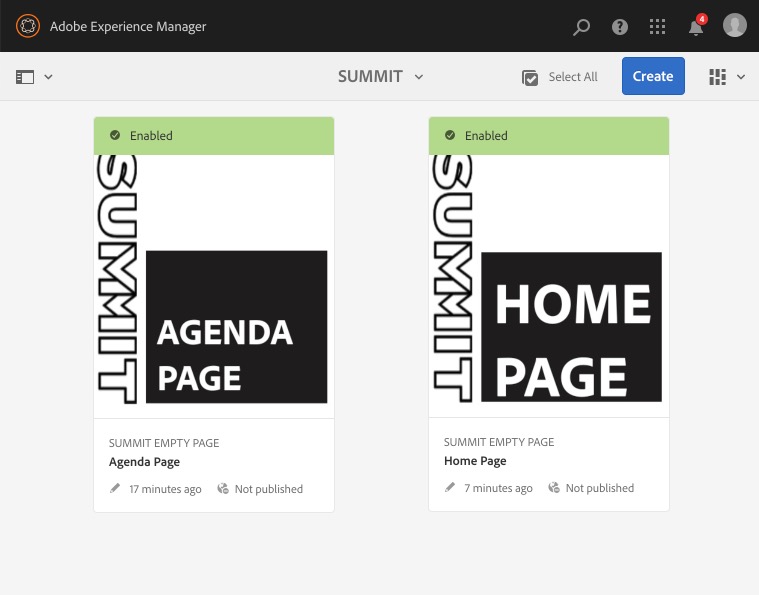
Summit Home Page. Click Create. Click Done.We will create another template - Summit Agenda Page.
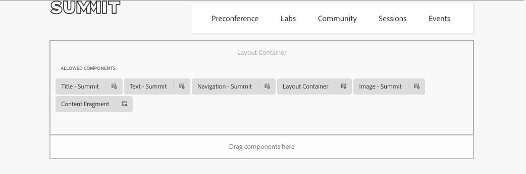
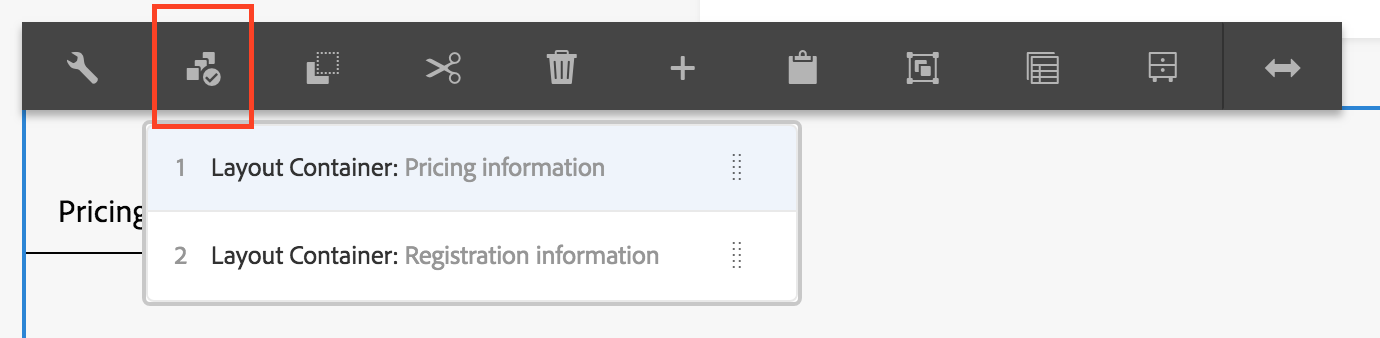
Summit Agenda Page. Click Create. Click Done.The page has a layout container by default, this is the root element of the page and will provide responsive capabilities to the page.
As Template Authors, we will be adding another layout container as a child of the root layout container, which content authors can use to add more components to the page.
Select and Edit the Summit Home Page Template.
Click the root layout container and select the Policy option.
In the Allowed Components section, check Layout Container from the General component group.
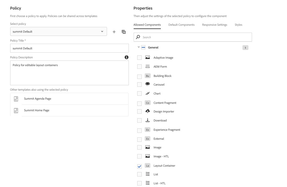
Click the right icon to the top-right corner to save it.
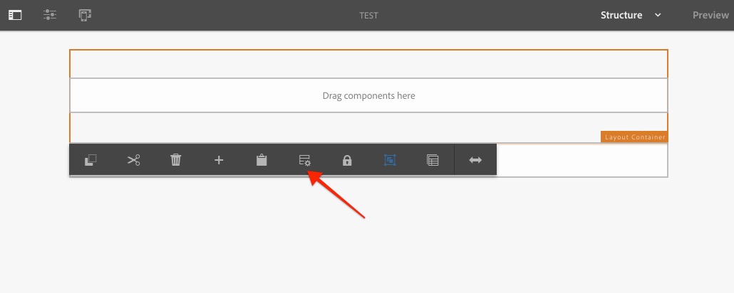
Click on the Drag components here area of the layout container, press the + icon and select Layout Container.
Click the new layout container and press the lock icon to unlock the layout container.
Click the new layout container and choose the Policy option.
SUMMIT Default.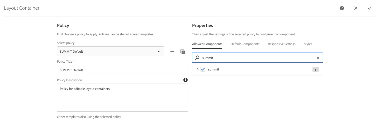
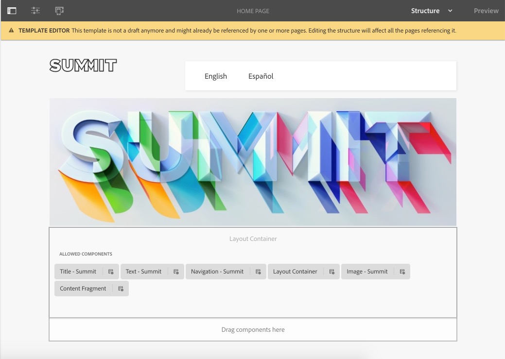
As Template Authors, we want both templates to contain the following components:
logo-summit.png on the image component./content/we-retail/us ( we will change it once the site structure is ready )1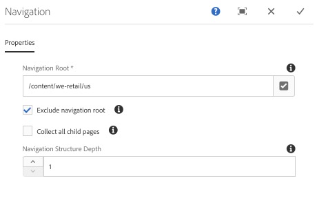
summit.jpg from the asset browser.Now we want to resize the components as shown in the below image.
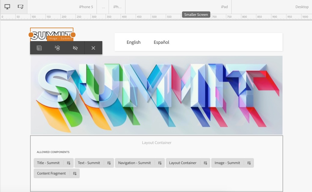
Click on the logo image component to show its action toolbar and select the Layout option represented by a two-sided arrow icon.
Once clicked, you should see two drag handle dots left and right of the component. Drag the right dot to resize the component to 2 columns.
Click on the navigation component, select the Layout option and drag right arrow to fit 9 grid columns or exclude 3 grid columns.
Repeat exercises 2.3, 2.4 and 2.5 to edit and configure the Summit Agenda template. Note: It is similar to the Summit Home Template except that it does not have a banner.
Now that our templates are ready, we can add thumbnail images to both templates and enable them.
Summit-2019/resources folder in your file system and select the homepagethumbnail.jpg thumbnail.Repeat the process for the Agenda Page Template and the result should be as shown in the following screenshot:
Now that we have templates, we can create a site structure.
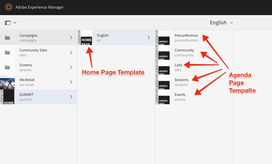
We based our navigation component on the we-retail site, but now that we have our own site structure we can change the navigation root to /content/summit/en.
/content/summit/en./content/summit/en.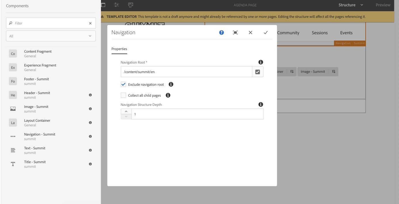
We have used AEM's powerful Template Editor to easily and intuitively create our templates for our website. Now we are ready to create our components so we can add them to the templates.
Although AEM comes with out-of-the-box components, it is often necessary to create your own custom components. In this lesson, we will see how to perform this task.
We need a custom component which content authors can use to add lab details to the page. This component will have two input fields:
Text Field)Textarea Field)/apps/summit/components/content.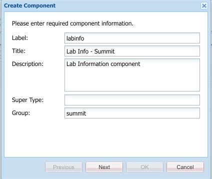
labinfo.jsp to labinfo.html. Click Save All.labinfo.html file, delete the existing code and add the following code:<h2> Lab Info </h2>
/apps/core/wcm/components/title/v2/title.cq:dialog node from the title component./apps/summit/components/content/labinfo.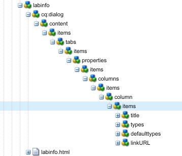
Delete types , defaulttypes and linkURL under the items tab.
Click on the title node and change the value of the property name to ./labtitle (by default it is ./jcr:title). Click Save All.
Right click on the title node and select the copy option.
Right click the items node above the title node and select paste.
Rename Copy of title to details. Click Save All.
Select the details node and change the value of the name property to ./labdetails.
Change the sling:resourceType to granite/ui/components/coral/foundation/form/textarea.
Change the fieldLabel to Details. Click Save All.
Open labinfo.html and replace the existing content with the following code:
<div class="summit-labinfo">
     <h2>Lab : ${properties.labtitle}</h2>
     <p>${properties.labdetails}</p>
</div>
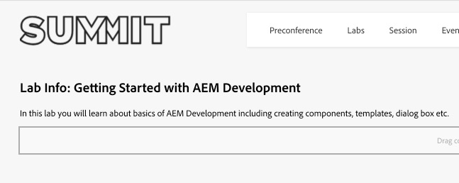
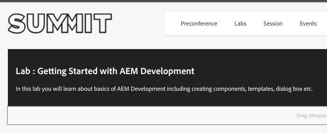
Go to the Labs page in the Summit Site.
Add the Lab Info component to the page.
Click on the component and from its action toolbar click on the wrench icon to open its configuration dialog. Once open, you should see the Title and Details input fields in the dialog.
Enter Values:
| Input | Values |
|---|---|
| Title | Getting Started with AEM Development |
| Details | In this lab you will learn about basics of AEM Development including creating components, templates, dialog box etc. |
You should see the details as provided.
In AEM, CSS and Javascript are provided using Client Libraries.
/apps/summit/components/content/labinfo.clientlibs.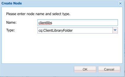
Click OK to confirm. Click Save All.
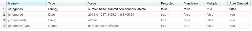
Click on the clientlibs folder and add the following multi-value property:
categoriesStringClick Add and add the following properties:
summit.base
summit.components.labinfo
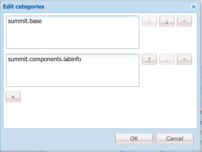
Click OK. Click Save All: you should see as follows:
Now create a file css.txt in the clientlibs folder. Save the changes.
Open the file css.txt and add the following code:
style.css
style.css with the following code:.summit-labinfo {
background-color: #000;
color: #fff;
padding:10px;
}
In this lesson we got started creating the basics of our own custom components including setting up the required structures in the repository. In the next lesson we will build on this by using the Core Components to customize our site.
Core Components provide robust and extensible base components, built on the latest technology and best practices. Core components make page authoring more flexible and customizable, and extending them to offer custom functionality is simple for the developer.
In this lesson we will learn how to leverage the Core Components to customize our site.
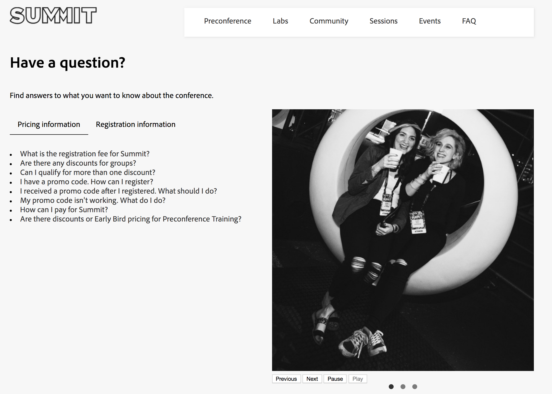
In this lesson, we will recreate the FAQ page from the Summit website at https://summit.adobe.com/na/faq by using and styling the following Core Components:
title
text
tabs
carousel.
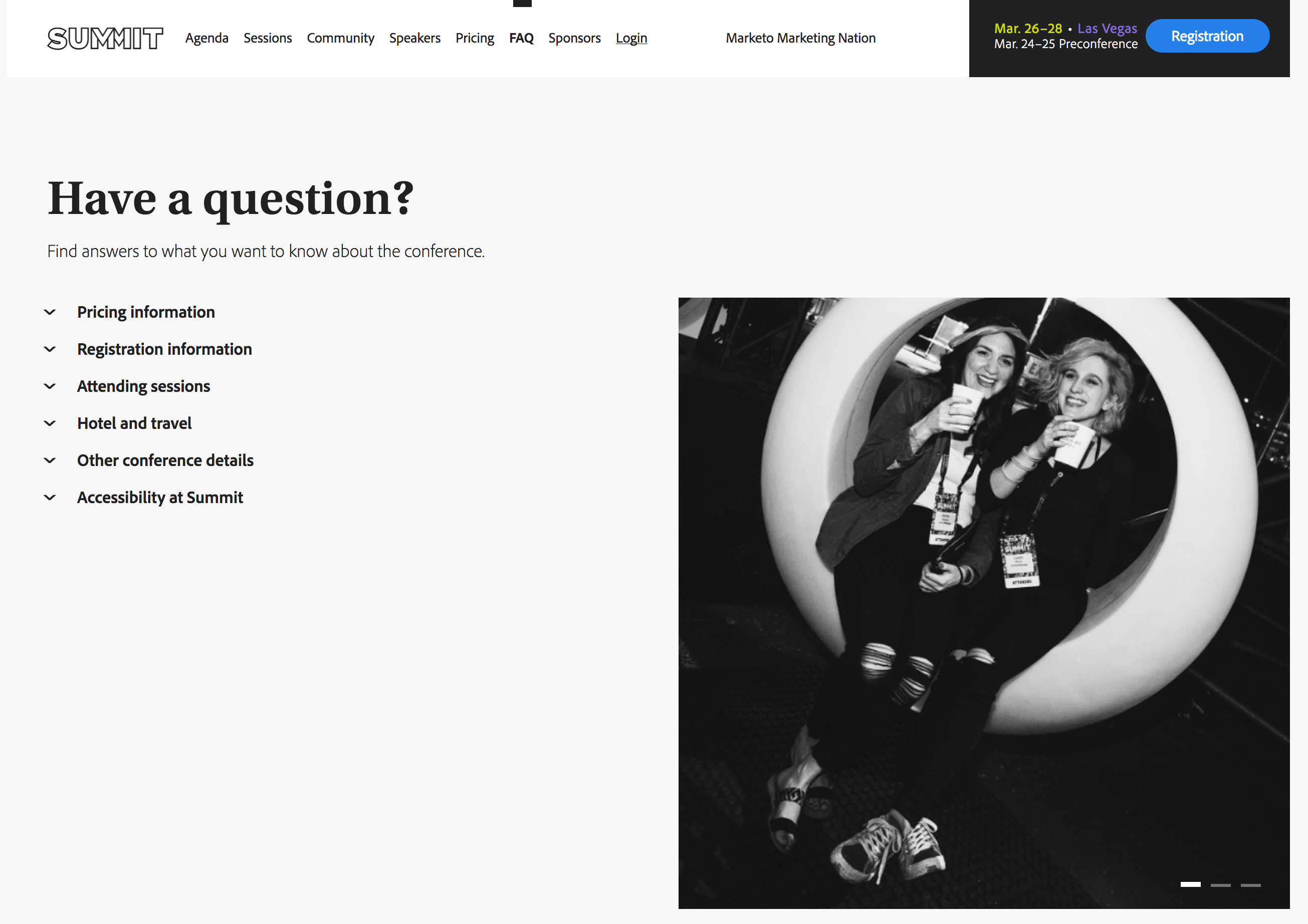
In this exercise we will create the FAQ page and add a title and a text component.
Have a question?.Find answers to what you want to know about the conference..As an accordion component is not yet available as a Core Component, we will use the tabs component to display the content in a similar way to the Summit FAQ page:
Pricing information.Registration information.What is the registration fee for Summit?
Are there any discounts for groups?
Can I qualify for more than one discount?
I have a promo code. How can I register?
I received a promo code after I registered. What should I do?
My promo code isn't working. What do I do?
How can I pay for Summit?
Are there discounts or Early Bird pricing for Preconference Training?
What are the registration policies/terms and conditions?
What is the cancellation policy?
What’s included in my registration fee?
Are meals included with my full conference pass?
Is there an additional charge for Preconference Training?
Does the registration fee include air transportation and hotel accommodations?
Can I purchase a guest social pass to the evening social events?
Where is the Summit meeting space located?
We will add a carousel component containing the three images used for the Summit FAQ page. We will set the slides to automatically transition every four seconds:
carousel1.jpg image from the asset finder and drop it onto the image component.carousel2.jpg image from the asset finder and drop it onto the image component.carousel3.jpg image from the asset finder and drop it onto the image component.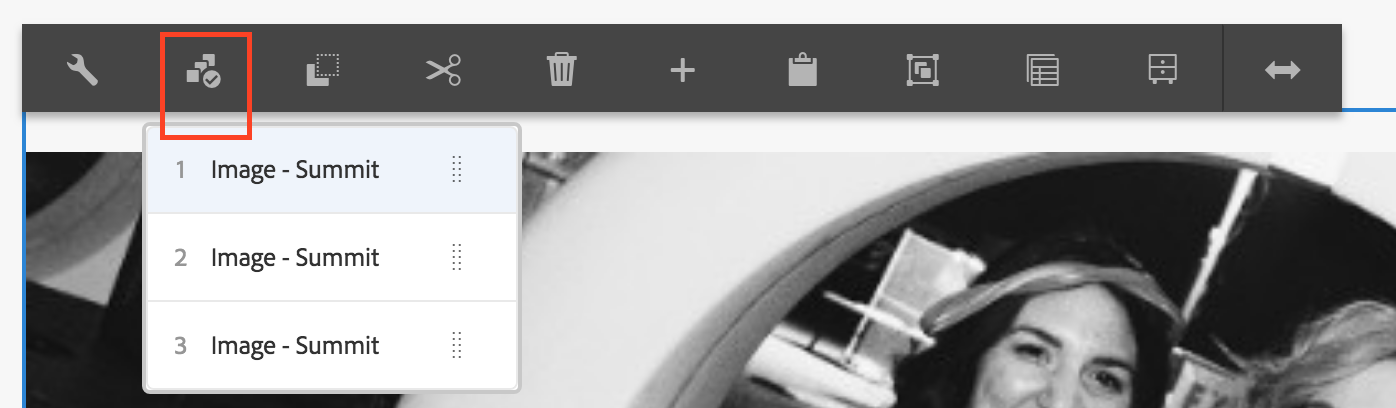
The carousel is now placed below the tabs. We will use the layout mode to put them beneath each other:
The FAQ page looks as follows:
We will have a look at the HTML of the tabs component, especially the CSS classes which are based on the BEM format, which is used to ease styling.
<div class="cmp-tabs">
    <ol role="tablist" class="cmp-tabs__tablist" aria-multiselectable="false">
        <li role="tab" class="cmp-tabs__tab cmp-tabs__tab--active" data-cmp-hook-tabs="tab" aria-selected="true" tabindex="0">Pricing information</li>
        <li role="tab" class="cmp-tabs__tab" data-cmp-hook-tabs="tab" aria-selected="false" tabindex="-1">Registration information</li>
    </ol>
    <div role="tabpanel" class="cmp-tabs__tabpanel cmp-tabs__tabpanel--active" data-cmp-hook-tabs="tabpanel">
        <div class="responsivegrid">
            <div class="aem-Grid aem-Grid--12 aem-Grid--default--12 ">
                <div class="text aem-GridColumn aem-GridColumn--default--12">
                    <div class="cmp-text">
                        <li><a>What is the registration fee for Summit?</a></li>
                        <li><a>Are there any discounts for groups?</a></li>
                    </div>
                </div>
            </div>
        </div>
    </div>
    <div role="tabpanel" class="cmp-tabs__tabpanel" data-cmp-hook-tabs="tabpanel" aria-hidden="true">
        <div class="responsivegrid">
            <div class="aem-Grid aem-Grid--12 aem-Grid--default--12 ">
                <div class="text aem-GridColumn aem-GridColumn--default--12">
                    <div class="cmp-text">
                        <p></p><li><a>What are the registration policies/terms and conditions?</a></li>
                        <li><a>What is the cancellation policy?</a></li>
                        <li><a>What’s included in my registration fee?</a></li>
                    </div>
                </div>
            </div>
        </div>
    </div>
</div>cmp-tabs, cmp-tabs__tablist, cmp-tabs__tab, cmp-tabs__tabpanel and cmp-tabs__tabpanel--active.Each Core Component can output a JSON rendering by simply adding the model selector and the json extension to the component path. The JSON can be used for example in a Single Page Application (SPA).
{
  ":itemsOrder": [
    "item_1548670181757",
    "item_1548670242858"
  ],
  ":items": {
    "item_1548670181757": {
      "columnClassNames": {
        "text": "aem-GridColumn aem-GridColumn--default--12"
      },
      "gridClassNames": "aem-Grid aem-Grid--12 aem-Grid--default--12",
      "columnCount": 12,
      ":items": {
        "text": {
          "text": "<p><li><a>What is the registration fee for Summit?</a></li>\r\n<li><a>Are there any discounts for groups?</a></li>\r\n<li><a>Can I qualify for more than one discount?</a></li>\r\n<li><a>I have a promo code. How can I register?</a></li>\r\n<li><a>I received a promo code after I registered. What should I do?</a></li>\r\n<li><a>My promo code isn't working. What do I do?</a></li>\r\n<li><a>How can I pay for Summit?</a></li>\r\n<li><a>Are there discounts or Early Bird pricing for Preconference Training?</a></li>\r\n</p>\r\n",
          "richText": true,
          ":type": "summit/components/content/text"
        }
      },
      ":itemsOrder": [
        "text"
      ],
      ":type": "wcm/foundation/components/responsivegrid",
      "cq:panelTitle": "Pricing information"
    },
    "item_1548670242858": {
      "columnClassNames": {
        "text": "aem-GridColumn aem-GridColumn--default--12"
      },
      "gridClassNames": "aem-Grid aem-Grid--12 aem-Grid--default--12",
      "columnCount": 12,
      ":items": {
        "text": {
          "text": "<p><li><a>What are the registration policies/terms and conditions?</a></li>\r\n<li><a>What is the cancellation policy?</a></li>\r\n<li><a>What’s included in my registration fee?</a></li>\r\n<li><a>Are meals included with my full conference pass?</a></li>\r\n<li><a>Is there an additional charge for Preconference Training?</a></li>\r\n<li><a>Does the registration fee include air transportation and hotel accommodations?</a></li>\r\n<li><a>Can I purchase a guest social pass to the evening social events?</a></li>\r\n<li><a>Where is the Summit meeting space located?</a></li>\r\n<li><a>How do I access my account, change personal information, and add registration packages?</a></li>\r\n<li><a>What is the age requirement for attending Summit?</a></li>\r\n<li><a>What kind of identification do I need to gain access to any Las Vegas lounge/bar/club?</a></li>\r\n<li><a>Will I receive confirmation of my Summit registration?</a></li>\r\n<li><a>What is the substitution policy?</a></li>\r\n<li><a>Where can I find the conference agenda?</a></li>\r\n<li><a>What are the onsite registration hours?</a></li>\r\n<li><a>What if I lose my badge onsite?</a></li>\r\n<li><a>What is the tax ID number?</a></li>\r\n<li><a>How do I obtain a W-9 form?</a></li>\r\n<li><a>What if I need a visa application?</a></li>\r\n<li><a>Where do I pick up my badge?</a></li>\r\n<li><a>I am a member of the press. Are press passes available?</a></li>\r\n</p>\r\n",
          "richText": true,
          ":type": "summit/components/content/text"
        }
      },
      ":itemsOrder": [
        "text"
      ],
      ":type": "wcm/foundation/components/responsivegrid",
      "cq:panelTitle": "Registration information"
    }
  },
  ":type": "summit/components/content/tabs"
}Now that we know which CSS classes are available for styling, we will:
style.less file of our site:/apps/summit/clientlibs/clientlib-site/less/style.lessstyle.less file:style.less file:In this lesson we familiarized ourselves with the Core Components and saw how powerful they can be when adapted for our own project.
If you have successfully performed all the above steps and if time permits, you can find here some small exercises that will help you dive deeper into the Core Components:
Before moving on to the next lesson, we will install a package that contains the FAQ page as it should be at the end of this lesson. This is not needed if you have successfully performed all the steps described in this lesson.
summit-aemdev-lesson4.zip file from the Summit-2019/resources directory of your file system.This appendix contains a few links to continue discovering the Core Components and the Archetype projects.
Core Components developer docs and source code:
https://github.com/adobe/aem-core-wcm-components
Core Components documentation on helpx:
https://helpx.adobe.com/experience-manager/core-components/using/introduction.html
Core Components Library: http://opensource.adobe.com/aem-core-wcm-components/library.html
Code for the Carousel:
https://github.com/adobe/aem-core-wcm-components/tree/master/content/src/content/jcr_root/apps/core/wcm/components/carousel/v1/carousel
Archetype project:
https://github.com/Adobe-Marketing-Cloud/aem-project-archetype\
Have fun with the Core Components!
In this lesson we will get an overview what extension points are available when using the Core Components to meet special project requirements.
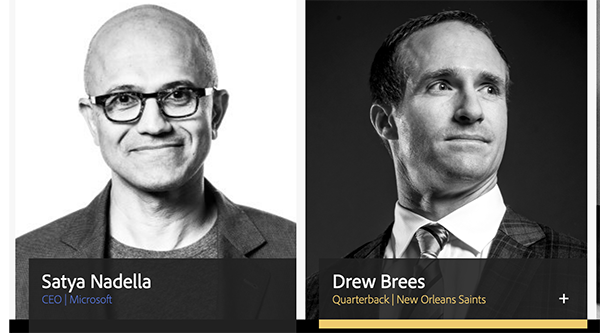
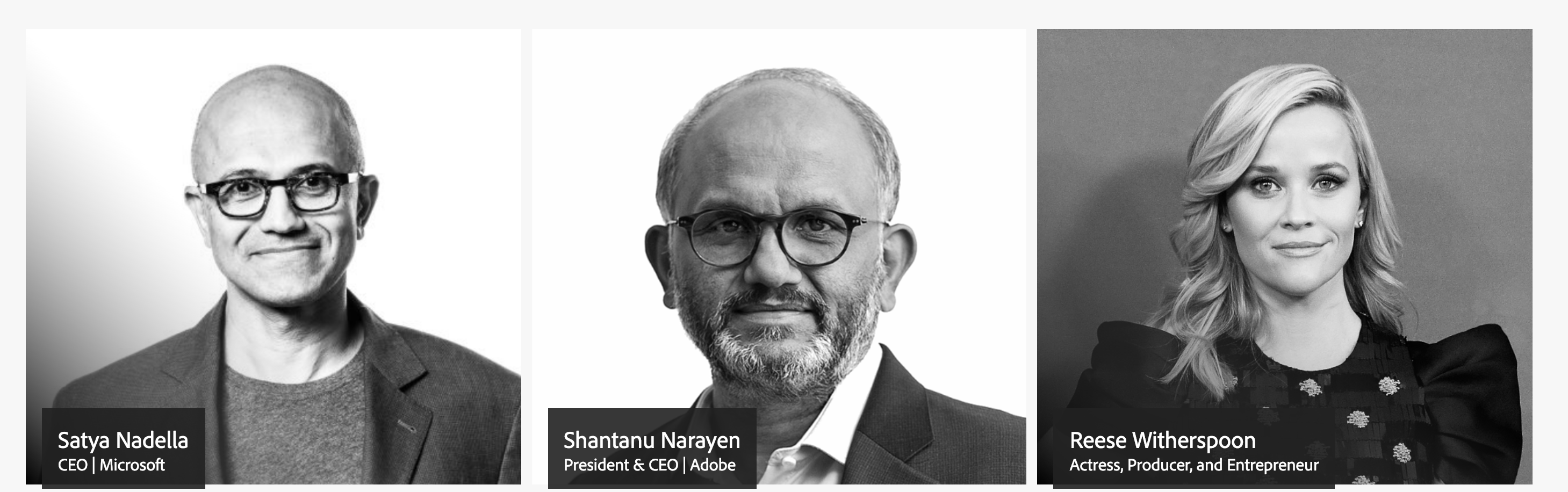
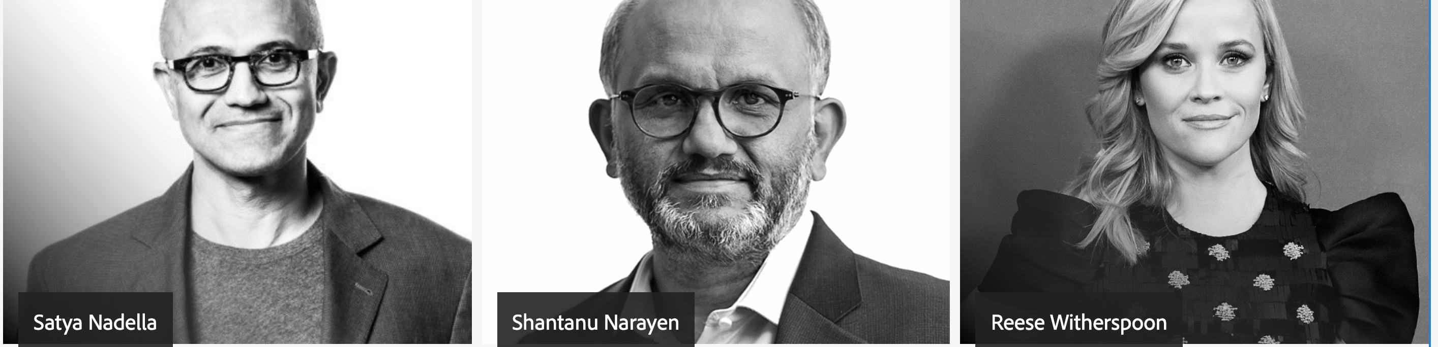
In this lesson we will extend the Summit home page example with a speaker overview on the home page. After this exercise the main speakers of the summit will be displayed as shown in the image below.
For this purpose, we will use the List component of the Core Component Library.
In this exercice we will install an AEM package that contains the speaker pages for Satya Nadella, Shantanu Narayen, Reese Witherspoon and Drew Brees. The pages will be available below /content/summit/speaker and will each provide a title, a subtitle, a description and an image. We will also add a list component to the home page that is based on the speaker pages.
summit-lesson5-speakers-pages.zip package:
Summit-2019/resources folder and select the summit-lesson5-speakers-pages.zip file. Click OK.Fixed list./content/summit/en/speaker/satya-nadella/content/summit/en/speaker/shantanu-narayen/content/summit/en/speaker/reese-witherspoonRight after the Summit banner we can see a list with three speakers:
/apps/core/wcm/components/list/v2/list./apps/summit/components/content/list.<template data-sly-template.item="${@ list, item}">
<article class="speaker__item">
<a class="speaker__item-link" href="${item.URL}" data-sly-unwrap="${!list.linkItems}">
<!--img src="${item.imageSrc}" /-->
<div class="speaker__item-container">
<span class="speaker__item-title">${item.title}</span>
<!--span class="speaker__item-subtitle">${item.subTitle}</span-->
</div>
</a>
<div class="speaker__item-description">${item.description}</div>
</article>
</template>summit.site and put the files File 2: speaker.js and File 3: speaker.less in this folder. Proceed as follows:
/apps/summit/components/content/list node.clientlib-speakercategoriesStringsummit.sitejs.txt in the clientlibs folder. Add the string speaker.js to the file content. Save the changes.css.txt in the clientlibs folder. Add the string speaker.less to the file content. Save the changes.speaker.js in the clientlibs folder. Add the content of the file File 2: speaker.js to the file. Save the changes.speaker.less in the clientlibs folder. Add the content of the file File 3: speaker.less to the file. Save the changes.com.adobe.training.summit.core.models. You can also find a copy of the Java Class in the resources folder at File 3: SpeakerList.java.Example implementation:
if (item.getPath() != null) {
    Resource resource = resourceResolver.getResource(item.getPath());
    if (resource != null) {
        Page page = resource.adaptTo(Page.class);
        if (page != null) {
            Resource contentResource = page.getContentResource();
            ValueMap valueMap = contentResource.getValueMap();
            subTitle = valueMap.get("subtitle", String.class);
            Resource image = page.getContentResource("image");
                if (image != null) {
                    ValueMap imageValueMap = image.getValueMap();
                    imageSrc = imageValueMap.get("fileReference", String.class);
                }
        }
    }
}mvn -PautoInstallBundle clean install.item.html from exercise 5.2 to display the subtitle and image source for the speaker list. Remove the HTML comment for the image and subtile section, so you will end up with the following HTL template:<template data-sly-template.item="${@ list, item}">
<article class="speaker__item">
<a class="speaker__item-link" href="${item.URL}" data-sly-unwrap="${!list.linkItems}">
<img src="${item.imageSrc}" />
<div class="speaker__item-container">
<span class="speaker__item-title">${item.title}</span>
<span class="speaker__item-subtitle">${item.subTitle}</span>
</div>
</a>
<div class="speaker__item-description">${item.description}</div>
</article>
</template>When you open the Homepage of the Summit page at http://localhost:4502/content/summit/en.html you can see the speaker list with the extended image and subtitle informations.
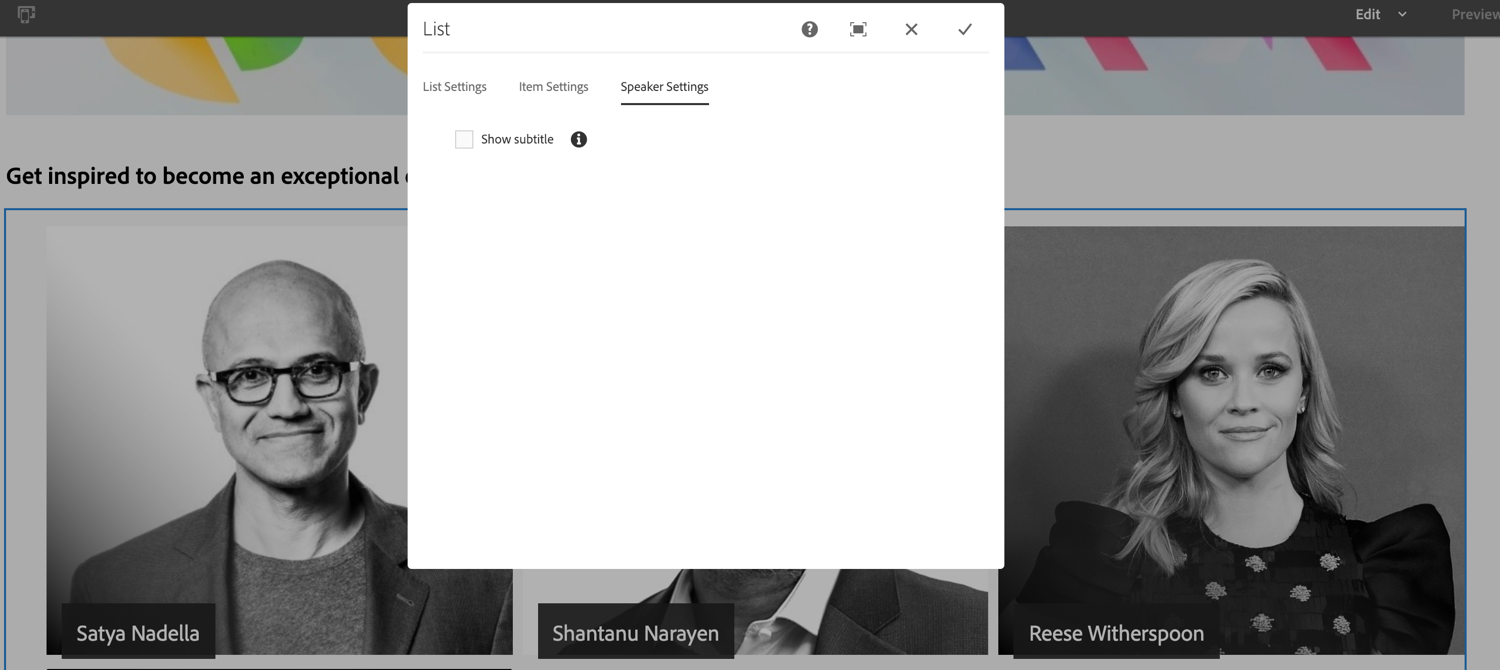
Sometimes it's also necessary to extend the existing edit dialog of a core component. For example, if a feature needs to be turned off for some use cases. In this exercise we will extend the edit dialog of the list component so that authors can control if the subtitle of a speaker should be displayed or not in the list.
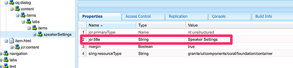
Browse to the existing edit dilalog of the list component in CRXDE Lite at the path /apps/core/wcm/components/list/v2/list/cq:dialog.
Copy the node by opening the context dialog in CRXDE Lite (with a right mouse click) and click on the copy command.
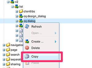
Paste the copied node at the summit list component path at /apps/summit/components/content/list.
Expand the node structure of the dialog up to the tab level.
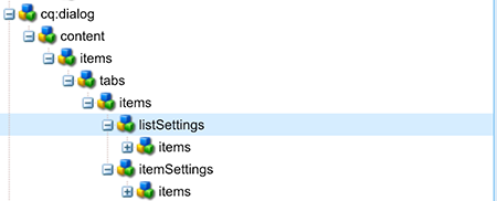
Delete the listSettings node (again with the command in the context menu) and rename the remaining itemSettings node in speakerSettings. Change the jcr:title property of that node in Speaker Settings.
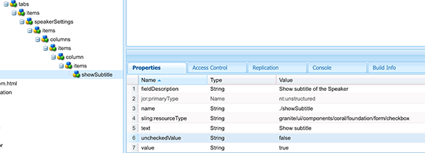
Under the speakerSettings node rename the linkItems subnode in showSubtile and remove all the other nodes at the same level.
Edit the properties of the showSubtitle node with the following values:
| Name | Type | Value |
|---|---|---|
| fieldDescription | String | Show subtitle of the Speaker |
| name | String | ./showSubtitle |
| sling:resourceType | String | granite/ui/components/coral/foundation/form/checkbox |
| text | String | Show subtitle |
| uncheckedValue | String | false |
| value | String | true |
Save the changes by clicking on the Save All menu item in upper left of CRXDE Lite.
With the help of the Resource Merger feature the new node structure is getting merged with the existing dialog of the list component.
Change the item.html template from the former exercise in CRXDE Lite at the path /apps/summit/components/content/list/item.html and add a data-sly-test condition to the subtitle section. The final section should look like.
Open the Homepage of the summit page at http://localhost:4502/editor.html/content/summit/en.html: the subtitle of the speaker is removed.
Open the edit dialog of the list component: there is a new tab Speaker Settings where an author can control if the subtitle should be visible or not.
In this lesson we saw some practical examples of extension points that we used to further customize our site project by customizing HTML output and extending a model.
In the next lesson we will learn how to reduce the amount of needed components in AEM by making use of the new Style System which gives authors the very flexible tool to change the look and feel of a component.
The new Style System is a powerful and easy way to customize the look and feel of a component on a website and finally to reduce the amount of needed components in an AEM project. In this lesson we will use the Style System to further customize our site by applying custom styles and combining them to make our components even more flexible.
In the first exercise we will create a style to change the grid system for the speaker overview. Afterwards the author will be able to control how many items should be displayed in a row.
In the second exercise we will continue by combining the styles of different style groups, which will add even more flexibility in the rendering options available for the component.
Open the home page template in the template editor http://localhost:4502/editor.html/conf/summit/settings/wcm/templates/summit-home-page/structure.html
Click on the policy icon of the List Component
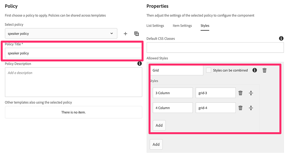
Open the Styles tab of the content policy

Set the Policy Title to speaker policy. Add a style group and call it Grid. Add 2 styles as in the table below. Save the content policy setting by clicking the Done button.
| Style Name | CSS Classes |
|---|---|
3 Column |
grid-3 |
4 Column |
grid-4 |
Modify the existing CSS rules from the previous lesson by opening the file http://localhost:4502/crx/de/index.jsp#/apps/summit/components/content/list/clientlib-speaker/speaker.less in CRXDE Lite. Copy-and-paste the content from the File 1: speaker.less of the lesson6 resources folder.
Please note the removed grid-template-columns property from the cmp-list selector. This property is now used in two new rules:
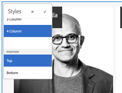
Open the home page in edit mode again by browsing to the following URL: http://localhost:4502/editor.html/content/summit/en.html. A new style icon will be visible in the action bar of the List component. 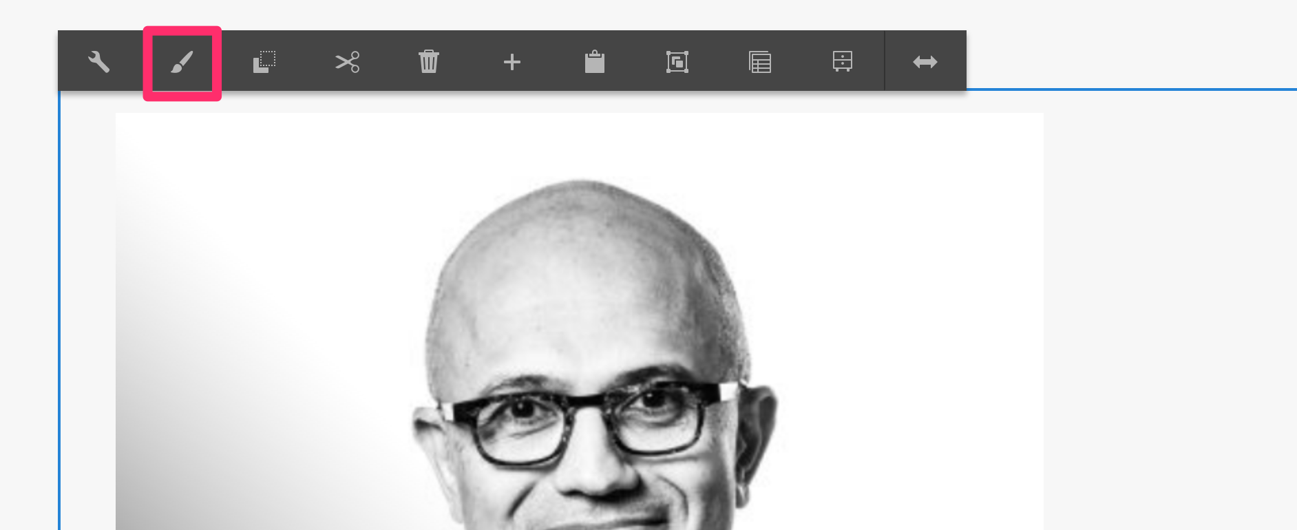
Click on the Styles icon and select the 3 Column style: the speakers are displayed in 3 columns.
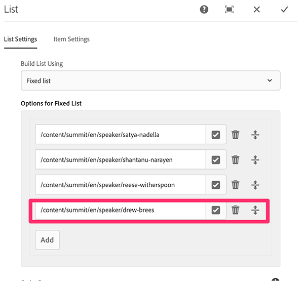
Add an additional item to the speaker list by opening the edit dialog of the list component and adding the path /content/summit/en/speaker/drew-brees to the fixed list of pages.
Select the 4 Column style: the speakers are displayed in 4 columns. 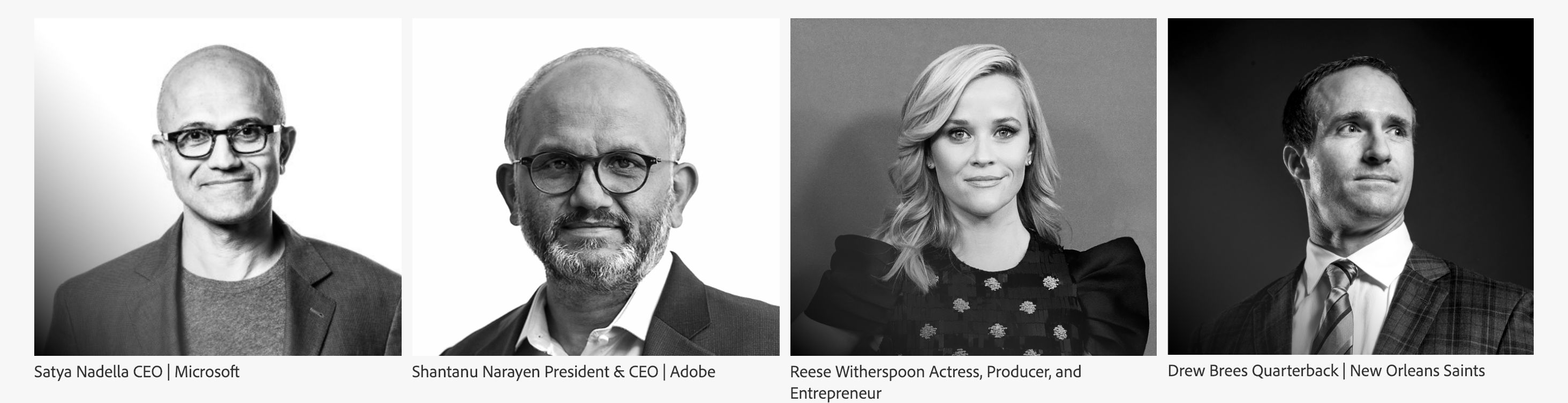
More information on how the Style System works can be found on its manual page
In this exercise we will combine two styles to showcase how flexible the list component for the speaker overview can be when it is used together with the Style System. To achieve this, we will combine the column style from the previous exercise with another style. With this style it will be possible to control the position of the speaker title.
Open again the Template Editor for the Homepage by accessing the URL http://localhost:4502/editor.html/conf/summit/settings/wcm/templates/summit-home-page/structure.html in the browser.
Edit the content policy for the List component as in step 2 of the previous exercise and click on the Styles tab.
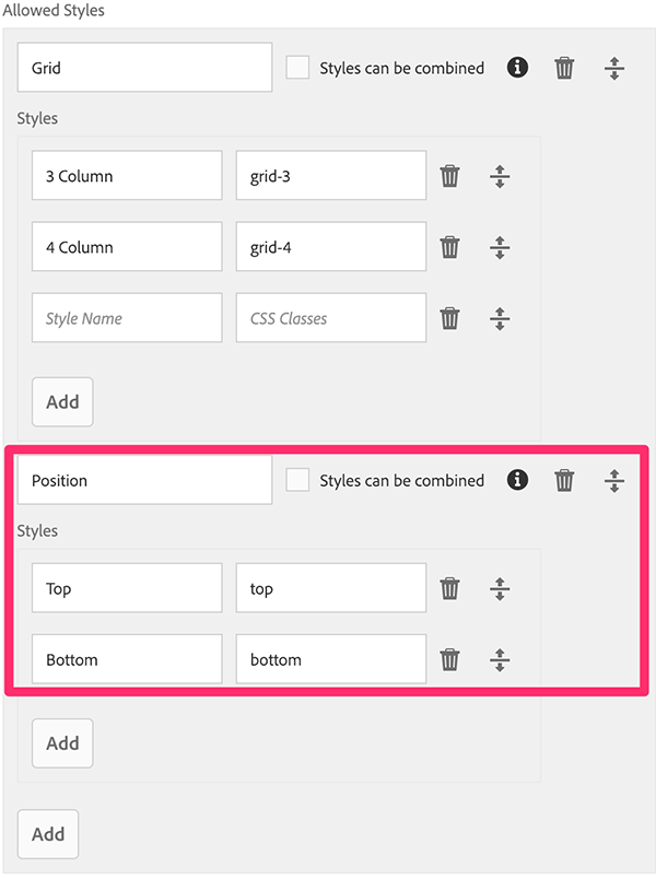
Add a new Style Group with the name Position to the existing style of the list component and add the following styles:
| Style Name | CSS Classes |
|---|---|
Top |
top |
Bottom |
bottom |
The dialog should look like in the following screenshot
Save the policy.
Edit the CSS file at /apps/summit/components/content/list/clientlib-speaker/speaker.less in CRXDE Lite:
bottom: 0px; below .speaker__item-container {In addition to the Grid selection the action toolbar of the List component now also provides the position group. By combining the Grid and Position group there are now 4 possible renderings for the speaker list.
We have seen in this final lesson how flexible the Style System is and how it can make our components even more useful. By adapting the appearance of our components, it is possible to eliminate the need to create custom components for every variation.